
This tutorial shows you how to use Table widget in Flutter, including how to create TableRow and TableCell.
Do you want to place widgets in a table layout? Flutter already has a widget called Table. As the name suggests, it's a widget that uses the table layout algorithm for placing its children. In this tutorial, I am going to show you how to use the Table widget which includes how to customize the style.
Using Table Widget
The constructor of Table can be seen below.
  Table({
    Key? key,
    List<TableRow> children = const <TableRow>[],
    Map<int, TableColumnWidth>? columnWidths,
    TableColumnWidth defaultColumnWidth = const FlexColumnWidth(1.0),
    TextDirection? textDirection,
    TableBorder? border,
    TableCellVerticalAlignment defaultVerticalAlignment = TableCellVerticalAlignment.top,
    TextBaseLine? textBaseline,
  })
To create a Table, you need to call the constructor. There is no required argument. The most essential argument that you need to pass in most cases is children. It's used to define the content of the table and you need to pass a List of TableRow as the value.
  Table(
    children: [], // Pass [TableRow]s
    // other arguments
  )
The next sections explain about TableRow and the other arguments that you can use to customize the style of the table.
For this tutorial, we are going to use the following class as the data structure for the rows
  class Item {
    Item({
      required this.id,
      required this.name,
      required this.price,
      required this.description,
    });

    int id;
    String name;
    double price;
    String description;
  }
Below is the code for generating a list of Item instances and store it in a state variable _items.
  List<Item> _items = [];

  @override
  void initState() {
    super.initState();
    setState(() {
      _items = _generateItems();
    });
  }

  List<Item> _generateItems() {
    return List.generate(5, (int index) {
      return Item(
        id: index,
        name: 'Item $index',
        price: index * 1000.00,
        description: 'Details of item $index',
      );
    });
  }
Create TableRow
Creating a TableRow can be done by calling the below constructor.
  TableRow({
    LocalKey? key,
    Decoration? decoration,
    List<Widget>? children
  })
The first one is key whose type is LocalKey. It's optional, but if you pass the argument, the value must be unique for each child.
The next argument is decoration. It's also optional and you can pass any Decoration object (e.g. BoxDecoration, ShapeDecoration). This argument can be used to add decoration paint for the row.
The other argument is children. You need to pass some widgets to be the content of a row. It supports any type of widget, but one of the most common widgets to be passed as the child of a TableRow is TableCell.
The method below creates a TableRow based on the passed Item. It also passes the item id as the key argument as well as a BoxDecoration as the decoration arguments. For the children argument, we are going to pass a list of TableCell which is explained in the next section.
  TableRow _buildTableRow(Item item) {
    return TableRow(
      key: ValueKey(item.id),
      decoration: BoxDecoration(
        color: Colors.lightBlueAccent,
      ),
      children: [], // Pass the widgets to be set as the row content.
    );
  }
Then, you need to pass the created TableRows as children argument.
  Table(
    children: _items.map((item) => _buildTableRow(item))
        .toList(),
    // other arguments
  )
Create TableCell
TableCell is a widget that can control how a child of a Table is aligned. It must be a descendant of a Table. Another thing you need to know is the path between Table and TableCell can only contain TableRows, StatelessWidgets, or StatefulWidgets. That means you cannot pass other kinds of widgets like RenderObjectWidgets. If you violate that rule, you will get an exception as shown below.
  ======== Exception caught by widgets library =======================================================
  The following assertion was thrown while applying parent data.:
  Incorrect use of ParentDataWidget.

  The ParentDataWidget TableCell(verticalAlignment: middle) wants to apply ParentData of type TableCellParentData to a RenderObject, which has been set up to accept ParentData of incompatible type ParentData.

  Usually, this means that the TableCell widget has the wrong ancestor RenderObjectWidget. Typically, TableCell widgets are placed directly inside Table widgets.
  The offending TableCell is currently placed inside a SizedBox widget.

  The ownership chain for the RenderObject that received the incompatible parent data was:
    TableCell ← SizedBox ← Table ← _BodyBuilder ← MediaQuery ← LayoutId-[] ← CustomMultiChildLayout ← AnimatedBuilder ← DefaultTextStyle ← ⋯
Below is the constructor of TableCell.
  const TableCell({
    Key? key,
    TableCellVerticalAlignment? defaultVerticalAlignment,
    required Widget child,
  })
The required argument is child for which you need to pass a widget to be set as the content of the cell.
Meanwhile, the defaultVerticalAlignment argument can be used to set the alignment of the cell's content. The argument's type is TableCellVerticalAlignment enum whose possible values are:
top: Places the top at the top of the row.middle: Vertically aligns at the center of the row.bottom: Places the bottom at the bottom of the row.baseline: Aligns cells so that they share the same baseline based on the specifiedRenderTable.textBaseline. Therefore, it should be used only ifRenderTable.textBaselineis specified. Cells with no-baseline are top-aligned.fill: Size the cells to be as tall as the row, then made to fit the row. The row weight will be zero if all cells use this alignment.
Below is an example of a TableCell. It sets the vertical alignment to middle. The child is a Text widget which is wrapped as the child of a Padding widget. Setting the padding size might be necessary here especially if you add border around the cell and the content is a text, so that the content doesn't stick or overlapped by the border.
  TableCell(
    verticalAlignment: TableCellVerticalAlignment.middle,
    child: Padding(
      padding: const EdgeInsets.all(5),
      child: Text(item.name),
    ),
  ),
The size of the content affects the height of a cell. Therefore, in order to set the height of a cell, you can add the height constraint to the child of the TableCell. The height of a cell also affects the height of other cells in the same row. Keep in mind that the height may not have any effect if the vertical alignment of the cell is top.
  TableCell(
    verticalAlignment: TableCellVerticalAlignment.bottom,
    child: SizedBox(
      height: 50,
      child: Center(
        child: Text(item.id.toString()),
      ),
    ),
  )
Set The Width of Columns
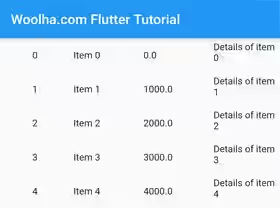
By default, the width of each column is the same, as shown in the picture below.
You may want to set the width of each column to a particular size, so that the table content looks good to users. One of the ways to set the widths of the columns is by passing defaultColumnWidth argument which is used to set the default width for the columns that do not explicitly set the sizing algorithm. The type of the argument is TableColumnWidth. There are some algorithms for calculating the width of the columns.
IntrinsicColumnWidth: Sizes the column according to the intrinsic dimensions of all the cells in that column. This algorihtm's computation is very expensive. The constructor accepts an optional value flex which specifies the flex factor. If the value is passed and there is any room left and after the widths of non-flexible columns have been calculated, the column will be counted for the distribution of remaining space.
const IntrinsicColumnWidth({ double? flex })FixedColumnWidth: Sizes the column to a specific number of pixels.
const FixedColumnWidth(double value);FractionColumnWidth: Sizes the column to a fraction of the maximum width constraint of the table. The computation with this algorithm is quite cheap.
const FractionColumnWidth(double value);FlexColumnWidth: Sizes the column based on the flex factor by using the remaining space after all non-flexible columns have been calculated. The computation with this algorithm is quite cheap.
const FlexColumnWidth([this.value = 1.0]);MaxColumnWidth: Get the maximum size of two TableColumnWidth values.
const MaxColumnWidth(TableColumnWidth a, TableColumnWidth b);MinColumnWidth: Get the minimum size of two TableColumnWidth values.
const MinColumnWidth(TableColumnWidth a, TableColumnWidth b);After you choose the default column width specification to use, you can pass the value as defaultColumnWidth argument.
  body: Table(
    defaultColumnWidth: IntrinsicColumnWidth(),
    // other arguments
  )
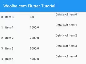
What if you want to specifically set the width of some columns? It's also possible by passing a map value as the columnWidths argument. The key of the map is the columns' index, while the type of the value is TableColumnWidth.
  body: Table(
    columnWidths: const <int, TableColumnWidth> {
      0: const FixedColumnWidth(20),
      1: const FlexColumnWidth(3),
      2: const MaxColumnWidth(FlexColumnWidth(2), FractionColumnWidth(0.3)),
      3: const FixedColumnWidth(150),
    },
    // other arguments
  )
Output:
Set Border
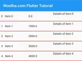
You can set how borders should be applied to a table by passing the border argument whose type is TableBorder. Using the below constructor, you can specify which parts of the table should have border painted. The top, right, bottom, and left arguments are for the outer sides of the table. For the inner borders between cells, you can use horizontalInside and verticalInside arguments. The type of each argument is BorderSide which defaults to BorderSide.none if you don't pass the argument.
  const TableBorder({
    BorderSide top = BorderSide.none,
    BorderSide right = BorderSide.none,
    BorderSide bottom = BorderSide.none,
    BorderSide left = BorderSide.none,
    BorderSide horizontalInside = BorderSide.none,
    BorderSide verticalInside = BorderSide.none,
  })
Example:
  Table(
     border: TableBorder(
        bottom: BorderSide(color: Colors.red, width: 2),
        horizontalInside: BorderSide(color: Colors.red, width: 2),
    ),
    // other arguments
  )
Output:
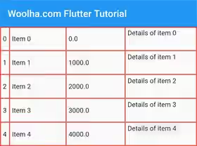
If you want to apply the same border style to all of the outer sides and the internal separator between cells, you can use TableBorder.all.
  factory TableBorder.all({
    Color color = const Color(0xFF000000),
    double width = 1.0,
    BorderStyle style = BorderStyle.solid,
  })
Example:
  Table(
     border: TableBorder.all(color: Colors.red, width: 2),
    // other arguments
  )
Output:
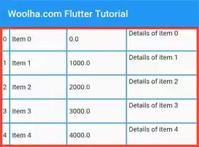
If you want to apply the same border style to all of the outer sides only, but different style for the internal separator between cells or vice versa, you can use TableBorder.symmetric.
  factory TableBorder.symmetric({
    BorderSide inside = BorderSide.none,
    BorderSide outside = BorderSide.none,
  })
Example:
  Table(
     border: TableBorder.symmetric(
      inside: BorderSide(color: Colors.blue, width: 2),
      outside: BorderSide(color: Colors.red, width: 5),
    ),
    // other arguments
  )
Output:
Set Default Vertical Alignment
For cells that do not explicitly specify the vertical alignment, you can set a default vertical alignment value. It can be done by passing defaultVerticalAlignment value whose type is TableCellVerticalAlignment enum. You can refer to Create TableCell section to get the enum values.
  Table(
    defaultVerticalAlignment: TableCellVerticalAlignment.fill,
    // other arguments
  )
Set Text Direction
The TableCells passed as the children of a TableRow are rendered based on the order in the list. If you want to set the order direction, whether it's left-to-right or right-to-left, you can pass the textDirection argument.
  Table(
    textDirection: TextDirection.rtl,
    // other arguments
  )
Output:
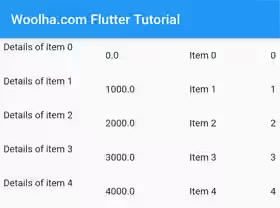
Table - Parameters
Key? key: The widget's key, used to control how a widget is replaced with another widget.List<TableRow> children: The rows of the table. Defaults toconst <TableRow>[].Map<int, TableColumnWidth> columnWidths: Define the width for the columns.TableColumnWidth defaultColumnWidth: Determine the width of columns without explicit sizing algorithm.. Defaults toconst FlexColumnWidth(1.0).TextDirection textDirection: The direction in which the columns are ordered.TableBorder border: The style for the boundary and interior divisions of the table.TableCellVerticalAlignment defaultVerticalAlignment: Determine how to align cells without explicit vertical alignment.. Defaults toTableCellVerticalAlignment.top.TextBaseLine textBaseline: The text baseline to use when aligning rows usingTableCellVerticalAlignment.baseline.
?: value can be null.
TableRow - Parameters
LocalKey? key: An identifier for the row.Decoration?: A decoration to paint behind this row.List<Widget>? children: The widgets that comprise the cells in this row.
?: value can be null.
TableCell - Parameters
Key? key: The widget's key, used to control how a widget is replaced with another widget.TableCellVerticalAlignment? defaultVerticalAlignment: TheRenderObjectWidgetused to set up theParentData.required Widget child: The widget under this widget in the tree.
?: value can be null.
required: value must be passed.
Full Code
  import 'package:flutter/material.dart';

  void main() => runApp(MyApp());

  class MyApp extends StatelessWidget {

    @override
    Widget build(BuildContext context) {
      return MaterialApp(
        title: 'Woolha.com Flutter Tutorial',
        home: TableExample(),
        debugShowCheckedModeBanner: false,
      );
    }
  }

  class Item {
    Item({
      required this.id,
      required this.name,
      required this.price,
      required this.description,
    });

    int id;
    String name;
    double price;
    String description;
  }

  class TableExample extends StatefulWidget {

    @override
    State<StatefulWidget> createState() {
      return TableExampleState();
    }
  }

  class TableExampleState extends State<TableExample> {

    List<Item> _items = [];

    @override
    void initState() {
      super.initState();
      setState(() {
        _items = _generateItems();
      });
    }

    List<Item> _generateItems() {
      return List.generate(5, (int index) {
        return Item(
          id: index,
          name: 'Item $index',
          price: index * 1000.00,
          description: 'Details of item $index',
        );
      });
    }

    TableRow _buildTableRow(Item item) {
      return TableRow(
        key: ValueKey(item.id),
        decoration: BoxDecoration(
          color: Colors.lightBlueAccent,
        ),
        children: [
          TableCell(
            verticalAlignment: TableCellVerticalAlignment.bottom,
            child: SizedBox(
              height: 50,
              child: Center(
                child: Text(item.id.toString()),
              ),
            ),
          ),
          TableCell(
            verticalAlignment: TableCellVerticalAlignment.middle,
            child: Padding(
              padding: const EdgeInsets.all(5),
              child: Text(item.name),
            ),
          ),
          TableCell(
            verticalAlignment: TableCellVerticalAlignment.middle,
            child: Padding(
              padding: const EdgeInsets.all(5),
              child: Text(item.price.toString()),
            ),
          ),
          TableCell(
            child: Padding(
              padding: const EdgeInsets.all(5),
              child: Text(item.description),
            ),
          ),
        ]
      );
    }

    @override
    Widget build(BuildContext context) {
      return Scaffold(
        appBar: AppBar(
          title: const Text('Woolha.com Flutter Tutorial'),
        ),
        body: Table(
          // border: TableBorder(
          //     bottom: BorderSide(color: Colors.red, width: 2),
          //     horizontalInside: BorderSide(color: Colors.red, width: 2),
          // ),
          // border: TableBorder.all(color: Colors.red, width: 2),
          border: TableBorder.symmetric(
            inside: BorderSide(color: Colors.blue, width: 2),
            outside: BorderSide(color: Colors.red, width: 5),
          ),
          defaultVerticalAlignment: TableCellVerticalAlignment.baseline,
          defaultColumnWidth: IntrinsicColumnWidth(),
          columnWidths: const <int, TableColumnWidth> {
            0: const FixedColumnWidth(20),
            1: const FlexColumnWidth(3),
            2: const MaxColumnWidth(FlexColumnWidth(2), FractionColumnWidth(0.3)),
            3: const FixedColumnWidth(150),
          },
          // textDirection: TextDirection.rtl,
          textBaseline: TextBaseline.alphabetic, // Pass this argument when using [TableCellVerticalAlignment.fill]
          children: _items.map((item) => _buildTableRow(item))
              .toList(),
        ),
      );
    }
  }
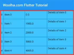
Output:
Summary
That's how to use the Table widget in Flutter. Basically, you need to create a list of TableRow and pass it as the children argument. You can also pass other arguments to customize the style of the Table. Even though this tutorial uses Text as the content of the cells, actually you can use any type of widget. If your table contains text data only, you may consider to use DataTable instead, which has some additional functionalities such as sorting and item selection.
You can also read about:
DataTable: A material design data table.
