This tutorial shows you how to use BoxDecoration in Flutter.
BoxDecoration is an immutable description of how to paint a box. It can be passed as decoration property when constructing Container or TableRow. As the name suggests, it is used to add decoration on the Widget where it is used on.
Supported decoration includes color, gradient, background image, border, as well as shadow.
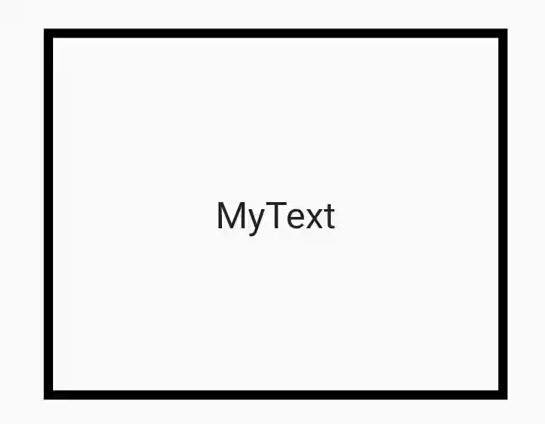
Adding Border
You can add border by passing border property. It must be a BoxBorder. You can create it using various ways such as the Border() constructor, Border.all factory, or Border.merge static method. Border is drawn on top of everything including color, gradient, or image which will be explained later.
  Container(
    width: 250,
    height: 200,
    decoration: BoxDecoration(
      border: Border.all(
        color: Colors.black,
        width: 5,
      ),
    ),
    child: Center(
      child: Text("MyText", style: TextStyle(fontSize: 20))
    ),
  )
Output:
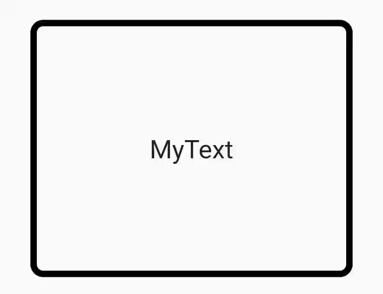
If you want to make the border looks rounded, you can pass borderRadius property.
  Container(
    width: 250,
    height: 200,
    decoration: BoxDecoration(
      border: Border.all(
        color: Colors.black,
        width: 5,
      ),
      borderRadius: BorderRadius.circular(10),
    ),
    child: Center(
      child: Text("MyText", style: TextStyle(fontSize: 20))
    ),
  )
Output:
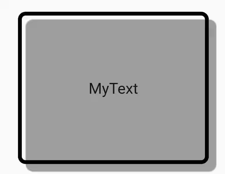
Adding Shadow
boxShadow property allows you to add a list of shadows behind the box.
  Container(
    width: 250,
    height: 200,
    decoration: BoxDecoration(
      border: Border.all(
        color: Colors.black,
        width: 5,
      ),
      borderRadius: BorderRadius.circular(10),
      boxShadow: [
        new BoxShadow(
          color: Colors.grey,
          offset: new Offset(10.0, 10.0),
         ),
      ],
    ),
    child: Center(
      child: Text("MyText", style: TextStyle(fontSize: 20))
    ),
  )
Output:
Setting Background and Image
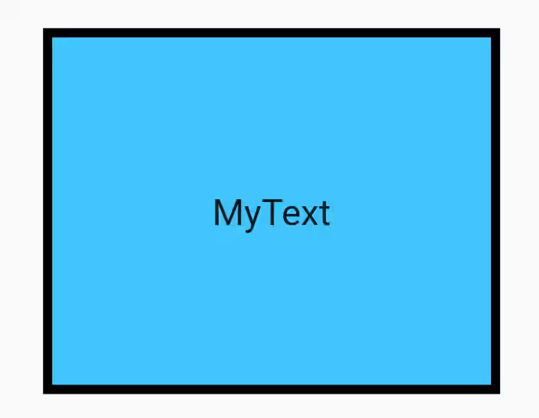
For setting the box color, you can use color property.
  Container(
    width: 250,
    height: 200,
    decoration: BoxDecoration(
      color: Colors.lightBlueAccent,
      border: Border.all(
        color: Colors.black,
        width: 5,
      ),
    ),
    child: Center(
      child: Text("MyText", style: TextStyle(fontSize: 20))
    ),
  )
Output:
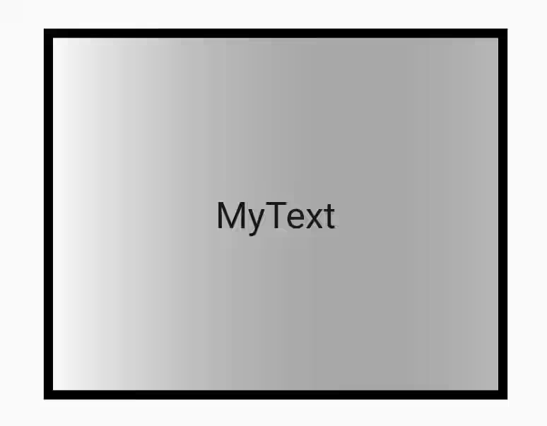
It also supports gradient color which is of type Gradient. You can use any class that extends Gradient such as LinearGradient, RadialGradient, SweepGradient. color will be ignored if gradient is defined.
  Container(
    width: 250,
    height: 200,
    decoration: BoxDecoration(
      color: Colors.lightBlueAccent,
      border: Border.all(
        color: Colors.black,
        width: 5,
      ),
      gradient: LinearGradient(
        colors: [Colors.white, Colors.black26],
      ),
    ),
    child: Center(
      child: Text("MyText", style: TextStyle(fontSize: 20))
    ),
  )
Output:
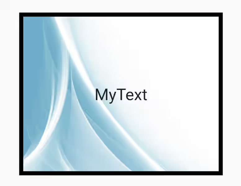
You can also add a DecorationImage as image property. Image is drawn on top of color and gradient.
  Container(
    width: 250,
    height: 200,
    decoration: BoxDecoration(
      color: Colors.lightBlueAccent,
      border: Border.all(
        color: Colors.black,
        width: 5,
      ),
      gradient: LinearGradient(
        colors: [Colors.white, Colors.black26],
      ),
      image: const DecorationImage(
        image: NetworkImage('https://www.pinclipart.com/picdir/big/211-2119839_snowflakes-transparent-background-free-snowflakes-png-clipart.png'),
        fit: BoxFit.cover,
      ),
    ),
    child: Center(
      child: Text("MyText", style: TextStyle(fontSize: 20))
    ),
  )
Output:
BoxDecoration Properties
Below are the available properties you can pass in the constructor.
Color color: The background color of the box.DecorationImage image: An image to paint above the backgroundcolororgradient.BoxBorder border: A border to draw above the backgroundcolor,gradient, orimage.BorderRadiusGeometry borderRadius: If non-null, the corners of this box are rounded by thisBorderRadius.List boxShadow: A list of shadows cast by this box behind the box.Gradient gradient: A gradient to use when filling the box.BlendMode backgroundBlendMode: The blend mode to be applied to thecolororgradientbackground of the box.BoxShape shape: The shape to fill the backgroundcolor,gradient, andimageinto and to cast as theboxShadow.
You can also read about:
ShapeDecoration: an immutable description of how to paint an arbitrary shape.
