
This tutorial shows you how to use DataTable widget in Flutter.
If you want to display data in a table using Flutter, there's a widget that's suitable for that purpose. You can use the DataTable widget. It allows you to display data in a table and it has some useful features such as row selection and data sorting. Below are the examples of how to use it.
Using DataTable Widget
To use the DataTable widget, you need to call the constructor below.
  DataTable({
    Key? key,
    required List<DataColumn> columns,
    int? sortColumnIndex,
    bool sortAscending = true,
    ValueSetter<bool?>? onSelectAll,
    Decoration? decoration,
    MaterialStateProperty<Color?>? dataRowColor,
    double? dataRowHeight,
    TextStyle? dataTextStyle,
    MaterialStateProperty<Color?>? headingRowColor,
    double? headingRowHeight,
    TextStyle? headingTextStyle,
    double? horizontalMargin,
    double? columnSpacing,
    bool showCheckboxColumn = true,
    bool showBottomBorder = false,
    double? dividerThickness,
    required List<DataRow> rows,
  })
The constructor has so many arguments and two of them are required. First, you need to pass the columns argument whose value is a List of DataColumns to define the column list. The other required argument is rows and you need to pass a List of DataRows which contains the data to be rendered as rows. The next sections explain how to create DataColumn and DataRow as well as how to customize the style of the table by passing the optional arguments.
For this tutorial, we are going to use the below class as the data structure for the rows.
  class Item {
    Item({
      required this.id,
      required this.name,
      required this.price,
      required this.description,
      required this.isSelected,
    });

    int id;
    String name;
    double price;
    String description;
    bool isSelected;
  }
Below is the code for generating the data. We store it to a state variable named _items.
  @override
  void initState() {
    super.initState();
    setState(() {
      _items = _generateItems();
    });
  }

  List<Item> _generateItems() {
    return List.generate(15, (int index) {
      return Item(
        id: index + 1,
        name: 'Item ${index + 1}',
        price: index * 1000.00,
        description: 'Details of item ${index + 1}',
        isSelected: false,
      );
    });
  }
Create DataColumn
For each column that you want to show in the table, you need to create a DataColumn object using the constructor below.
  const DataColumn({
    required Widget label,
    String? tooltip,
    bool numeric = false,
    DataColumnSortCallback? onSort,
  })
It requires you to pass a widget as the label argument which will be set as the header of a column. Usually the passed widget is a Text widget, but you can use other kinds of widget.
The constructor allows you to pass an argument named tooltip which is used to set the tooltip for the column header. You can also pass numeric argument which is used to indicate whether the column contains numeric data or not. Columns that contain numeric data will be right-aligned.
There's another argument called onSort that can be useful if you want to allow sorting based on the column's data. The detail about how to handle data sorting is going to be explained in the Handle Data Sorting section of this tutorial.
Below is a method for creating the DataColumn list.
  List<DataColumn> _createColumns() {
    return [
      DataColumn(
        label: const Text('No'),
        numeric: true,
      ),
      DataColumn(
        label: const Text('Name'),
        numeric: false,
        tooltip: 'Name of the item',
      ),
      DataColumn(
        label: const Text('Price'),
        numeric: false,
        tooltip: 'Price of the item',
      ),
      DataColumn(
        label: const Text('Description'),
        numeric: false,
        tooltip: 'Description of the item',
      ),
    ];
  }
Then, you need to pass the list as the columns argument.
  DataTable(
    columns: _createColumns(),
    // other arguments
  )
Create DataRow
For each row that you want to display as the table's content, you need to create a DataRow.
  const DataRow({
    LocalKey? key,
    bool selected = false,
    ValueChanged<bool?>? onSelectChanged,
    MaterialStateProperty<Color?>? color,
    required List<DataCell> cells,
  })
To create a DataRow, you have to pass the cells argument whose type is a List<DataCell>. The passed value contains the cells that you want to display in a row. The other arguments are optional, but can be useful in some cases.
Create DataCell
Creating a DataCell can be done by calling the constructor below.
  const DataCell(
    Widget child, {
    bool placeholder = false,
    bool showEditIcon = false,
    VoidCallback? onTap,
  })
A widget must be passed as the first argument. You can pass any widget, but in most cases, you can use a Text widget containing the text to be displayed in the cell. The other arguments are optional. You can pass placeholder argument to indicate whether the cell is a placeholder. For showing an edit icon on the cell, you can pass showEditIcon argument with true as the value. However, it does not make the cell editable. You need to handle the event when a cell is tapped by passing a function as onTap argument. Inside the function, you can determine what to do, such as changing the value or displaying an input field that allows the user to enter a new value.
The number of DataCells for a row must match the number of DataColumns passed to the DataTable's columns arguments. Otherwise, you'll get the following assertion error.
    ======== Exception caught by widgets library =======================================================
  The following assertion was thrown building DataTableExample(dirty, dependencies: [MediaQuery], state: DataTableExampleState#7a1f5):
  'package:flutter/src/material/data_table.dart': Failed assertion: line 441 pos 15: '!rows.any((DataRow row) => row.cells.length != columns.length)': is not true
Below is an example of a DataRow with four DataCells (matches with the number of DataColumns) passed as the cells argument.
  DataRow(
    cells: [
      DataCell(
        Text(item.id.toString()),
      ),
      DataCell(
        Text(item.name),
        placeholder: false,
        showEditIcon: true,
        onTap: () {
          print('onTap');
        },
      ),
      DataCell(
        Text(item.price.toString())
      ),
      DataCell(
        Text(item.description),
      ),
    ],
    // other arguments
  )
Handle Row Selection
If you want to allow row selection, you need to pass selected and onSelectChanged arguments to the constructor of DataRow. The selected argument is used to control whether a row is selected or not. When the user selects or unselects a row, Flutter will invoke the function passed as onSelectChanged argument. The passed function must have a parameter isSelected. Inside the function, you need to do something that causes the value passed as the selected argument changes.
  DataRow(
    selected: item.isSelected,
    onSelectChanged: (bool? isSelected) {
      if (isSelected != null) {
        item.isSelected = isSelected;

        setState(() {});
      }
    },
    // other arguments
  )
Set Row Color
The color of a row can be set by passing the color argument. You need to pass a MaterialStateProperty<Color> as the value which can be done by using MaterialStateColor.resolveWith static method. The passed callback has a parameter whose type is Set<MaterialState> and it returns a Color. Based on the passed states, you can determine the color of the row. For example, you can return a different color if the row is being selected.
  DataRow(
    color: MaterialStateColor.resolveWith((Set<MaterialState> states) => states.contains(MaterialState.selected)
        ? Colors.grey
        : Colors.white
    ),
    // other arguments
  )
Sort Row Key
You can pass the key argument to the constructor of DataRow. The value must be a unique LocalKey value. It's useful to ensure that if a row is added or removed, the stateful widgets related to the row would remain on the right row.
  DataRow(
    key: ValueKey(item.id),
    // other arguments
  )
There is an alternative way for creating DataRow. You can use DataRow.byIndex, which derives the key from the row index.
  DataRow.byIndex({
    int? index,
    bool selected = false,
    ValueChanged<bool?>? onSelectChanged,
    MaterialStateProperty<Color?>? color,
    required List<DataCell> cells,
  })
Example:
  DataRow.byIndex(
    index: item.id,
    // other arguments
  )
After you have created the List of DataRows, you need to pass it as the rows argument to the constructor of DataTable.
  DataTable(
    rows: _items.map((item) => _createRow(item))
              .toList()
    // other arguments
  )
Set Column and Table Width
Setting the width of each column is a bit tricky. There's no explicit way to set the width of the columns which is possible if you use Table. Looking at the source code of DataTable, it turns out that IntrinsicColumnWidth is applied for each column. You can try to add size constraints by wrapping the DataColumn and DataCell as the child of another widget that can apply constraints such as SizedBox, Container, or ConstrainedBox.
Not only the individual column width, setting the width of the DataTable is not an easy thing. You can read this StackOverflow question. Some people suggest using BoxConstraints.expand if you set the table's width to fill the available space. However, it's not guaranteed that the table content doesn't overflow the allowed width.
Allow Scroll
It's quite often that the list is long and doesn't fit on the screen. In that case, you may want to allow the users to perform scroll on the table. To do so, you can set the DataTable as the child of SingleChildScrollView
  SingleChildScrollView(
    child: DataTable(
      // arguments
    )
  )
Handle Data SortIng
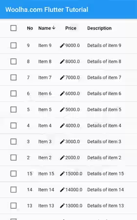
In some cases, allowing the users to perform sort on certain columns can provide better user experience. Flutter's DataTable already supports sort functionality. To set which column is currently used for sorting, you need to pass the column index as sortColumnIndex argument. The sort type can be ascending or descending and you can set whether the current sort is ascending by passing a boolean as sortAscending argument. For example, we have two state variables _sortColumnIndex and _sortAscending passed as sortColumnIndex and sortAscending arguments respectively.
  DataTable(
    sortColumnIndex: _sortColumnIndex,
    sortAscending: _sortAscending,
    // other arguments
  )
If you want to make a column sortable, on the DataColumn constructor of the respective column, you need to pass a callback function as onSort argument. The passed function must have two parameters. The first parameter is an integer that indicates the column index. The second parameter is a boolean which indicates whether the current sort type is ascending or not. The function will be invoked every time a user changes the sorting of the column by tapping the column header. Inside the function, besides sorthing the row data, you also need to change the values passed as sortColumnIndex and sortAscending based on the passed values when the function is invoked.
  DataColumn(
    label: const Text('Name'),
    onSort: (int columnIndex, bool ascending) {
      if (ascending) {
        _items.sort((item1, item2) => item1.name.compareTo(item2.name));
      } else {
        _items.sort((item1, item2) => item2.name.compareTo(item1.name));
      }

      setState(() {
        _sortColumnIndex = columnIndex;
        _sortAscending = ascending;
      });
    },
    // other arguments
  )
Output:
Handle Select/Unselect All
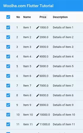
If you allow row selection, there will be checkboxes not only in each row, but also in the header row. The checkbox in the header row can be used to perform select or unselect all. To handle that event, you need to pass a function as the onSelectAll argument. The function accepts a parameter whose type is bool. Since the selected state of a DataRow depends on the value passed as the selected argument, the functions need to handle that.
  DataTable(
    onSelectAll: (bool? isSelected) {
      if (isSelected != null) {
        _items.forEach((item) {
          item.isSelected = isSelected;
        });

        setState(() {});
      }
    },
    // other arguments
  )
Output:
Show/Hide Checkbox Column
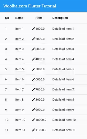
If you allow row selection, you can control whether the checkbox column should be shown or hidden by passing the showCheckboxColumn argument. By default, it will show the checkbox column if row selection is enabled.
  DataTable(
    showCheckboxColumn: false,
    // other arguments
  )
Output:
Customize Data Row Style
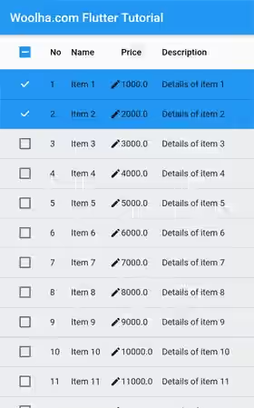
If you want to apply the same color for all data rows, you can pass dataRowColor argument. The value that you need to pass is a MaterialStateProperty<Color>, which can be obtained by using MaterialStateColor.resolveWith static method. The method requires you to pass a function which accepts a Set<MaterialState> as the parameter. Based on the passed value, you need to return a Color. For example, you can return a different color if the row is selected.
  DataTable(
    dataRowColor: MaterialStateColor.resolveWith( (Set<MaterialState> states) => states.contains(MaterialState.selected)
        ? Colors.blue
        : Color.fromARGB(100, 215, 217, 219)
    ),
    // other arguments
  )
Output:
The text style for the rows can be set by passing a TextStyle value as the dataTextStyle argument.
  DataTable(
     dataTextStyle: const TextStyle(fontStyle: FontStyle.italic, color: Colors.black),
    // other arguments
  )
Output:
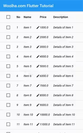
To set the height of each data row, you can use the dataRowHeight argument. It can be very important since Flutter may not automatically adjust the row height even if the content doesn't fit.
  DataTable(
     dataRowHeight: 80,
    // other arguments
  )
Output:
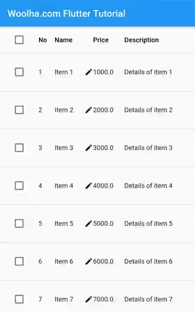
Customize Header Row Style
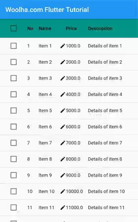
Similar to data rows, you can also set the color of the header by passing a MaterialStateProperty<Color> as headingRowColor argument.
  DataTable(
     headingRowColor: MaterialStateColor.resolveWith((states) => Colors.teal),
    // other arguments
  )
Output:
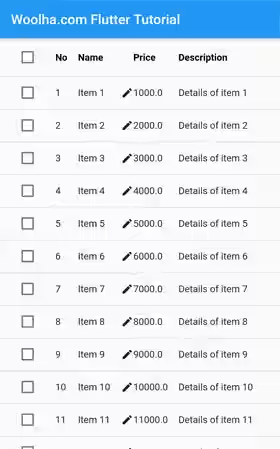
For changing the text style on the header row, you can pass your own TextStyle as the headingTextStyle argument.
  DataTable(
     headingTextStyle: const TextStyle(fontWeight: FontWeight.bold, color: Colors.black),
    // other arguments
  )
Output:
The header row's height can be set by using the headingRowHeight argument.
  DataTable(
     headingRowHeight: 80,
    // other arguments
  )
Output:
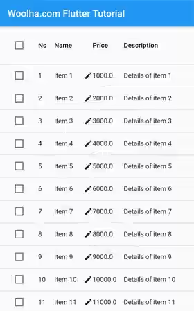
Set Column Spacing
The margin between columns can be set by passing the columnSpacing argument. The value defaults to Material Design specifications of 56.0 if you don't pass the argument.
  DataTable(
    columnSpacing: 0,
    // other arguments
  )
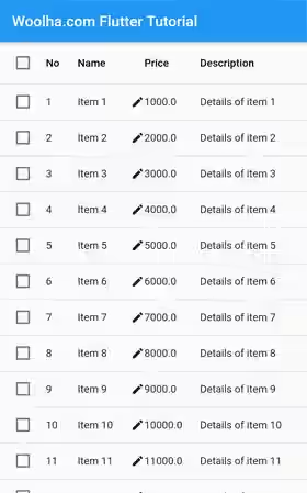
Set Horizontal Margin
The horizontal margin between the edges of the table and the content in the first and last cells of each column can be set by passing the horizontalMargin argument. The value defaults to Material Design specifications of 24 if you don't pass the argument.
  DataTable(
    horizontalMargin: 10,
    // other arguments
  )
Output:
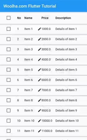
Set Divider Thickness
If you want to change the thickness of the divider, you can pass the dividerThickness argument. The value defaults to 1.0.
  DataTable(
    dividerThickness: 5,
    // other arguments
  )
Output:
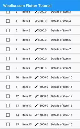
Show Bottom Border
By default, the border is not shown at the bottom of the table. If you want to show the bottom border, you can pass the showBottomBorder argument with true as the value.
  DataTable(
    showBottomBorder: true,
    // other arguments
  )
Output:
Set Decoration
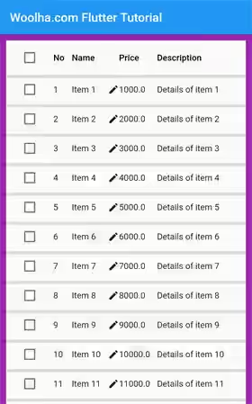
You can add decoration to the table by passing it as the decoration argument. It can be anything that extends Decoration, such as BoxDecoration and ShapeDecoration.
  DataTable(
    decoration: BoxDecoration(border: Border.all(color: Colors.purple, width: 10)),
    // other arguments
  )
Output:
DataTable - Parameters
Key? key: The widget's key, used to control how a widget is replaced with another widget.required List<DataColumn> columns: The column list, including the labels and configurations.int? sortColumnIndex: The index of the column currently used for sorting.bool sortAscending: Whether the current sorting is ascending. Defaults totrue.ValueSetter<bool?>? onSelectAll: A function invoked every time the user selects or unselects all rows by using the checkbox in the heading row.Decoration? decoration: The decoration for the table.MaterialStateProperty<Color?>? dataRowColor: The background color for data rows.double? dataRowHeight: The height of each data row.TextStyle? dataTextStyle: The text style for data rows.MaterialStateProperty<Color?>? headingRowColor: The background color for the heading row.double? dataRowHeight: The height of the heading row.TextStyle? headingTextStyle: The text style for the heading row..double? horizontalMargin: The horizontal margin between the edges of the table and the content in the first and last cells of each row.double? columnSpacing: The horizontal margin between each data column..bool showCheckboxColumn: Whether a checkbox should be displayed for selectable rows.bool showBottomBorder: Whether it should display the border at the bottom of the table.double? dividerThickness: The width of the divider between rows.required List<DataRow> rows: The data list, each will be displayed in a row.
?: value can be null.
required: value must be passed.
DataColumn - Parameters
required Widget label: Header of the column.String? tooltip: The tooltip for the column's header.bool numeric: Whether the column represents number data or not.DataColumnSortCallback? onSor: A function called the user changes the sorting using the column.
?: value can be null.
required: value must be passed.
DataRow - Parameters
LocalKey? key: A unique identifier for the row.bool selected: Whether the row is selected. Defaults tofalse.ValueChanged<bool?>? onSelectChanged: A function called when the user selects or unselects the row.MaterialStateProperty<Color?>? color: The color for the row.required List<DataCell> cells: The data for the row.
?: value can be null.
required: value must be passed.
DataCell - Parameters
Widget child: The data for the cell.bool placeholder: Whether thechildis a placeholder. Defaults tofalse.bool showEditIcon: Whether to show an edit icon at the end of the cell. Defaults tofalse.VoidCallback? onTap: A function called the user taps the cell.
?: value can be null.
required: value must be passed.
Full Code
  import 'package:flutter/material.dart';

  void main() => runApp(MyApp());

  class MyApp extends StatelessWidget {

    @override
    Widget build(BuildContext context) {
      return MaterialApp(
        title: 'Woolha.com Flutter Tutorial',
        home: DataTableExample(),
        debugShowCheckedModeBanner: false,
      );
    }
  }

  class Item {
    Item({
      required this.id,
      required this.name,
      required this.price,
      required this.description,
      required this.isSelected,
    });

    int id;
    String name;
    double price;
    String description;
    bool isSelected;
  }

  class DataTableExample extends StatefulWidget {

    @override
    State<StatefulWidget> createState() {
      return DataTableExampleState();
    }
  }

  class DataTableExampleState extends State<DataTableExample> {

    List<Item> _items = [];
    int _sortColumnIndex = 0;
    bool _sortAscending = true;

    @override
    void initState() {
      super.initState();
      setState(() {
        _items = _generateItems();
      });
    }

    List<Item> _generateItems() {
      return List.generate(15, (int index) {
        return Item(
          id: index + 1,
          name: 'Item ${index + 1}',
          price: (index + 1) * 1000.00,
          description: 'Details of item ${index + 1}',
          isSelected: false,
        );
      });
    }

    void updateSort(int columnIndex, bool ascending) {
      setState(() {
        _sortColumnIndex = columnIndex;
        _sortAscending = ascending;
      });
    }

    List<DataColumn> _createColumns() {
      return [
        DataColumn(
          label: const Text('No'),
          numeric: false, // Deliberately set to false to avoid right alignment.
        ),
        DataColumn(
          label: const Text('Name'),
          numeric: false,
          tooltip: 'Name of the item',
          onSort: (int columnIndex, bool ascending) {
            if (ascending) {
              _items.sort((item1, item2) => item1.name.compareTo(item2.name));
            } else {
              _items.sort((item1, item2) => item2.name.compareTo(item1.name));
            }

            setState(() {
              _sortColumnIndex = columnIndex;
              _sortAscending = ascending;
            });
          },
        ),
        DataColumn(
          label: const Text('Price'),
          numeric: false,  // Deliberately set to false to avoid right alignment.
          tooltip: 'Price of the item',
          onSort: (int columnIndex, bool ascending) {
            if (ascending) {
              _items.sort((item1, item2) => item1.price.compareTo(item2.price));
            } else {
              _items.sort((item1, item2) => item2.price.compareTo(item1.price));
            }

            setState(() {
              _sortColumnIndex = columnIndex;
              _sortAscending = ascending;
            });
          },
        ),
        DataColumn(
          label: const Text('Description'),
          numeric: false,
          tooltip: 'Description of the item',
        ),
      ];
    }

    DataRow _createRow(Item item) {
      return DataRow(
        // index: item.id, // for DataRow.byIndex
        key: ValueKey(item.id),
        selected: item.isSelected,
        onSelectChanged: (bool? isSelected) {
          if (isSelected != null) {
            item.isSelected = isSelected;

            setState(() {});
          }
        },
        color: MaterialStateColor.resolveWith((Set<MaterialState> states) => states.contains(MaterialState.selected)
            ? Colors.red
            : Color.fromARGB(100, 215, 217, 219)
        ),
        cells: [
          DataCell(
            Text(item.id.toString()),
          ),
          DataCell(
            Text(item.name),
            placeholder: false,
            showEditIcon: true,
            onTap: () {
              print('onTap');
            },
          ),
          DataCell(
            Text(item.price.toString())
          ),
          DataCell(
            Text(item.description),
          ),
        ],
      );
    }

    @override
    Widget build(BuildContext context) {
      return Scaffold(
        appBar: AppBar(
          title: const Text('Woolha.com Flutter Tutorial'),
        ),
        body: SizedBox(
          width: MediaQuery.of(context).size.width,
          child: SingleChildScrollView(
            child: DataTable(
              sortColumnIndex: _sortColumnIndex,
              sortAscending: _sortAscending,
              columnSpacing: 0,
              dividerThickness: 5,
              onSelectAll: (bool? isSelected) {
                if (isSelected != null) {
                  _items.forEach((item) {
                    item.isSelected = isSelected;
                  });

                  setState(() {});
                }
              },
              decoration: BoxDecoration(border: Border.all(color: Colors.purple, width: 10)),
              dataRowColor: MaterialStateColor.resolveWith((Set<MaterialState> states) => states.contains(MaterialState.selected)
                  ? Colors.blue
                  : Color.fromARGB(100, 215, 217, 219)
              ),
              dataRowHeight: 80,
              dataTextStyle: const TextStyle(fontStyle: FontStyle.italic, color: Colors.black),
              headingRowColor: MaterialStateColor.resolveWith((states) => Colors.teal),
              headingRowHeight: 80,
              headingTextStyle: const TextStyle(fontWeight: FontWeight.bold, color: Colors.black),
              horizontalMargin: 10,
              showBottomBorder: true,
              showCheckboxColumn: false,
              columns: _createColumns(),
              rows: _items.map((item) => _createRow(item))
                  .toList(),
            ),
          ),
        )
      );
    }
  }
Summary
That's how to use Flutter's DataTable widget. Basically, you need to define the list of columns and rows for the table. You can also handle data sorting, handle row selection, and customize the style of the table by passing the optional arguments. Adjusting the width of the columns and the table can be one of the most challenging things. If you are stuck on doing that, you can consider to use Table instead, though it requires more effort if you need to have sort or row selection feature.
You can also read about:
Table: A widget for placing widgets in a table layout.
