This tutorial shows you how to use the NavigationBar widget in Flutter.
Navigation bar is a Material Design component that allows users to switch between UI views on devices with a small screen. It's usually put at the bottom of the screen below the main content and consists of several destinations. In Flutter, there is a widget called NavigationBar that can be used to create that component. In this tutorial, I am going to explain how to use the widget.
Using NavigationBar
Below is the constructor of NavigationBar.
  NavigationBar({
    Key? key,
    Duration? animationDuration,
    int selectedIndex = 0,
    required List<Widget> destinations,
    void Function(int)? onDestinationSelected,
    Color? backgroundColor,
    double elevation,
    Color? shadowColor,
    Color? surfaceTintColor,
    Color? indicatorColor,
    ShapeBorder? indicatorShape,
    double? height,
    NavigationDestinationLabelBehavior? labelBehavior,
  })
If you use Scaffold widget, the NavigationBar can be passed as the bottomNavigationBar. As a result, it sticks at the bottom of the screen below the main content.
The displayed content usually depends on the currently selected destination. So, we need to be able to set the content based on the currently selected destination. In this tutorial, to make it simple, we are going to use the class below to create the destination pages. In real cases, you may need to have a different widget for each destination.
  class DestinationPage extends StatelessWidget {

    final String text;

    const DestinationPage({super.key, required this.text});

    @override
    Widget build(BuildContext context) {
      return Center(
        child: Text(text),
      );
    }
  }
We are going to create three destinations. All of them will have the same layout with a different text. As a start, we can write the code below.
  class MyNavigationBarState extends State<MyNavigationBar> {

    int _selectedIndex = 0;

    final List<String> destinationTexts = [
      'Home',
      'Favorites',
      'Tasks',
    ];

    @override
    Widget build(BuildContext context) {
      return Scaffold(
        appBar: AppBar(
          title: const Text('Woolha.com Flutter Tutorial'),
          backgroundColor: Colors.teal,
        ),
        body: Center(
          child: DestinationPage(text: destinationTexts[_selectedIndex]),
        ),
        bottomNavigationBar: NavigationBar(
          // will be explained below
        ),
      );
    }
  }
Create Destinations
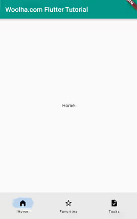
As you can see from the constructor above, the required argument is destinations. For the argument, you have to pass a list of widgets to be set as the destinations. The number of passed widgets must not be less than 2 as it doesn't make sense to make a navigation bar with only one destination. You can pass any type of widget, but it's recommended to pass NavigationDestination widgets.
NavigationDestination is a widget optimized to be set as the destinations of a navigation bar. There are some advantages of using NavigationDestination over other widgets. First, it already handles selection change events by triggering the onDestinationSelected callback, which is going to be explained in the next section. Therefore, you don't need to use a widget with on pressed callback such as IconButton or wrap it with a GestureDetector. In addition, it also provides the argument that's commonly used to customize a destination such as adding a label or using a different icon when selected.
  const NavigationDestination({
    Widget? key,
    required Widget icon,
    Widget? selectedIcon,
    required String label,
    String? tooltip,
  })
You are required to pass a Widget as the icon argument, typically an Icon widget. You also have to pass a String as the label argument even if you don't want to show any label. How to hide the label is going to be explained later in this tutorial. Besides the required arguments, you can also pass a Widget as the selectedIcon argument if you want to display a different icon when the destination is selected. You can also set a text to be displayed when the user long presses the icon as the tooltip argument.
  NavigationBar(
    destinations: const [
      NavigationDestination(
        icon: Icon(Icons.home),
        selectedIcon: Icon(Icons.home_filled),
        label: 'Home',
        tooltip: 'App home',
      ),
      NavigationDestination(
        icon: Icon(Icons.star_border),
        selectedIcon: Icon(Icons.star),
        label: 'Favorites',
        tooltip: 'Favorite things',
      ),
      NavigationDestination(
        icon: Icon(Icons.task),
        selectedIcon: Icon(Icons.task_sharp),
        label: 'Tasks',
        tooltip: 'Your tasks',
      ),
    ],
  )
Output:
Handle Select Destination
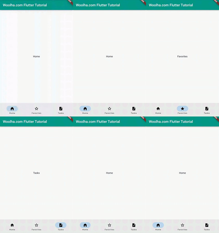
The index of the currently selected destination is determined by the value of selectedIndex argument. The value defaults to 0 if you don't pass it. The valid values for the arguments are positive integers that's less than the number of destinations. The value should be changed when the selected destination changes. To make it updatable, you should use something like a state variable. However, Flutter doesn't update the value automatically.
When a NavigationDestination is selected, Flutter will trigger the function passed as the onDestinationSelected argument with the index of the pressed destination. So, you have to pass a function that updates the state variable when invoked. The function might not be called if you use a widget other than a NavigationDestination.
  NavigationBar(
    selectedIndex: _selectedIndex,
    onDestinationSelected: (int index) {
      setState(() {
        _selectedIndex = index;
      });
    },
    // other arguments
  )
Output:
Set Height
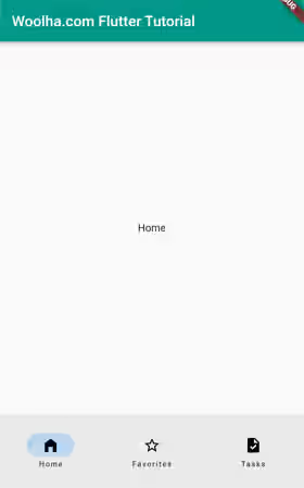
To adjust the height of the navigation bar, you can pass the height argument. If null, Flutter will use the value of NavigationBarThemeData.height. If that's also null, the default is 80.
  NavigationBar(
    height: 100,
    // other arguments
  )
Output:
Set Background Color
The background color can be set by passing a Color value as the backgroundColor argument. Flutter uses NavigationBarThemeData.backgroundColor as the default value. If it's null and ThemeData.useMaterial3 is true, the default value will be ColorScheme.surface. If ThemeData.useMaterial3 is false, Flutter will blend ColorScheme.surface and ColorScheme.onSurface using an ElevationOverlay.
  NavigationBar(
    backgroundColor: Colors.teal,
    // other arguments
  )
Output:
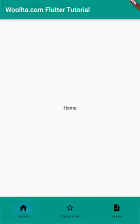
Change Indicator Shape and Color
The currently selected destination is differentiated from non-selected by an indicator surrounding the icon. The shape of the indicator can be set by passing a ShapeBorder as the shapeIndicator argument. The default value is NavigationBarThemeData.indicatorColor. If that's null and ThemeData.useMaterial3 is true, ColorScheme.secondaryContainer will be set as the default color. Otherwise, the default is ColorScheme.secondary with an opacity of 0.24.
  NavigationBar(
    indicatorShape: const CircleBorder(),
    indicatorColor: Colors.pink,
    // other arguments
  )
Output:

Hide/Show Labels
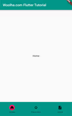
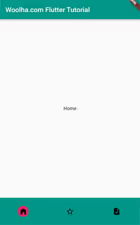
A navigation destination can have a label displayed below the icon. To adjust the behavior whether the label should be shown or hidden, you can use the labelBehavior argument. The argument type is NavigationDestinationLabelBehavior enum whose values are:
alwaysShow: Always shows the labels of all navigation destinations..alwaysHide: Always hides the labels of all navigation destinations.onlyShowSelected: Only shows the labels when selected.
If you don't pass the argument, the default value will be NavigationBarThemeData.labelBehavior which falls back to NavigationDestinationLabelBehavior.alwaysShow if the theme's value is also null.
  NavigationBar(
    labelBehavior: NavigationDestinationLabelBehavior.onlyShowSelected,
    // other arguments
  )
Always show:
Always Hide:
Only show selected:
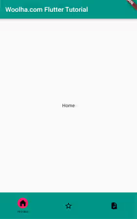
Set Navigation Bar Theme
Flutter also provides a way to set the style of the navigation bar by defining it in the theme. What you need to do is to create a custom ThemeData and pass it as the theme argument of MaterialApp. To set the theme for the navigation bars in your Flutter application, you can pass a NavigationBarThemeData as the navigationBarTheme argument of the ThemeData. The constructor of NavigationBarThemeData can be seen below.
  const NavigationBarThemeData({
    double? height,
    Color? backgroundColor,
    double? elevation,
    Color? shadowColor,
    Color? surfaceTintColor,
    Color? indicatorColor,
    ShapeBorder? indicatorShape,
    MaterialStateProperty<TextStyle?>? labelTextStyle,
    MaterialStateProperty<IconThemeData?>? iconTheme,
    NavigationDestinationLabelBehavior? labelBehavior,
  });
Most of the arguments are the same as the arguments of NavigationBar, so I'm not going to explain the same arguments again. Flutter provides some additional arguments that are currently not available in the constructor of NavigationBar. Those arguments are labelTextStyle and iconTheme. The first one is used to set the text style, while the latter is used to set the icon style. Both of them use MaterialStateProperty as the type, so you can set different styles based on the current states. If you don't understand how to pass a valid value of that type, you can read our tutorial about MaterialStateProperty in Flutter.
  MaterialApp(
    title: 'Woolha.com Flutter Tutorial',
    home: const MyNavigationBar(),
    theme: ThemeData.light().copyWith(
      navigationBarTheme: const NavigationBarThemeData(
        iconTheme: MaterialStatePropertyAll(IconThemeData(
          color: Colors.white,
        )),
        labelTextStyle: MaterialStatePropertyAll(
            TextStyle(fontStyle: FontStyle.italic, color: Colors.white)
        ),
      )
    ),
  )
Output:
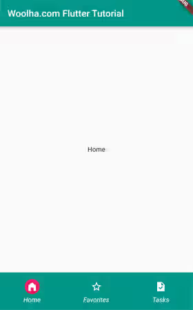
The styles of the ThemeData can have effects on all NavigationBars in the application. However, the customizations defined on a particular NavigationBar will replace those defined in the ThemeData.
NavigationBar Parameters
Key? key: The widget's key, used to control how a widget is replaced with another.Duration? animationDuration: The transaction time when a destination goes between selected and unselected.int selectedIndex: The index of the destination being selected.required List<Widget> destinations: The list of destinations.void Function(int)? onDestinationSelected: Callback to be called when a destination is selected.Color? backgroundColor: The background color of the navigation bar.double elevation: The elevation of the navigation bar.Color? shadowColor: The drop shadow color to indicate elevation.Color? surfaceTintColor: The color used as an overlay onbackgroundColorto indicate elevation.Color? indicatorColor: The color of the indicator of the selected destination.ShapeBorder? indicatorShape: The shape of the selected indicator.double? height: The height of the navigation bar.NavigationDestinationLabelBehavior? labelBehavior: How the destinations' labels are displayed.
NavigationBarThemeData Parameters
double? height: The height of the navigation bar.Color? backgroundColor: The background color of the navigation bar.double? elevation: The elevation of the navigation bar.Color? shadowColor: The drop shadow color to indicate elevation.Color? surfaceTintColor: The color used as an overlay onbackgroundColorto indicate elevation.Color? indicatorColor: The color of the indicator of the selected destination.ShapeBorder? indicatorShape: The shape of the selected indicator.MaterialStateProperty<TextStyle?>? labelTextStyle: The style to merge with the default text style forNavigationDestinationlabels.MaterialStateProperty<IconThemeData?>? iconTheme: The theme to merge with the default icon theme forNavigationDestinationicons.NavigationDestinationLabelBehavior? labelBehavior: How the destinations' labels are displayed.
Full Code
  import 'package:flutter/material.dart';

  void main() => runApp(const MyApp());

  class MyApp extends StatelessWidget {

    const MyApp({Key? key}) : super(key: key);

    @override
    Widget build(BuildContext context) {
      return MaterialApp(
        title: 'Woolha.com Flutter Tutorial',
        home: const MyNavigationBar(),
        theme: ThemeData.light().copyWith(
          navigationBarTheme: const NavigationBarThemeData(
            iconTheme: MaterialStatePropertyAll(IconThemeData(
              color: Colors.white,
            )),
            labelTextStyle: MaterialStatePropertyAll(
                TextStyle(fontStyle: FontStyle.italic, color: Colors.white)
            ),
          )
        ),
      );
    }
  }

  class MyNavigationBar extends StatefulWidget {

    const MyNavigationBar({super.key});

    @override
    State<StatefulWidget> createState() {
      return MyNavigationBarState();
    }
  }

  class DestinationPage extends StatelessWidget {

    final String text;

    const DestinationPage({super.key, required this.text});

    @override
    Widget build(BuildContext context) {
      return Center(
        child: Text(text),
      );
    }
  }

  class MyNavigationBarState extends State<MyNavigationBar> {

    int _selectedIndex = 0;

    final List<String> destinationTexts = [
      'Home',
      'Favorites',
      'Tasks',
    ];

    @override
    Widget build(BuildContext context) {
      return Scaffold(
        appBar: AppBar(
          title: const Text('Woolha.com Flutter Tutorial'),
          backgroundColor: Colors.teal,
        ),
        body: Center(
          child: DestinationPage(text: destinationTexts[_selectedIndex]),
        ),
        bottomNavigationBar: NavigationBar(
          selectedIndex: _selectedIndex,
          onDestinationSelected: (int index) {
            setState(() {
              _selectedIndex = index;
            });
          },
          backgroundColor: Colors.teal,
          height: 100,
          indicatorShape: const CircleBorder(),
          indicatorColor: Colors.pink,
          labelBehavior: NavigationDestinationLabelBehavior.onlyShowSelected,
          destinations: const [
            NavigationDestination(
              icon: Icon(Icons.home),
              selectedIcon: Icon(Icons.home_filled),
              label: 'Home',
              tooltip: 'App home',
            ),
            NavigationDestination(
              icon: Icon(Icons.star_border),
              selectedIcon: Icon(Icons.star),
              label: 'Favorites',
              tooltip: 'Favorite things',
            ),
            NavigationDestination(
              icon: Icon(Icons.task),
              selectedIcon: Icon(Icons.task_sharp),
              label: 'Tasks',
              tooltip: 'Your tasks',
            ),
          ],
        ),
      );
    }
  }
Summary
Flutter already provides a widget called NavigationBar for creating Material Design 3's navigation bar. To use the widget, you can create some destinations using the NavigationDestination widget. You also need to handle updating the selected index when the user selects another destination. The widget also provides some customizations such as setting the height, changing the background color, and changing the indicator appearance. It's also possible to define a NavigationBarThemeData to be set as the default style for all navigation bars in the application.
You can also read about:
