
This tutorial shows you how to add a navigation drawer to a Flutter application, including how to customize the appearance and behavior.
A navigation drawer is a common way to navigate through an application. If you have an application developed using Flutter, adding a drawer can be done easily. The basic functionality and widgets are already provided by Flutter. So, you only need to set the content and add some customizations.
Add Navigation Drawer
In Flutter, adding a navigation drawer can be done by using the Scaffold widget. Scaffold, which provides layout structure for Material Design components, has a named argument drawer where you can pass a widget to be set as the navigation drawer. In this example, we are going to create the widget using Flutter's Drawer widget.
  Scaffold(
    drawer: const MyDrawer(), // a widget to be set as the drawer
  )
Scaffold also has several arguments for customizing the behavior and appearance of the drawer. In this tutorial, I am going to explain how to create the widget to be set as a drawer, followed by how to do customizations.
Using Drawer Widget
Flutter has a Material Design widget called Drawer that can be used for this purpose. Below is the constructor.
  Drawer({
    Key? key,
    Color? backgroundColor,
    double? elevation
    Color? shadowColor,
    Color? surfaceTintColor
    ShapeBorder? shape,
    double? width
    Widget? child,
    String? semanticLabel,
    Clip? clipBehavior
  })
There is no required argument. The first argument that you need to know is child, for which you have to pass a widget that contains the content of the drawer. The other arguments are mostly used to customize the appearance.
Create Drawer Content
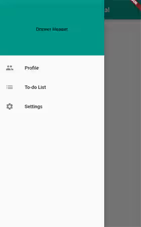
You can use any widget to be passed as the child argument of the drawer. One of the most common widgets to use is ListView since it's able to handle scrolling if the vertical space isn't enough to fit all the items. The ListView itself contains several widgets passed as the children argument. A navigation drawer usually has a header at the top followed by a list of clickable items. You can create the header using the DrawerHeader widget.
In the example below, the list of items are created using ListTile widgets. In the ListTile, you can pass a callback function as the onTap argument which will be invoked when the item is clicked. You can do anything you want, like navigating to another page or just closing the drawer. For closing the drawer, you can use Navigator.pop(context). For navigating to another page, you can read our tutorial about how to navigate using named routes.
  class MyDrawer extends StatelessWidget {

    const MyDrawer({super.key});

    @override
    Widget build(BuildContext context) {
      return Drawer(
        child: ListView(
          padding: EdgeInsets.zero,
          children: [
            const DrawerHeader(
              decoration: BoxDecoration(
                color: Colors.teal,
              ),
              child: Center(
                child: Text('Drawer Header'),
              ),
            ),
            ListTile(
              title: const Text('Profile'),
              leading: const Icon(Icons.people),
              onTap: () {
                Navigator.pop(context);
              },
            ),
            ListTile(
              title: const Text('To-do List'),
              leading: const Icon(Icons.list),
              onTap: () {
                Navigator.pop(context);
              },
            ),
            ListTile(
              title: const Text('Settings'),
              leading: const Icon(Icons.settings),
              onTap: () {
                Navigator.pushNamed(context, 'settings');
              },
            ),
          ],
        ),
      );
    }
  }
Output:
If the header is used to display account details, you can consider using UserAccountsDrawerHeader.
  Drawer(
    child: ListView(
      padding: EdgeInsets.zero,
      children: [
        const UserAccountsDrawerHeader(
          accountName: Text('Ivan Andrianto'),
          accountEmail: Text('ivan@test.com'),
          currentAccountPicture: CircleAvatar(
            backgroundColor: Colors.white,
            child: Text(
              'IA',
              style: TextStyle(fontSize: 40.0, color: Colors.teal),
            ),
          ),
          decoration: BoxDecoration(
            color: Colors.teal,
          ),
        ),
        // Items
      ],
    ),
  )
Output:

Set Width
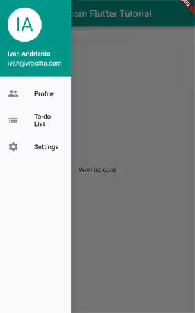
The width when the drawer is opened can be set by using the width argument. If the value is null, it will be set to DrawerThemeData.width. If that's also null, it will use Material spec's default value of 304.0.
  Drawer(
    width: 150,
    // other arguments
  )
Output:
Set Background Color
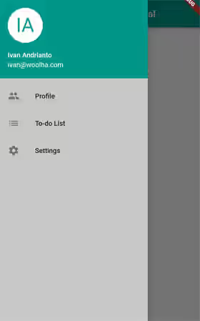
To set the background color of the content, you can pass the backgroundColor argument. If the value is null, it will be set to DrawerThemeData.backgroundColor. If that's also null, it will use Material's default.
  Drawer(
    backgroundColor: const Color.fromARGB(255, 200, 200, 200),
    // other arguments
  )
Output:
Set Elevation
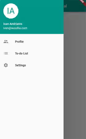
The elevation or the z-coordinate relative to its parent can be set by passing a value as the elevation argument. The value defaults to DrawerThemeData.elevation. If that's also null, the default value is 16.0.
  Drawer(
    elevation: 100,
    // other arguments
  )
Output:
Set Shadow Color
You can also set the color to paint the drop shadow by passing a Color as the shadowColor argument. If you don't pass it and ThemeData.useMaterial3 is true, there will be no drop shadow rendered. If you don't pass it and ThemeData.useMaterial3 is false, the default value will be ThemeData.shadowColor.
  Drawer(
    elevation: 100,
    shadowColor: Colors.pink,
    // other arguments
  )
Output:

Set Shape
It's also possible to change the shape of the drawer. The default value is DrawerThemeData.shape which falls back to Material's default if that's also null. For example, you can change it to have rounded corners.
  Drawer(
    shape: const RoundedRectangleBorder(
      side: BorderSide(color: Colors.teal),
      borderRadius: BorderRadius.all(Radius.circular(20)),
    ),
    // other arguments
  )
Output:

Enable/Disable Open Drag Gesture
By default, the drawer can be opened using a gesture. If you want to disable the gesture (only allow opening from the icon), set the drawerEnableOpenDragGesture argument to true.
  Scaffold(
    drawerEnableOpenDragGesture: false,
    // other arguments
  )
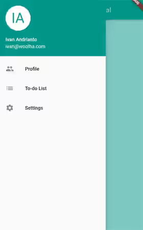
Set Scrim Color
When the drawer is open, you can set the color for the scrim that obscures primary content by passing a Color value as the drawerScrimColor argument. If you don't pass it, Flutter will use the value from DrawerThemeData.scrimColor. If that's also null, it will use Colors.black54 as the defaults.
  Scaffold(
    drawerScrimColor: Colors.teal.withOpacity(0.5),
    // other arguments
  )
Output:
Set Edge Drag Width
If the gesture for opening the drawer is enabled, you can set the horizontal area within which the users can use a horizontal swipe to open the drawer. The default value is 20.0 added to the padding edge of MediaQuery.of(context).padding.
  Scaffold(
    drawerEdgeDragWidth: 100,
    // other arguments
  )
Handle State Change
To get notified when the drawer's state changes to open or closed, pass a callback function as the onDrawerChanged argument. The passed function needs to have an argument whose value is a boolean. If the state is changed to open, the passed argument will be true. The argument value will be false when the drawer is closed.
  Scaffold(
    onDrawerChanged: (isOpened) {
      print(isOpened);
    },
    // other arguments
  )
Set End Drawer
In the examples above, the drawer is put at the start of the text direction. For example, if the text direction is left-to-right, it will be put on the left side. To put it on the opposite side, you can use the endDrawer argument. To enable or disable the open drag gesture for the end drawer, use the endDrawerEnableOpenDragGesture argument. To handle the events when the state of the end drawer changes, pass a callback function as the onEndDrawerChanged argument.
  Scaffold(
    endDrawer: MyDrawer(),
    endDrawerEnableOpenDragGesture: false,
    onEndDrawerChanged: (isOpened) {
      print(isOpened);
    },
    // other arguments
  )
Output:

Open/Close Programmatically
To programmatically open the drawer, you can use the openDrawer method of ScaffoldState. The ScaffoldState itself can be obtained by calling Scaffold.of(context). Make sure you pass a BuildContext of a widget under the Scaffold in the tree.
Scaffold.of(context).openDrawer();For closing the drawer, we have seen that Navigator.pop(context) can do the job. Another alternative is to use ScaffoldState's closeDrawer method.
Scaffold.of(context).closeDrawer();For an end drawer, the corresponding methods are openEndDrawer and closeEndDrawer.
Drawer Parameters
Below is the list of parameters of the Drawer constructor.
Key? key: The widget's key, used to control how a widget is replaced with another.Color? backgroundColor: the color of the Material that holds all of the contents.double? elevation: The z-coordinate relative to the parent.Color? shadowColor: The color to paint a drop shadow under the drawer's Material which reflects the elevation.Color? surfaceTintColor: The color used as a surface tint overlay on the background color which reflects the elevation.ShapeBorder? shape: The shape of the widget.double? width: The width of the widget.Widget? child: A widget to be set as the content of the drawer.String? semanticLabel: The semantic label used by accessibility frameworks.
DrawerHeader Parameters
Below is the list of parameters of the DrawerHeader constructor.
Key? key: The widget's key, used to control how a widget is replaced with another.Decoration? decoration: Decoration for the header.EdgeInsetsGeometry? margin: The margin around the header. Defaults toconst EdgeInsets.only(bottom: 8.0).EdgeInsetsGeometry padding: The padding by which to insetchild. Defaults toconst EdgeInsets.fromLTRB(16.0, 16.0, 16.0, 8.0).Duration duration: The duration for animations of the decoration. Defaults toconst Duration(milliseconds: 250).Curve curve: The animation curve. Defaults toCurves.fastOutSlowIn.required Widget? child: A widget to be placed inside the header.
UserAccountsDrawerHeader Parameters
Below is the list of parameters of the UserAccountsDrawerHeader constructor.
Key? key: The widget's key, used to control how a widget is replaced with another.Decoration? decoration: Decoration for the header.EdgeInsetsGeometry? margin: The margin around the header. Defaults toconst EdgeInsets.only(bottom: 8.0).Widget? currentAccountPicture: A widget in the upper-left corner that represents the picture of the user's current account.List<Widget>? otherAccountsPictures: A list of widgets in the upper-left corner that represents the pictures of the user's other accounts.Size currentAccountPictureSize: The size of thecurrentAccountPicture. Defaults toSize.square(72.0).Size otherAccountsPicturesSize: The size of each widget inotherAccountsPicturesSize. Defaults toSize.square(40.0).required Widget? accountName: A widget that represents the user's name.required Widget? accountEmail: A widget that represents the user's email address.VoidCallback? onDetailsPressed: A callback to be called when the horizontal area containing theaccountNameandaccountEmailis tapped.Color arrowColor: TheColorof the arrow icon. Defaults toColors.white.
Full Code
  import 'package:flutter/material.dart';

  void main() => runApp(const MyApp());

  class MyApp extends StatelessWidget {

    const MyApp({Key? key}) : super(key: key);

    @override
    Widget build(BuildContext context) {
      return const MaterialApp(
        title: 'Woolha.com Flutter Tutorial',
        home: NavigationDrawerExample(),
      );
    }
  }

  class NavigationDrawerExample extends StatelessWidget {

    const NavigationDrawerExample({super.key});

    @override
    Widget build(BuildContext context) {
      return Scaffold(
        appBar: AppBar(
          title: const Text('Woolha.com Flutter Tutorial'),
          backgroundColor: Colors.teal,
        ),
        drawer: const MyDrawer(),
        drawerEdgeDragWidth: 100,
        // drawerEnableOpenDragGesture: false,
        drawerScrimColor: Colors.teal.withOpacity(0.5),
        onDrawerChanged: (isOpened) {
          print(isOpened);
        },
        // endDrawer: MyDrawer(),
        // endDrawerEnableOpenDragGesture: false,
        // onEndDrawerChanged: (isOpened) {
        //   print(isOpened);
        // },
        body: SizedBox(
          width: double.infinity,
          child: Column(
            mainAxisAlignment: MainAxisAlignment.center,
            children: [
              const Text('Woolha.com'),
              Builder(
                builder: (BuildContext context) {
                  return OutlinedButton(
                    onPressed: () {
                      Scaffold.of(context).openDrawer();
                    },
                    child: const Text('Open'),
                  );
                },
              ),
            ],
          ),
        ),
      );
    }
  }

  class MyDrawer extends StatelessWidget {

    const MyDrawer({super.key});

    @override
    Widget build(BuildContext context) {
      return Drawer(
        backgroundColor: const Color.fromARGB(255, 200, 200, 200),
        elevation: 100,
        shadowColor: Colors.pink,
        shape: const RoundedRectangleBorder(
          side: BorderSide(color: Colors.teal),
          borderRadius: BorderRadius.all(Radius.circular(20)),
        ),
        // width: 150,
        child: ListView(
          padding: EdgeInsets.zero,
          children: [
            // const DrawerHeader(
            //   decoration: BoxDecoration(
            //     color: Colors.teal,
            //   ),
            //   child: Center(
            //     child: Text('Drawer Header'),
            //   ),
            // ),
            const UserAccountsDrawerHeader(
              accountName: Text('Ivan Andrianto'),
              accountEmail: Text('ivan@woolha.com'),
              currentAccountPicture: CircleAvatar(
                backgroundColor: Colors.white,
                child: Text(
                  'IA',
                  style: TextStyle(fontSize: 40.0, color: Colors.teal),
                ),
              ),
              decoration: BoxDecoration(
                color: Colors.teal,
              ),
            ),
            ListTile(
              title: const Text('Profile'),
              leading: const Icon(Icons.people),
              onTap: () {
                Navigator.pop(context);
              },
            ),
            ListTile(
              title: const Text('To-do List'),
              leading: const Icon(Icons.list),
              onTap: () {
                Scaffold.of(context).closeDrawer();
              },
            ),
            ListTile(
              title: const Text('Settings'),
              leading: const Icon(Icons.settings),
              onTap: () {
                Navigator.pushNamed(context, 'settings');
              },
            ),
          ],
        ),
      );
    }
  }
Summary
Adding a navigation drawer in Flutter can be done by passing a widget as the drawer argument of the Scaffold widget. You can pass a Drawer widget for that purpose. Flutter already provides some arguments that you can use to customize the appearance and the behavior. It's also possible to place it on the opposite side by passing it as the endDrawer argument instead.
You can also read about:
