This tutorial shows you how to add a BottomAppBar in a Flutter application.
A bottom app bar is a component that's usually displayed at the bottom of mobile screens. It's usually used for navigation and access to actions. Sometimes, it may also contain a floating action button. In Flutter, there is a widget called BottomAppBar which makes it easy to create such a component. Below are the examples which include how to customize the appearance and how to handle the presence of a floating action button.
Using BottomAppBar
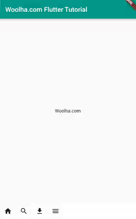
To add a bottom navigation Bar in Flutter, you can pass a BottomAppBar widget as the bottomNavigationBar argument of the Scaffold. widget To create a BottomAppBar, you can use the constructor below.
  const BottomAppBar({
    Key? key,
    Color? color,
    double? elevation,
    this.shape,
    Clip clipBehavior = Clip.none,
    double notchMargin = 4.0,
    Widget? child,
    EdgeInsetsGeometry? padding,
    Color? surfaceTintColor,
    Color? shadowColor,
    double? height,
  })
There is no required argument. However, if you don't pass any argument, it will display nothing. To define the content, you can pass a widget as the child argument. Usually, it contains a list of clickable icons. Therefore, you can create a Row whose children are IconButtons.
  class MyPage extends StatelessWidget {

    const MyPage({super.key});

    @override
    Widget build(BuildContext context) {
      return Scaffold(
        appBar: AppBar(
          title: const Text('Woolha.com Flutter Tutorial'),
          backgroundColor: Colors.teal,
        ),
        body: const Center(
          child: Text('Woolha.com'),
        ),
        bottomNavigationBar: BottomAppBar(
          child: Row(
            children: <Widget>[
              IconButton(
                tooltip: 'Open navigation menu',
                icon: const Icon(Icons.home),
                onPressed: () {},
              ),
              IconButton(
                tooltip: 'Search',
                icon: const Icon(Icons.search),
                onPressed: () {},
              ),
              IconButton(
                tooltip: 'Download',
                icon: const Icon(Icons.download),
                onPressed: () {},
              ),
              IconButton(
                tooltip: 'Open navigation menu',
                icon: const Icon(Icons.menu),
                onPressed: () {},
              ),
            ],
          ),
        ),
      );
    }
  }
Output:
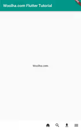
Using the Row widget makes it easier to adjust the alignment. For example (assuming the text direction is left-to-right), to align the children to the end, set the mainAxisAlignment to MainAxisAlignment.end.
  BottomAppBar(
    child: Row(
      mainAxisAlignment: MainAxisAlignment.end,
      children: <Widget>[
        IconButton(
          tooltip: 'Open navigation menu',
          icon: const Icon(Icons.home),
          onPressed: () {},
        ),
        IconButton(
          tooltip: 'Search',
          icon: const Icon(Icons.search),
          onPressed: () {},
        ),
        IconButton(
          tooltip: 'Download',
          icon: const Icon(Icons.download),
          onPressed: () {},
        ),
        IconButton(
          tooltip: 'Open navigation menu',
          icon: const Icon(Icons.menu),
          onPressed: () {},
        ),
      ],
    ),
  )
Output:
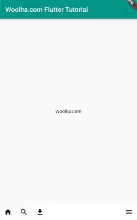
You can also add a Spacer widget if you want to align some icons at the start of the row and the others at the end of the row.
  BottomAppBar(
    child: Row(
      children: <Widget>[
        IconButton(
          tooltip: 'Open navigation menu',
          icon: const Icon(Icons.home),
          onPressed: () {},
        ),
        IconButton(
          tooltip: 'Search',
          icon: const Icon(Icons.search),
          onPressed: () {},
        ),
        IconButton(
          tooltip: 'Download',
          icon: const Icon(Icons.download),
          onPressed: () {},
        ),
        const Spacer(),
        IconButton(
          tooltip: 'Open navigation menu',
          icon: const Icon(Icons.menu),
          onPressed: () {},
        ),
      ],
    ),
  )
Output:
Since the icons usually have a similar style, you can put the icons under an IconTheme widget.
  BottomAppBar(
    child: IconTheme(
      data: const IconThemeData(color: Colors.teal),
      child: Row(
        children: <Widget>[
          IconButton(
            tooltip: 'Open navigation menu',
            icon: const Icon(Icons.home),
            onPressed: () {},
          ),
          IconButton(
            tooltip: 'Search',
            icon: const Icon(Icons.search),
            onPressed: () {},
          ),
          IconButton(
            tooltip: 'Download',
            icon: const Icon(Icons.download),
            onPressed: () {},
          ),
          IconButton(
            tooltip: 'Open navigation menu',
            icon: const Icon(Icons.menu),
            onPressed: () {},
          ),
        ],
      ),
    ),
  )
Output:
![]()
Set Background Color
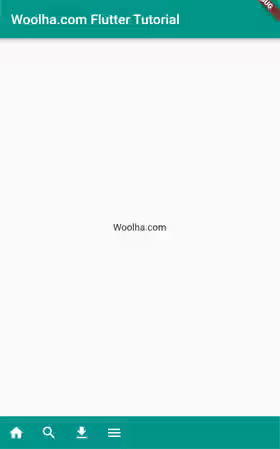
By default, Flutter will use the value of BottomAppBarTheme.color as the background color. If that value is null, ThemeData.bottomAppBarColor will be used. To use another color, you can pass a Color value as the color argument.
Below is an example of how to set the background color. In the next examples, the color of IconThemeData is set to white, so that the icons are still visible in a dark background.
  BottomAppBar(
    color: Colors.teal,
    // other arguments
  )
Output:
Set Height
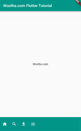
The height can be set by passing a double value as the height argument. If you don't pass it, the default value is the minimum of the content. But if ThemeData.useMaterial3 is true, the default value is 80.0.
  BottomAppBar(
    height: 70.0,
    // other arguments
  )
Output:
Handle FloatingActionButton
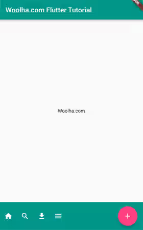
A bottom app bar is intended to be used along with a floating action button. If your application has both of them, you may need to adjust the shape of the bottom app bar, especially if they have an intersection area. Usually, there will be a cropped area with a margin to accommodate the floating action button.
To add a floating action button, you can create a FloatingActionButton widget and pass it as the floatingActionButton argument to the Scaffold widget. The position can be set by passing the floatingActionButtonLocation argument. Whether a floating action button affects the bottom app bar depends on the position. Usually, it has effect if the position is contained or docked.
Below is an example where the position is endContained. In this case, you may need to adjust the height so that the bottom app bar is able to contain the entire floating action button.
  Scaffold(
    floatingActionButton: Padding(
      padding: const EdgeInsets.only(bottom: 10.0),
      child: FloatingActionButton(
        backgroundColor: Colors.pinkAccent,
        tooltip: 'Add',
        onPressed: () {},
        child: const Icon(Icons.add, color: Colors.white),
      ),
    ),
    floatingActionButtonLocation: FloatingActionButtonLocation.endContained,
    bottomNavigationBar: BottomAppBar(
      height: 80.0,
      // other arguments
    ),
    // other arguments
  )
Output:
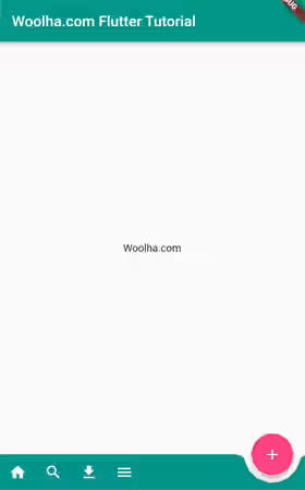
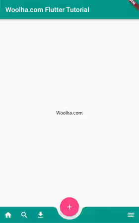
If the position is docked, it's quite common to have a notch whose shape follows the shape of the floating action button. Flutter has made it easy by providing an argument named shape whose type is NotchedShape. The argument is used to define the shape to be occupied by the floating action button. If the floating action button's shape is a circle which is the default shape, you can simply pass a CircularNotchedRectangle as the value. In addition, there is another argument named notchMargin which is used to set the margin between the bottom app bar and the floating action button.
  Scaffold(
    floatingActionButton: Padding(
      padding: const EdgeInsets.only(bottom: 10.0),
      child: FloatingActionButton(
        backgroundColor: Colors.pinkAccent,
        tooltip: 'Add',
        onPressed: () {},
        child: const Icon(Icons.add, color: Colors.white),
      ),
    ),
    floatingActionButtonLocation: FloatingActionButtonLocation.endDocked,
    bottomNavigationBar: BottomAppBar(
      notchMargin: 10,
      shape: const CircularNotchedRectangle(),
      // other arguments
    ),
  )
Output:
In case the floating action button's position is centerDocked, you may need to adjust the alignment of the icons so that it doesn't overlap with the floating action button. For example, you can add a Spacer widget to make some of the icons pushed to the end of the row.
  Scaffold(
    floatingActionButton: Padding(
      padding: const EdgeInsets.only(bottom: 10.0),
      child: FloatingActionButton(
        backgroundColor: Colors.pinkAccent,
        tooltip: 'Add',
        onPressed: () {},
        child: const Icon(Icons.add, color: Colors.white),
      ),
    ),
    floatingActionButtonLocation: FloatingActionButtonLocation.centerDocked,
    bottomNavigationBar: BottomAppBar(
      notchMargin: 10,
      shape: const CircularNotchedRectangle(),
      child: IconTheme(
        data: const IconThemeData(color: Colors.white),
        child: Row(
          // mainAxisAlignment: MainAxisAlignment.spaceEvenly,
          children: <Widget>[
            IconButton(
              tooltip: 'Open navigation menu',
              icon: const Icon(Icons.home),
              onPressed: () {},
            ),
            IconButton(
              tooltip: 'Search',
              icon: const Icon(Icons.search),
              onPressed: () {},
            ),
            IconButton(
              tooltip: 'Download',
              icon: const Icon(Icons.download),
              onPressed: () {},
            ),
            const Spacer(),
            IconButton(
              tooltip: 'Open navigation menu',
              icon: const Icon(Icons.menu),
              onPressed: () {},
            ),
          ],
        ),
      ),
    ),
  )
Output:
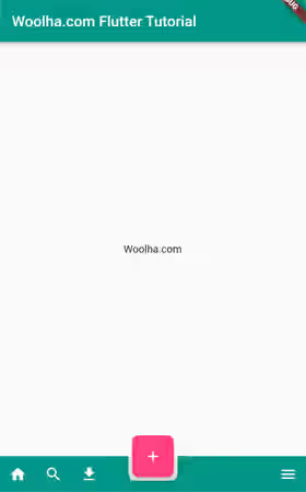
If the shape of the floating action button is not a circle, you may need to create a custom NotchedShape using AutomaticNotchedShape constructor. It has two positional arguments. The first one is the shape of the widget that uses the notched shape (in this case the BottomAppBar). The second one which is optional is the shape to subtract from the shape passed as the first argument.
  Scaffold(
    floatingActionButton: FloatingActionButton(
      backgroundColor: Colors.pinkAccent,
      tooltip: 'Add',
      onPressed: () {},
      child: const Icon(Icons.add, color: Colors.white),
      shape: const ContinuousRectangleBorder(
          borderRadius: BorderRadius.all(Radius.circular(20))
      ),
    ),
    floatingActionButtonLocation: FloatingActionButtonLocation.centerDocked,
    bottomNavigationBar: BottomAppBar(
      color: Colors.teal,
      notchMargin: 5.0,
      shape: const AutomaticNotchedShape(
        ContinuousRectangleBorder(),
        ContinuousRectangleBorder(
          borderRadius: BorderRadius.all(Radius.circular(20)),
        ),
      ),
      // other arguments
    ),
  )
Output:
Set BottomAppBarTheme
If your application has several different BottomAppBars, most likely they will use a similar theme. If that's the case, it's better to define a BottomAppBarTheme. You can pass a BottomAppBarTheme instance as the bottomAppBarTheme argument of the ThemeData. You can create the theme using the constructor below.
  BottomAppBarTheme({
    Color? color,
    double? elevation,
    NotchedShape? shape,
    double? height
    Color? surfaceTintColor,
    Color? shadowColor,
    EdgeInsetsGeometry? padding
  })
Example:
  MaterialApp(
    title: 'Woolha.com Flutter Tutorial',
    theme: ThemeData.light().copyWith(
      bottomAppBarTheme: const BottomAppBarTheme(
        color: Colors.teal,
      )
    ),
    home: const MyPage(),
  )
BottomAppBar Parameters
Key? key: The widget's key, used to control how a widget is replaced with another.Color? color: The background color.double? elevation: The z-coordinate relative to the parent.NotchedShape? shape: Shape for the notch made for a floating action button.Clip clipBehavior: How to clip the content. Defaults toClip.none.double notchMargin: The margin between the notch and theFloatingActionButton. Defaults to 4.0.Widget? child: The content of the bottom app bar.EdgeInsetsGeometry? padding: The space to surround the child.Color? surfaceTintColor: The overlay color to indicate elevation.Color? shadowColor: The shadow color below the app bar.double? height: The height of the widget.
BottomAppBarTheme Parameters
Color? color: The background color.double? elevation: The z-coordinate relative to the parent.NotchedShape? shape: Shape for the notch made for a floating action button.double? height: The height of the widget.Color? surfaceTintColor: The overlay color to indicate elevation.Color? shadowColor: The shadow color below the app bar.EdgeInsetsGeometry? padding: The space to surround the child.
Summary
This tutorial shows you how to add a BottomAppBar in a Flutter application. Basically, you need to pass a Widget as the child argument to be set as the content. It's possible to customize the appearance such as the height and the background color. If it has an intersection with a FloatingActionButton, you may need to adjust the height or create a notched shape.
You can also read about:
