
This tutorial shows you how to use SizedOverflowBox in Flutter.
You may already know about SizedBox in Flutter, which is a box with a specified size. It can be used to give size constraints to its child widget. That means the width or the height of the child cannot be greater than the SizedBox's size. What if you want to allow the child to overflow the box. One of the possible solutions is by wrapping the child inside an OverflowBox. However, there's another widget that makes it possible to create a box with a specified size but allows the child to overflow. The widget is called SizedOverflowBox.
Using SizedOverflowBox
To use SizedOverflowBox, you need to call the constructor.
  const SizedOverflowBox({
    Key key,
    @required this.size,
    this.alignment = Alignment.center,
    Widget child,
  })
The constructor requires you to pass a named argument size whose type is Size. You can create an instance of Size by calling its constructor.
Size(double width, double height)Below is a basic usage example that sets both width and height of the SizedOverflowBox to 100. If the width or the height of the child is greater than the values defined as size in the respective dimension, the child will overflow the box. The size of the SizedOverflowBox remains unchanged.
The example below is a SizedOverflowBox with a child whose width is greater than the width of the box.
  Container(
    color: Colors.grey,
    child: SizedOverflowBox(
      size: const Size(100, 100),
      child: Container(height: 50.0, width: 150.0, color: Colors.teal),
    ),
  )
Output:

Set Alignment
By default, the child is always aligned to the center of the box. To change the alignment of the child, pass alignment argument. The example below sets the alignment of the child to center left.
  Container(
    color: Colors.grey,
    child: SizedOverflowBox(
      size: const Size(100, 100),
      child: Container(height: 50.0, width: 150.0, color: Colors.teal),
      alignment: Alignment.centerLeft,
    ),
  )
Output:
centerLeft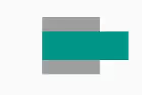
topLeft
topCenter
topRight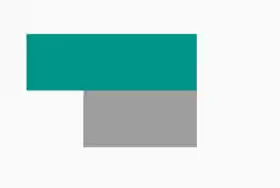
centerLeft
center
centerRight
bottomLeft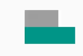
bottomCenter
bottomRight
SizedOverflowBox Parameters
Key key: The widget's key, used to control how a widget is replaced with another widget.Size size*: The size this widget should attempt to be..alignment: How to align the child. Defaults toAlignment.center.Widget child: The widget below this widget in the tree.
*: required
Full Code
  import 'package:flutter/material.dart';
  import 'package:flutter/rendering.dart';

  void main() => runApp(MyApp());

  class MyApp extends StatelessWidget {

    @override
    Widget build(BuildContext context) {
      return MaterialApp(
        title: 'Woolha.com Flutter Tutorial',
        home: _SizedOverflowBoxExample(),
      );
    }
  }

  class _SizedOverflowBoxExample extends StatelessWidget {

    @override
    Widget build(BuildContext context) {
      return Scaffold(
        appBar: AppBar(
          title: const Text('Woolha.com Flutter Tutorial'),
        ),
        body: Center(
          child: Container(
            color: Colors.grey,
            child: SizedOverflowBox(
              size: const Size(100, 100),
              child: Container(height: 50.0, width: 150.0, color: Colors.teal),
              alignment: Alignment.centerLeft,
            ),
          ),
        ),
      );
    }
  }
Summary
SizedOverflowBox can be useful if you want to have a box with a specified size while allowing its child to overflow the size of the box. It also allows you to easily set the alignment of the child.
You can also read about:
SizedBox: a box with a specified size.OverflowBox: a widget that imposes different constraints on its child and allows the child to overflow its parent.UnconstrainedBox: a widget that imposes no constraints on its child.
