This tutorial shows you how to use UnconstrainedBox widget in Flutter.
First, let's start with the following example. A SizedBox has another SizedBox as its child. Both have width and height constraints. What does the result look like?
  Container(
    width: 200,
    height: 200,
    color: Colors.black38,
    child: SizedBox(
      width: 100,
      height: 50,
      child: RaisedButton(
        color: Colors.teal,
        child: Text('Woolha', style: TextStyle(color: Colors.white)),
        onPressed: () {},
      ),
    ),
  )
Output:
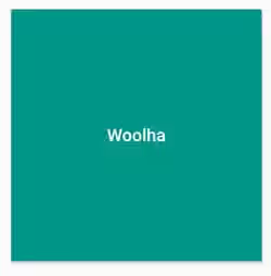
It turns out that the constraints of the child do not take effect. How can we get rid of the constraints from the ancestor. A widget called UnconstrainedBox can be the solution.
UnconstrainedBox is a widget that imposes no constraints on its child. Therefore, the child can render at the size as if it has no constraints. The constraints from its parent are not applied on the child of UnconstrainedBox.
Using UnconstrainedBox
Here's the constructor of UnconstrainedBox.
  const UnconstrainedBox({
    Key key,
    Widget child,
    this.textDirection,
    this.alignment = Alignment.center,
    this.constrainedAxis,
  })
Below is the description of the arguments you can pass on the constructor.
Key key: The widget key, used to control if it should be replaced.Widget child: The widget under this widget in tree, where the constraints from the ancestor widgets will not be applied on.TextDirection textDirection: The text direction to use when interpreting thealignmentif it is anAlignmentDirectional.AlignmentGeometry alignment: The axis to retain constraints on, if any.Axis constrainedAxis: The alignment to use when laying out the child.
By wrapping the button inside an UnconstrainedBox widget, the size of the button is no longer determined by its ancestor's constraints.
  Container(
    width: 200,
    height: 200,
    color: Colors.black38,
    child: UnconstrainedBox(
      child: RaisedButton(
        color: Colors.teal,
        child: Text('Woolha', style: TextStyle(color: Colors.white)),
        onPressed: () {},
      ),
    ),
  )
Output:
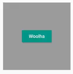
You can also set a different size by wrapping the child inside another widget that allows you to set different constraints, such as another SizedBox or Container.
  Container(
    width: 200,
    height: 200,
    color: Colors.black38,
    child: UnconstrainedBox(
      child: SizedBox(
        width: 100,
        height: 50,
        child: RaisedButton(
          color: Colors.teal,
          child: Text('Woolha', style: TextStyle(color: Colors.white)),
          onPressed: () {},
        ),
      ),
    ),
  )
Output:
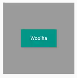
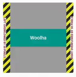
However, you need to make sure that the size of the child doesn't overflow the parent's constraints. In debug mode, you will get black and yellow striped areas if that occurs.
  Container(
    width: 200,
    height: 200,
    color: Colors.black38,
    child: UnconstrainedBox(
      child: SizedBox(
        width: 300,
        height: 50,
        child: RaisedButton(
          color: Colors.teal,
          child: Text('Woolha', style: TextStyle(color: Colors.white)),
          onPressed: () {},
        ),
      ),
    ),
  )
Output:
Setting Constrained Axis
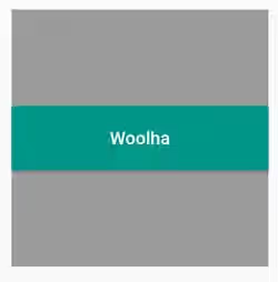
What if you want to retain the constraint for a certain axis? For example, you want to retain the constraint for horizontal axis, but not for vertical axis. You can set constrainedAxis property to Axis.horizontal.
  Container(
    width: 200,
    height: 200,
    color: Colors.black38,
    child: UnconstrainedBox(
      constrainedAxis: Axis.horizontal,
      child: SizedBox(
        width: 100,
        height: 50,
        child: RaisedButton(
          color: Colors.teal,
          child: Text('Woolha', style: TextStyle(color: Colors.white)),
          onPressed: () {},
        ),
      ),
    ),
  )
Output:
Setting Alignment and Text Direction
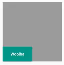
As the size of the child may not be the same as the size of the parent, Flutter needs to handle how the child should be laid out inside its parent. The default value is Alignment.center, but you can override it by passing alignment property whose type is AlignmentGeometry.
  Container(
    width: 200,
    height: 200,
    color: Colors.black38,
    child: UnconstrainedBox(
      alignment: AlignmentDirectional.bottomStart,
      child: SizedBox(
        width: 100,
        height: 50,
        child: RaisedButton(
          color: Colors.teal,
          child: Text('Woolha', style: TextStyle(color: Colors.white)),
          onPressed: () {},
        ),
      ),
    ),
  )
Output:
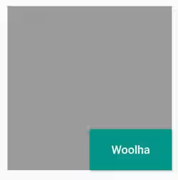
If you use AlignmentDirectional, you can pass textDirection argument for setting the TextDirection value.
  Container(
    width: 200,
    height: 200,
    color: Colors.black38,
    child: UnconstrainedBox(
      alignment: AlignmentDirectional.bottomStart,
      textDirection: TextDirection.rtl,
      child: SizedBox(
        width: 100,
        height: 50,
        child: RaisedButton(
          color: Colors.teal,
          child: Text('Woolha', style: TextStyle(color: Colors.white)),
          onPressed: () {},
        ),
      ),
    ),
  )
Output:
That's how to use UnconstrainedBox widget. You can also read about
SizedBox, a widget used for setting width and height constraints.ConstrainedBox, a widget used for imposing additional constraints to its child.OverflowBox, a widget that allows you to impose different constraints to the child and allows the child to overflow its parent.
