This tutorial explains how to use Flutter's ChoiceChip widget.
Choice chip is a type of Material Design's chips. Choice chips allow selection of a single chip from a set of options. In Flutter, there is a dedicated widget called ChoiceChip that allows you to easily create action chips. This tutorial explains how to use the widget from the basic example until how to customize the visual of the chip.
Other chip types include ActionChip, InputChip, and FilterChip.
Creating ChoiceChip
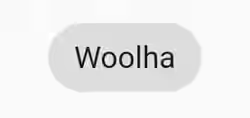
Creating ChoiceChip in Flutter can be done by using the constructor. The required arguments are label (Widget) and onSelected (ValueChanged<bool>). Usually label is a Text widget. onSelected is a callback that will be called every time the chip becomes selected or unselected.
Another important property is selected, which determines whether the chip should be rendered as selected or not selected. Thereofore, you should change which chip is selected inside the callback. There should only one selected action chip from a set of options. In order to simplify the examples in this tutorial, let's assume there is only one chip and pressing the chip makes it becomes selected or unselected.
  ChoiceChip(
    selected: _selected,
    label: Text('Woolha'),
    onSelected: (bool selected) {
      setState(() {
        _selected = !_selected;
      });
    }
  )
Output:
Adding Avatar
An avatar in this context is a widget displayed before the label. It can be a Text, a CircleAvatar, an Icon, or any type of Widget.
  ChoiceChip(
    selected: _selected,
    label: Text('Woolha'),
    avatar: Text('W'),
    onSelected: (bool selected) {
      setState(() {
        _selected = !_selected;
      });
    }
  )
Output:
![]()
Customizing Label
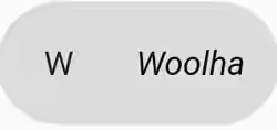
The label padding can be set using labelPadding property. For setting the style of the text inside the label, you can use labelStyle property.
  ChoiceChip(
    selected: _selected,
    label: Text('Woolha'),
    labelStyle: TextStyle(color: Colors.black, fontStyle: FontStyle.italic),
    labelPadding: EdgeInsets.all(10),
    avatar: Text('W'),
    onSelected: (bool selected) {
      setState(() {
        _selected = !_selected;
      });
    }
  )
Output:
Customizing Colors
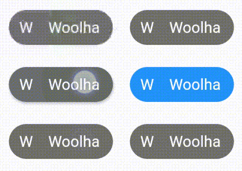
The backgroundColor property can be used to set the background color of the chip when it's enabled but not selected. To change the color of the chip when it's selected, use selectedColor property. For the color of the avatar, it depends on the widget you set as avatar.
  ChoiceChip(
    selected: _selected,
    label: Text('Woolha'),
    labelStyle: TextStyle(color: Colors.white),
    avatar: Text('W', style: TextStyle(color: Colors.white)),
    backgroundColor: Colors.black54,
    selectedColor: Colors.blue,
    onSelected: (bool selected) {
      setState(() {
        _selected = !_selected;
      });
    }
  )
Output:
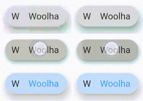
Setting Elevation and Shadow Color
The elevation of the chip can be set using elevation property. For the elevation when the chip is pressed, use pressElevation property. When the elevation is above 0, you can set the color of the shadow using shadowColor property.
  ChoiceChip(
    selected: _selected,
    label: Text('Woolha'),
    avatar: Text('W'),
    elevation: 10,
    pressElevation: 5,
    shadowColor: Colors.teal,
    onSelected: (bool selected) {
      print('Fluter is pressed');

      setState(() {
        _selected = !_selected;
      });
    }
  )
Output:
Full Code
Here's a full code example with a set of action chips, and only one chip can be selected at the same time.
  import 'package:flutter/material.dart';

  void main() => runApp(MyApp());

  class MyApp extends StatelessWidget {
    @override
    Widget build(BuildContext context) {
      return MaterialApp(
        title: 'Woolha.com Flutter Tutorial',
        home: _InputChipExample(),
      );
    }
  }

  class _InputChipExample extends StatefulWidget {
    @override
    _InputChipExampleState createState() =>
        new _InputChipExampleState();
  }

  class _InputChipExampleState extends State<_InputChipExample> with TickerProviderStateMixin {

    int _selectedIndex;
    List<String> _options = ['Woolha', 'Flutter', 'Dart'];

    Widget _buildChips() {
      List<Widget> chips = new List();

      for (int i = 0; i < _options.length; i++) {
        ChoiceChip choiceChip = ChoiceChip(
          selected: _selectedIndex == i,
          label: Text(_options[i], style: TextStyle(color: Colors.white)),
          avatar: FlutterLogo(),
          elevation: 10,
          pressElevation: 5,
          shadowColor: Colors.teal,
          backgroundColor: Colors.black54,
          selectedColor: Colors.blue,
          onSelected: (bool selected) {
            setState(() {
              if (selected) {
                _selectedIndex = i;
              }
            });
          },
        );

        chips.add(Padding(
          padding: EdgeInsets.symmetric(horizontal: 10),
          child: choice Chip
        ));
      }

      return ListView(
        // This next line does the trick.
        scrollDirection: Axis.horizontal,
        children: chips,
      );
    }

    @override
    Widget build(BuildContext context) {
      return Scaffold(
        appBar: AppBar(
          title: Text('Woolha.com Flutter Tutorial'),
        ),
        body: Padding(
            padding: const EdgeInsets.all(15.0),
            child: Column(
              children: <Widget>[
                Container(
                  height: 30,
                  child: _buildChips(),
                ),
              ],
            )
        ),
      );
    }
  }
Output:

Properties
Here's the list of properties of ChoiceChip you can pass to the constructor.
Key key: The widget key, used to control if it should be replaced.Widget avatar: A widget displayed before the label.Widget label*: The primary content of the chip.TextStyle labelStyle: The text style for the label.EdgeInsetsGeometry labelPadding: The padding for the label.bool selected*: Whether the chip is selected. Defaults tofalse.ValueChanged<bool> onSelected: A callback function that will be called when the widget is selected or unselected.double pressElevation: The elevation when the widget is pressed.Color disabledColor: Color if the chip is disabled.Color selectedColor: Color for selected chip's background.String tooltip: Tooltip that will be displayed by long pressing the chip.ShapeBorder shape: TheShapeBorderto draw around the chip.Clip clipBehavior: Defines how to clip the content. Defaults toClip.none.FocusNode focusNode: Focus node for the widget.bool autofocus: Whether this widget will be set as initial focus. Defaults tofalse.Color backgroundColor: Color for enabled, unselected chip's background.EdgeInsetsGeometry padding: The padding between the contents of the chip and the outside shape.VisualDensity visualDensity: The compactness of the chip's layout.MaterialTapTargetSize materialTapTargetSize: The the minimum size of the tap target.double elevation: Elevation relative to its parent.Color shadowColor: Color of the chip's shadow if the elevation is greater than 0.Color selectedShadowColor: Color of the chip's shadow if the elevation is greater than 0 and the chip is selected.ShapeBorder avatarBorder: Border shape for the avatar.
*: required
