This tutorial is about how to use FilterChip in Flutter.
Filter chip is a type of Material Design's chips. A collection of filter chips is usually used where the user can select multiple options. Creating filter chip in Flutter can be done using FilterChip widget which is very easy to use. Below is the tutorial of how to use the widget and how to customize it.
Other chip types include ActionChip, InputChip, and ChoiceChip.
Creating FilterChip
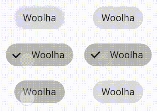
To use FilterChip widget, the constructor requires you to pass two arguments. The first one is label whose type is Widget and it's typically a Text. The other required argument is onSelected, a callback function that has a parameter of type bool. The callback is usually used to change the state of the chip to selected or unselected. Whether the chip is selected or not depends on selected property value. So, it's very common to update the value of selected inside the callback.
  FilterChip(
    selected: _selected,
    label: Text('Woolha'),
    onSelected: (bool selected) {
      setState(() {
        _selected = !_selected;
      });
    }
  )
Output:
Adding Avatar
If you want to add an avatar, pass a Widget as avatar property. Any Flutter Widget can be used as avatar, such as CricleAvatar, Icon, or even Text. The avatar widget is displayed before the label
  FilterChip(
    selected: _selected,
    label: Text('Woolha'),
    avatar: Text('W'),
    onSelected: (bool selected) {
      setState(() {
        _selected = !_selected;
      });
    }
  )
Output:
![]()
Customizing Label
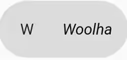
Text style of the label can be changed using labelStyle property. You can also set the padding size for the label using labelPadding property.
  FilterChip(
    selected: _selected,
    label: Text('Woolha'),
    labelStyle: TextStyle(color: Colors.black, fontStyle: FontStyle.italic),
    labelPadding: EdgeInsets.all(10),
    avatar: Text('W'),
    onSelected: (bool selected) {
      setState(() {
        _selected = !_selected;
      });
    }
  )
Output:
Customizing Colors
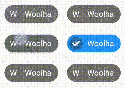
If you want to change the color when the chip is enabled but not selected, use backgroundColor property. When the chip is selected, the background color depends on selectedColor property.
  FilterChip(
    selected: _selected,
    label: Text('Woolha'),
    labelStyle: TextStyle(color: Colors.white),
    backgroundColor: Colors.black54,
    selectedColor: Colors.blue,
    avatar: Text('W', style: TextStyle(color: Colors.white)),
    onSelected: (bool selected) {
      setState(() {
        _selected = !_selected;
      });
    }
  )
Output:
Setting Elevation and Shadow Color
Elevation of the chip can be set using elevation property, while the elevation when the user presses the chip can be set using pressElevation property.
  FilterChip(
    selected: _selected,
    label: Text('Woolha'),
    avatar: Text('W'),
    elevation: 10,
    pressElevation: 5,
    onSelected: (bool selected) {
      setState(() {
        _selected = !_selected;
      });
    }
  )
Output:
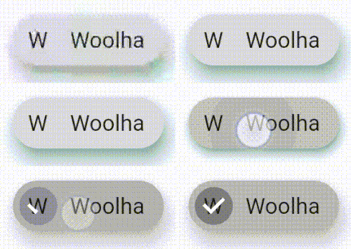
Full Code
Below is the full code example with multiple chips.
  import 'package:flutter/material.dart';

  void main() => runApp(MyApp());

  class MyApp extends StatelessWidget {
    @override
    Widget build(BuildContext context) {
      return MaterialApp(
        title: 'Woolha.com Flutter Tutorial',
        home: _InputChipExample(),
      );
    }
  }

  class _InputChipExample extends StatefulWidget {
    @override
    _InputChipExampleState createState() =>
        new _InputChipExampleState();
  }

  class _InputChipExampleState extends State<_InputChipExample> with TickerProviderStateMixin {

    List<String> _options = ['Flutter', 'Dart', 'Woolha'];
    List<bool> _selected = [false, false, false];

    Widget _buildChips() {
      List<Widget> chips = new List();

      for (int i = 0; i < _options.length; i++) {
        FilterChip filterChip = FilterChip(
          selected: _selected[i],
          label: Text(_options[i], style: TextStyle(color: Colors.white)),
          avatar: FlutterLogo(),
          elevation: 10,
          pressElevation: 5,
          shadowColor: Colors.teal,
          backgroundColor: Colors.black54,
          selectedColor: Colors.blue,
          onSelected: (bool selected) {
            setState(() {
              _selected[i] = selected;
            });
          },
        );

        chips.add(Padding(
            padding: EdgeInsets.symmetric(horizontal: 10),
            child: filterChip
        ));
      }

      return ListView(
        // This next line does the trick.
        scrollDirection: Axis.horizontal,
        children: chips,
      );
    }

    @override
    Widget build(BuildContext context) {
      return Scaffold(
        appBar: AppBar(
          title: Text('Woolha.com Flutter Tutorial'),
        ),
        body: Padding(
            padding: const EdgeInsets.all(15.0),
            child: Column(
              children: <Widget>[
                Container(
                  height: 30,
                  child: _buildChips(),
                ),
              ],
            )
        ),
      );
    }
  }
Output:

Properties
Here's the list of properties of FilterChip you can pass to the constructor.
Key key: The widget key, used to control if it should be replaced.Widget avatar: A widget displayed before the label.Widget label*: The primary content of the chip.TextStyle labelStyle: The text style for the label.EdgeInsetsGeometry labelPadding: The padding for the label.bool selected: Whether the chip is selected. Defaults tofalse.ValueChanged<bool> onSelected*: A callback function that will be called when the widget is selected or unselected.double pressElevation: The elevation when the widget is pressed.Color disabledColor: Color if the chip is disabled.Color selectedColor: Color for selected chip's background.String tooltip: Tooltip that will be displayed by long pressing the chip.ShapeBorder shape: TheShapeBorderto draw around the chip.Clip clipBehavior: Defines how to clip the content. Defaults toClip.none.FocusNode focusNode: Focus node for the widget.bool autofocus: Whether this widget will be set as initial focus. Defaults tofalse.Color backgroundColor: Color for enabled, unselected chip's background.EdgeInsetsGeometry padding: The padding between the contents of the chip and the outside shape.VisualDensity visualDensity: The compactness of the chip's layout.MaterialTapTargetSize materialTapTargetSize: The the minimum size of the tap target.double elevation: Elevation relative to its parent.Color shadowColor: Color of the chip's shadow if the elevation is greater than 0.Color selectedShadowColor: Color of the chip's shadow if the elevation is greater than 0 and the chip is selected.bool showCheckmark: Whether to show checkmark.Color checkmarkColor: Color of the checkmark.ShapeBorder avatarBorder: Border shape for the avatar.
*: required
