This tutorial shows you how to add a password field where the users can make the text visible or hidden using an icon.
If your application has a feature for login using a password, usually there is an input field for it. The text is usually obscured, so that other people who glance at the user's screen cannot read the password. However, sometimes the user may want to show the inputted text. For example, to check whether the typed text is already correct. For that reason, it's quite common to see a password field where the text can be shown or hidden using an icon, typically an eye icon.
In Flutter, you can create a password field using a TextField or TextFormField. In this tutorial, I am going to show you how to create such a field where the text can be shown or hidden using an icon.
Obscure Text
Both TextField and TextFormField's constructor have the obscureText argument whose type is bool. If the value is true, the inputted text will be obscured. Therefore, we can use that argument to control whether the text should be visible or obscured. To be able to dynamically change the visibility of the text, we create a state variable and use it as the value of the obscureText argument. The best practice is to set the initial value to false.
  class ExampleState extends State<Example> {

    bool _isVisible = false;

    @override
    Widget build(BuildContext context) {
      return Padding(
        padding: const EdgeInsets.all(10),
        child: Column(
          children: [
            TextField(
              obscureText: !_isVisible,
            ),
          ],
        ),
      );
    }
  }
Add Show/Hide Icon
In order to allow the users to toggle the text visibility, there should be an icon for it. The most common icon to be used is the eye icon. Fortunately, Flutter has provided the suitable icons. Therefore, you don't need to create your own icons unless you want to use different icons. When the text is not visible, you can show the visibility icon, which indicates that the user can make the text visible. When the text is visible, you can show the visibility_off icon, which indicates that the user can make the text not visible.
To make an icon that can be clicked, you can use the IconButton widget and pass it as the suffixIcon argument. For the icon itself, use the current state to determine whether to display visibility or visibility_off. The IconButon widget requires you to pass a function as the onPressed argument to handle the events when the button is pressed. Inside the function, you have to update the _isVisible state using the invert operator.
  TextField(
    obscureText: !_isVisible,
    decoration: InputDecoration(
      border: const OutlineInputBorder(),
      labelText: 'Password',
      suffixIcon: IconButton(
        icon: Icon(_isVisible ? Icons.visibility_off : Icons.visibility),
        onPressed: () => setState(() {
          _isVisible = !_isVisible;
        }),
      ),
    ),
  )
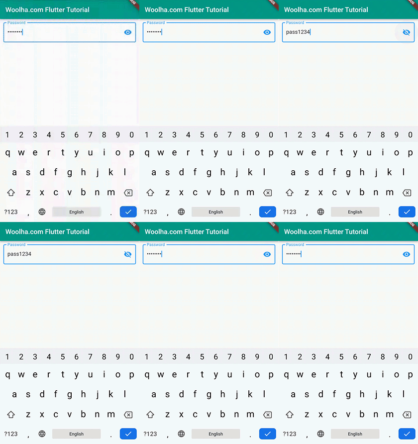
Below is the result.

Full Code
  import 'package:flutter/material.dart';

  void main() => runApp(const MyApp());

  class MyApp extends StatelessWidget {

    const MyApp({Key? key}) : super(key: key);

    @override
    Widget build(BuildContext context) {
      return MaterialApp(
        title: 'Woolha.com Flutter Tutorial',
        home: Scaffold(
          appBar: AppBar(
            title: const Text('Woolha.com Flutter Tutorial'),
            backgroundColor: Colors.teal,
          ),
          body: const Example(),
        ),
      );
    }
  }

  class Example extends StatefulWidget {
    const Example({super.key});

    @override
    State<StatefulWidget> createState() {
      return ExampleState();
    }
  }
  class ExampleState extends State<Example> {

    bool _isVisible = false;

    @override
    Widget build(BuildContext context) {
      return Padding(
        padding: const EdgeInsets.all(10),
        child: Column(
          children: [
            TextField(
              obscureText: !_isVisible,
              decoration: InputDecoration(
                border: const OutlineInputBorder(),
                labelText: 'Password',
                suffixIcon: IconButton(
                  icon: Icon(_isVisible ? Icons.visibility_off : Icons.visibility),
                  onPressed: () => setState(() {
                    _isVisible = !_isVisible;
                  }),
                ),
              ),
            ),
          ],
        ),
      );
    }
  }
Summary
In this tutorial, we have learned how to create a password field where the text can be shown or hidden using a TextField or TextFormField. Basically, you can control the visibility of the text using the obscureText argument. The icon for toggling the visibility can be added using the suffixIcon argument. Then, handle to inverse the visibility status every time the icon is clicked.
You can also read about:
- How to change the border of a
TextField/TextFormFieldin Flutter, in case you want to customize the appearance of the password field - How to create a password field with strength validation checker in Flutter
