This tutorial shows you how to change the border style and color of a TextField or TextFormField widget in Flutter.
Text field is a user interface component that allows users to type input. In Flutter, you can create such a component using a TextField or TextFormField widget. Providing a text field that looks good may improve the user experience of your application. A text field usually has a border. In this tutorial, I am going to show you how to set different border styles.
Change Border Style of a Specific TextField or TextFormField
Both TextField and TextFormField have an argument named decoration for which you can pass an InputDecoration. InputDecoration is used to set the styles of a Material Design text field. So, in order to modify the border of a text field, you can create a custom InputDecoration which defines the border style you want. Then, pass it as the decoration argument of the field.
You can set a custom border by defining one or more InputBorders which have to be passed to the constructor of InputDecoration. Flutter provides built-in subtypes of InputBorder that you can use which include UnderlineInputBorder or OutlineInputBorder. There are some arguments of InputDecoration that can be used to determine the appearance of the border based on the current state. The type for all of the arguments is InputBorder?
enabledBorder: used when enabled and not showing an error.disabledBorder: used when disabled and not showing an error.focusedBorder: used when in focus and not showing an error.errorBorder: used when not in focus and showing an error.focusedErrorBorder: used when in focus and showing an error.border: shape of the border to draw around the decoration's container when the corresponding argument above (based on the current state) is not defined.
That means you can specify different InputBorders for each state. If it's not defined, it will fall back to border. An InputBorder has a property called borderSide, which defines the border line's color and weight. However, for the border argument, the InputBorder.borderSide property is configured by the InputDecorator, depending on the values of InputDecoration.errorText, InputDecoration.enabled, InputDecorator.isFocused and the styles of the Theme. That's why if you only define an InputBorder using the border argument, you may find out that the defined borderSide may not have any effect.
Change Border Shape
By default, if you don't customize it, Flutter will use an UnderlineInputBorder. As you can see from the image below, the line is only on the bottom of the field below the inputted text.
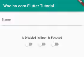
Below are the examples of how to customize the shape, color, and line thickness.
UnderlineInputBorder
This is the border shape that Flutter uses by default. Despite it's the default one, you can also customize how it looks. Let's take a look at the constructor.
  const UnderlineInputBorder({
    BorderSide borderSide = const BorderSide(),
    BorderRadius borderRadius = const BorderRadius.only(
      topLeft: Radius.circular(4.0),
      topRight: Radius.circular(4.0),
    ),
  })
If you look at the constructor, there are two named arguments, borderSide and borderRadius. The borderSide argument can be used to customize how the border line looks, including the color and width. The borderRadius defines the radius of the border line.
Below is an example that uses UnderlineInputBorder with different styles for each state.
  TextField(
    decoration: InputDecoration(
      border: const UnderlineInputBorder( // won't be used if the state-specific arguments are defined
        borderRadius: BorderRadius.all(Radius.circular(10)),
      ),
      enabledBorder: const UnderlineInputBorder(
        borderSide: BorderSide(color: Colors.teal, width: 2.0),
      ),
      disabledBorder: const UnderlineInputBorder(
        borderSide: BorderSide(color: Colors.grey, width: 2.0),
      ),
      focusedBorder: const UnderlineInputBorder(
        borderSide: BorderSide(color: Colors.teal, width: 5.0),
      ),
      errorBorder: const UnderlineInputBorder(
        borderSide: BorderSide(color: Colors.red, width: 2.0),
        borderRadius: BorderRadius.all(Radius.circular(10)),
      ),
      focusedErrorBorder: const UnderlineInputBorder(
        borderSide: BorderSide(color: Colors.red, width: 5.0),
        borderRadius: BorderRadius.all(Radius.circular(10)),
      ),
      errorText: _isError ? 'Input must be filled' : null,
      labelText: 'Name',
    ),
  )
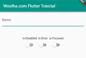
Output:
Enabled:
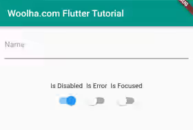
Disabled:
Focused:
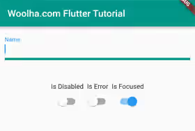
Error:
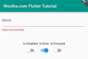
Focused Error:
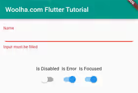
OutlineInputBorder
It's very common to have a text field with an outline on all sides. If that's what you want, you can change it to use an OutlineInputBorder which can be created using the constructor below.
  const OutlineInputBorder({
    BorderSide borderSide = const BorderSide(),
    BorderRadius borderRadius = const BorderRadius.all(Radius.circular(4.0)),
    double gapPadding = 4.0,
  })
Below is the example that uses an OutlineInputBorder.
  TextField(
    decoration: InputDecoration(
      border: const OutlineInputBorder( // won't be used if the state-specific arguments are defined
        borderRadius: BorderRadius.all(Radius.circular(10)),
      ),
      enabledBorder: const OutlineInputBorder(
        borderSide: BorderSide(color: Colors.teal, width: 2.0),
      ),
      disabledBorder: const OutlineInputBorder(
        borderSide: BorderSide(color: Colors.grey, width: 2.0),
      ),
      focusedBorder: const OutlineInputBorder(
        borderSide: BorderSide(color: Colors.teal, width: 5.0),
      ),
      errorBorder: const OutlineInputBorder(
        borderSide: BorderSide(color: Colors.red, width: 2.0),
        borderRadius: BorderRadius.all(Radius.circular(10)),
      ),
      focusedErrorBorder: const OutlineInputBorder(
        borderSide: BorderSide(color: Colors.red, width: 5.0),
        borderRadius: BorderRadius.all(Radius.circular(10)),
      ),
      errorText: _isError ? 'Input must be filled' : null,
      labelText: 'Name',
    ),
  )
Output:
Enabled:
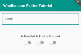
Disabled:
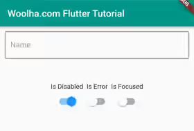
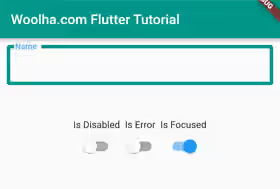
Focused:
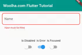
Error:
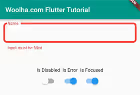
Focused Error:
Set Style in ThemeData
If your application has many text fields, most likely they will have similar styles including the border. You don't have to define the same style one by one on each field since it's possible to set it to the theme, so that it will be used by all text fields across the application. What you need to do is pass a custom ThemeData as the theme argument of the MaterialApp widget. The ThemeData has to contain a custom InputDecorationTheme passed as the inputDecorationTheme argument. For the InputDecorationTheme, you can set the border styles for each state using the same named arguments as those used on the InputDecoration.
MaterialApp(
  theme: ThemeData.light().copyWith(
    inputDecorationTheme: InputDecorationTheme(
      enabledBorder: const OutlineInputBorder(
        borderSide: BorderSide(color: Colors.teal, width: 2.0),
      ),
      disabledBorder: const OutlineInputBorder(
        borderSide: BorderSide(color: Colors.grey, width: 2.0),
      ),
    )
  ),
)
Full Code
Below is the full code where the states of the input field can be changed using switches.
  import 'package:flutter/material.dart';

  void main() => runApp(const MyApp());

  class MyApp extends StatelessWidget {

    const MyApp({Key? key}) : super(key: key);

    @override
    Widget build(BuildContext context) {
      return MaterialApp(
        title: 'Woolha.com Flutter Tutorial',
        theme: ThemeData.light().copyWith(
          inputDecorationTheme: const InputDecorationTheme(
            enabledBorder: OutlineInputBorder(
              borderSide: BorderSide(color: Colors.teal, width: 2.0),
            ),
            disabledBorder: OutlineInputBorder(
              borderSide: BorderSide(color: Colors.grey, width: 2.0),
            ),
          )
        ),
        home: Scaffold(
          appBar: AppBar(
            title: const Text('Woolha.com Flutter Tutorial'),
            backgroundColor: Colors.teal,
          ),
          body: const Home(),
        ),
      );
    }
  }

  class Home extends StatefulWidget {
    const Home({super.key});

    @override
    State<StatefulWidget> createState() {
      return HomeState();
    }
  }
  class HomeState extends State<Home> {

    bool _isError = false;
    bool _isFocused = false;
    bool _isDisabled = false;
    final FocusNode _focusNode = FocusNode();

    @override
    Widget build(BuildContext context) {
      return Padding(
        padding: const EdgeInsets.all(10),
        child: Column(
          children: [
            TextField(
              focusNode: _focusNode,
              decoration: InputDecoration(
                // border: const UnderlineInputBorder( // won't be used if the state-specific arguments are defined
                //   borderRadius: BorderRadius.all(Radius.circular(10)),
                // ),
                // enabledBorder: const UnderlineInputBorder(
                //   borderSide: BorderSide(color: Colors.teal, width: 2.0),
                // ),
                // disabledBorder: const UnderlineInputBorder(
                //   borderSide: BorderSide(color: Colors.grey, width: 2.0),
                // ),
                // focusedBorder: const UnderlineInputBorder(
                //   borderSide: BorderSide(color: Colors.teal, width: 5.0),
                // ),
                // focusedErrorBorder: const UnderlineInputBorder(
                //   borderSide: BorderSide(color: Colors.red, width: 5.0),
                //   borderRadius: BorderRadius.all(Radius.circular(10)),
                // ),
                // errorBorder: const UnderlineInputBorder(
                //   borderSide: BorderSide(color: Colors.red, width: 2.0),
                //   borderRadius: BorderRadius.all(Radius.circular(10)),
                // ),
                border: const OutlineInputBorder( // won't be used if the state-specific arguments are defined
                  borderRadius: BorderRadius.all(Radius.circular(10)),
                ),
                enabledBorder: const OutlineInputBorder(
                  borderSide: BorderSide(color: Colors.teal, width: 2.0),
                ),
                disabledBorder: const OutlineInputBorder(
                  borderSide: BorderSide(color: Colors.grey, width: 2.0),
                ),
                focusedBorder: const OutlineInputBorder(
                  borderSide: BorderSide(color: Colors.teal, width: 5.0),
                ),
                focusedErrorBorder: const OutlineInputBorder(
                  borderSide: BorderSide(color: Colors.red, width: 5.0),
                  borderRadius: BorderRadius.all(Radius.circular(10)),
                ),
                errorBorder: const OutlineInputBorder(
                  borderSide: BorderSide(color: Colors.red, width: 2.0),
                  borderRadius: BorderRadius.all(Radius.circular(10)),
                ),
                errorText: _isError ? 'Input must be filled' : null,
                labelText: 'Name',
              ),
              onTap: () => setState(() => _isFocused = true),
              enabled: !_isDisabled,
            ),
            const SizedBox(height: 50),
            Row(
              mainAxisAlignment: MainAxisAlignment.center,
              children: [
                Column(
                  children: [
                    const Text('Is Disabled'),
                    Switch(
                      value: _isDisabled,
                      onChanged: (val) => setState(() {
                        _isDisabled = val;
                      }),
                    ),
                  ],
                ),
                Column(
                  children: [
                    const Text('Is Error'),
                    Switch(
                      value: _isError,
                      onChanged: (val) => setState(() {
                        _isError = val;
                      }),
                    ),
                  ],
                ),
                Column(
                  children: [
                    const Text('Is Focused'),
                    Switch(
                      value: _isFocused,
                      onChanged: (isFocused) => setState(() {
                        if (isFocused) {
                          _focusNode.requestFocus();
                        } else {
                          _focusNode.unfocus();
                        }

                        setState(() {
                          _isFocused = isFocused;
                        });
                      }),
                    ),
                  ],
                ),
              ],
            )
          ],
        ),
      );
    }
  }
Summary
In Flutter, you can change the appearance of the border by defining custom InputBorders in the InputDecoration. Flutter allows you to define different borders for each state. For example, you can have different borders when the field is disabled, focused, or has an error text.
You can also read about:
