This tutorial shows you how to display a TextField or TextFormField in Flutter without a border or underline.
Text fields are usually used as an interface that accepts user input from the keyboard. In Flutter, you can use the TextField or TextFormField widget to create such an interface. By default, Flutter renders an underline at the bottom. If you don't want the underline to appear, read the examples in this tutorial.
Remove Border/Underline of a Specific TextField/TextFormField
The TextField and TextFormField have an argument named decoration that allows you to pass a custom InputDecoration. The InputDecoration itself can be used to customize how the text field looks. That includes specifying the border.
The InputDecoration has some arguments for setting the border depending on the current state. For example, you can set a different style when the field is in the focused state. Below is the list of the arguments
- enabledBorder: used when enabled and not showing an error.
- disabledBorder: used when disabled and not showing an error.
- focusedBorder: used when in focus and not showing an error.
- errorBorder: used when not in focus and showing an error.
- focusedErrorBorder: used when in focus and showing an error.
- border: shape of the border to draw around the decoration's container when the corresponding argument above (based on the current state) is not defined.
Flutter will use the corresponding argument based on the current state of the field. Therefore, it's also possible to not display the border only in certain states. All of the arguments have the same type which is InputBorder?. If the corresponding argument for a state doesn't exist, the one defined by the border argument will be used. The default value is UnderlineInputBorder, which draws a horizontal line at the bottom. That's why you'll see an underline even if you don't set it explicitly.
Using InputBorder.none
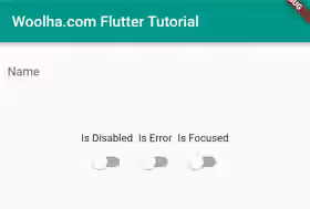
To remove the underline, you have to pass an InputBorder that doesn't have any border line. Assuming there is no state-specific style that has been set, you can set it to have no border by passing InputBorder.none to the border argument.
  TextField(
    decoration: const InputDecoration(
      border: InputBorder.none,
      labelText: 'Name',
    ),
    // other arguments
  )
Output:

If you have set the border argument but the border is still visible, probably it's from the state-specific style defined in the theme. For example, if you define enabledBorder in the theme, it will be used for all text fields which do not have its own enabledBorder style. Therefore, you may also need to specify enabledBorder to use InputBorder.none. The same also applies for other state-specific arguments.
  TextField(
    decoration: const InputDecoration(
      enabledBorder: InputBorder.none,
      border: InputBorder.none,
      labelText: 'Name',
    ),
    // other arguments
  )
Using InputDecoration.collapsed
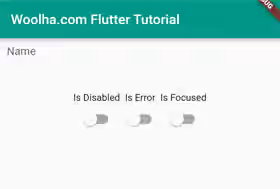
The InputDecoration.collapsed is a named constructor that creates a new InputDecoration whose size is the same as the input field and doesn't include the border by default . If you look at the constructor, the border is set to InputBorder.none (but not with the other state-specific arguments). Using this way, you'll notice a size different since it's adjusted to be the same as the input field. In addition, it may have a border if there is any state-specific border set in the theme.
  TextField(
    decoration: const InputDecoration.collapsed(
      hintText: 'Name'
    ),
    // other arguments
  )
Output:

Remove Border/Underline Using ThemeData
If you have a lot of text fields and you want them to be rendered without any underline or border, you can set the default style in the theme. If you use MateialApp, there is an argument named theme where you can set a custom ThemeData. In the ThemeData, you have to define an InputDecorationTheme which doesn't have any border. The arguments that you need to pass to the InputDecorationTheme for customizing the border are the same as those passed to the InputDecoration.
Setting only the border argument to InputBorder.none should be enough to remove the border, unless there is any state-specific argument that overrides the shape.
You also need to know that the theme's style can be overridden if the field has its own InputDecoration that defines the same argument. So, it's still possible to add a border on specific fields.
  MaterialApp(
    theme: ThemeData.light().copyWith(
      inputDecorationTheme: const InputDecorationTheme(
        border: InputBorder.none,
      )
    )
  )
Full Code
Below is the full code that renders a text field without a border or underline. There are also switches for changing the state of the input field, so you can see how it looks in each state.
  import 'package:flutter/material.dart';

  void main() => runApp(const MyApp());

  class MyApp extends StatelessWidget {

    const MyApp({Key? key}) : super(key: key);

    @override
    Widget build(BuildContext context) {
      return MaterialApp(
        title: 'Woolha.com Flutter Tutorial',
        theme: ThemeData.light().copyWith(
          inputDecorationTheme: const InputDecorationTheme(
            // border: InputBorder.none,
          )
        ),
        home: Scaffold(
          appBar: AppBar(
            title: const Text('Woolha.com Flutter Tutorial'),
            backgroundColor: Colors.teal,
          ),
          body: const Home(),
        ),
      );
    }
  }

  class Home extends StatefulWidget {
    const Home({super.key});

    @override
    State<StatefulWidget> createState() {
      return HomeState();
    }
  }
  class HomeState extends State<Home> {

    bool _isError = false;
    bool _isFocused = false;
    bool _isDisabled = false;
    final FocusNode _focusNode = FocusNode();

    @override
    Widget build(BuildContext context) {
      return Padding(
        padding: const EdgeInsets.all(10),
        child: Column(
          children: [
            TextField(
              focusNode: _focusNode,
              decoration: const InputDecoration(
                border: InputBorder.none,
                // The commented arguments only necessary if you define it in the theme.
                // enabledBorder: InputBorder.none,
                // disabledBorder: InputBorder.none,
                // focusedBorder: InputBorder.none,
                // errorBorder: InputBorder.none,
                // focusedErrorBorder: InputBorder.none,
                labelText: 'Name',
              ),
              onTap: () => setState(() => _isFocused = true),
              enabled: !_isDisabled,
            ),
            const SizedBox(height: 50),
            Row(
              mainAxisAlignment: MainAxisAlignment.center,
              children: [
                Column(
                  children: [
                    const Text('Is Disabled'),
                    Switch(
                      value: _isDisabled,
                      onChanged: (val) => setState(() {
                        _isDisabled = val;
                      }),
                    ),
                  ],
                ),
                Column(
                  children: [
                    const Text('Is Error'),
                    Switch(
                      value: _isError,
                      onChanged: (val) => setState(() {
                        _isError = val;
                      }),
                    ),
                  ],
                ),
                Column(
                  children: [
                    const Text('Is Focused'),
                    Switch(
                      value: _isFocused,
                      onChanged: (isFocused) => setState(() {
                        if (isFocused) {
                          _focusNode.requestFocus();
                        } else {
                          _focusNode.unfocus();
                        }

                        setState(() {
                          _isFocused = isFocused;
                        });
                      }),
                    ),
                  ],
                ),
              ],
            )
          ],
        ),
      );
    }
  }
Summary
To remove the border or underline of a TextField or TextInputField, you need to create an InputDecoration where the border is set to InputBorder.none. The InputDecoration has some arguments for setting the border based on the state of the field. Setting only the border argument should be enough if there is no state-specific argument set. There is also a named constructor InputDecoration.collapsed that creates an InputDecorator whose size is the same as the input field and sets the border argument to InputBorder.none by default. It's also possible to set it in the ThemeData which affects all the text fields in the application.
You can also read about:
