This tutorial shows you how to use Wrap widget in Flutter.
In Flutter, Wrap is a widget that displays its children in multiple horizontal or vertical runs. For each child, it will try to place it next to the previous child in the main axis. If there is not enough space to place a child in the main axis, it will create a new run adjacent to its existing children in the cross axis. This widget can be useful if you need to place a list of items in multiple rows or columns.
Using Wrap Widget
Below is the constructor of Wrap.
  Wrap({
    Key key,
    this.direction = Axis.horizontal,
    this.alignment = WrapAlignment.start,
    this.spacing = 0.0,
    this.runAlignment = WrapAlignment.start,
    this.runSpacing = 0.0,
    this.crossAxisAlignment = WrapCrossAlignment.start,
    this.textDirection,
    this.verticalDirection = VerticalDirection.down,
    this.clipBehavior = Clip.hardEdge,
    List children = const [],
  })
For this tutorial, we are going to use the following methods for generating the children.
  Widget _generateItem(double width, double height) {
    return Container(
      width: width,
      height: height,
      decoration: BoxDecoration(
        border: Border.all(color: Colors.blueAccent),
        color: Colors.pink,
      ),
      child: const Center(
        child: const Text('Woolha', style: TextStyle(color: Colors.white)),
      ),
    );
  }

  List<Widget> _generateChildren(int count) {
    List<Widget> items = [];

    for (int i = 0; i < count; i++) {
      items.add(_generateItem(90, 75));
    }

    return items;
  }
In the first example, we only pass the children argument. That means the default alignment (horizontal) is used. By default, the width of the Wrap widget depends on its content. For example, if the direction is horizontal and each run can have 4 items each with a width of 90, the width of the Wrap widget will be 360 assuming there is no spacing between items. If you want to make it as wide as the parent, the solution is to set the Wrap widget as the child of another widget that can set the width constraint, such as SizedBox.
  SizedBox(
    width: double.infinity,
    child: Wrap(
      children: _generateChildren(7),
    ),
  )
Output:
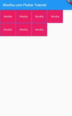
That's the result of a basic example that only passes the children argument and leaves the other options to default. For the width of the Wrap widget, you may not see the effect of setting the width constraint from the above output because the default alignment is start. However, you can see that actually the width matches the parent width by using Flutter Inspector. It will be more obvious if the alignment type is not start which will be exemplified later in this tutorial
Set Direction
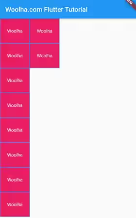
The default value for the direction argument is horizontal if we don't set it. That means Flutter will try to put an item in the same row or beside the previous item as long as the space in the same row is enough to place a new item, before moving to the next row if the space isn't enough. If you want to put the next item in the same column instead (before moving to the next column if the current column is already full), you can pass direction argument with Axis.vertical as the value.
  SizedBox(
    height: double.infinity,
    child: Wrap(
      direction: Axis.vertical,
      children: _generateChildren(7),
    ),
  )
Output:
Set Alignment
The alignment between children in the main axis can be set using alignment argument whose type is WrapAlignment. The possible values are:
start: Place the objects at the start of the main axis.endPlace the objects at the middle of the main axis.center: Place the objects at the end of the main axis.spaceBetween: Place the free space evenly between the objects.spaceAround: Place the free space evenly between the objects as well as half of that space before and after the first and last objects.spaceEvenly: Place the free space evenly between the objects as well as before and after the first and last objects.
The below example sets the alignment value to WrapAlignment.center.
  SizedBox(
    width: double.infinity,
    child: Wrap(
      alignment: WrapAlignment.center,
      children: _generateChildren(7),
    ),
  )
Output:
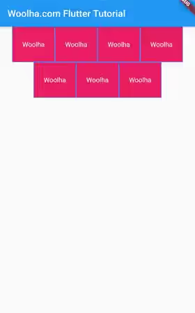
You can see the following images to see the differences between supported alignments.
start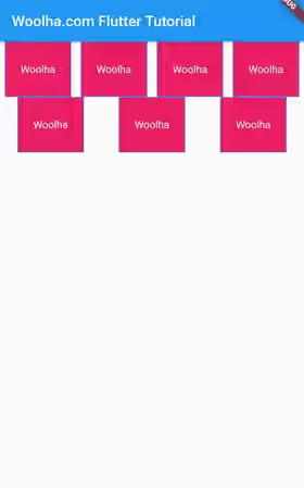
end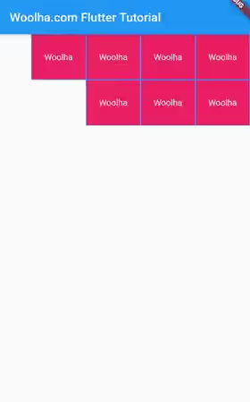
center
spaceBetween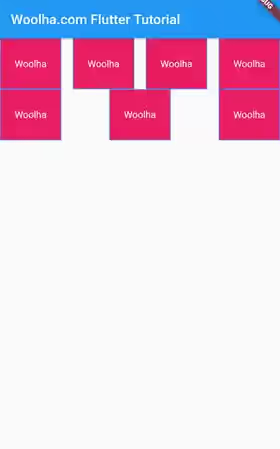
spaceAround
spaceEvenly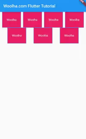
Set Run Alignment
The runAlignment argument whose type is also WrapAlignment can be used to set how the runs should be placed in the cross axis. The list of possible values is the same as alignment.
Here's the usage example. Because this example uses default (horizontal) alignment,the height constraint for the Wrap widget should be bigger than the intrinsic height of the widget, so that we can see the differences of using the supported values for runAlignment.
  Container(
    width: double.infinity,
    height: 500,
    color: Colors.grey,
    child: Wrap(
      runAlignment: WrapAlignment.end,
      children: _generateChildren(7),
    ),
  )
Output:
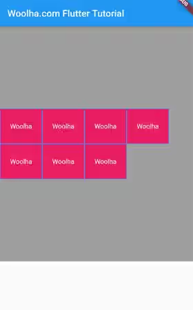
The below images are the screenshots of using all supported values.
start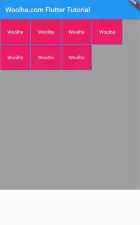
end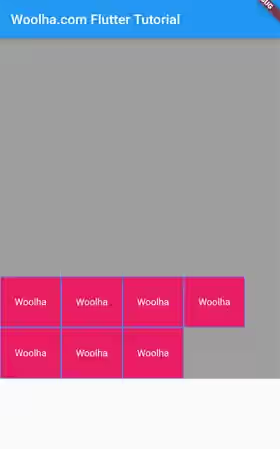
center
spaceBetween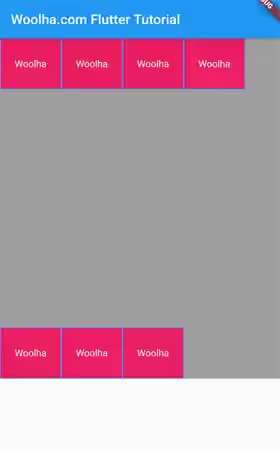
spaceAround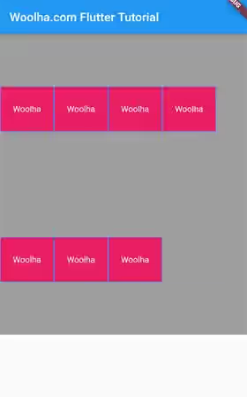
spaceEvenly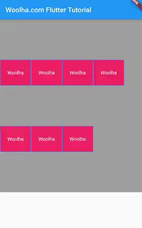
Set Cross Axis Alignment
For the cross alignment between children in a run, you can pass crossAxisAlignment argument whose type is WrapCrossAlignment. The available values are:
start: places the children as close to the start of the run in the cross axis.end: places the children as close to the end of the run in the cross axis.center: places the children as close to the middle of the run in the cross axis.
To make it obvious, the children must have different heights if the direction is horizontal. To achieve that, we are going to use the below function which generates children with different heights.
  List<Widget> _generateChildrenWithCustomHeight(int count) {
    List<Widget> items = [];

    for (int i = 0; i < count; i++) {
      items.add(_generateItem(90, 20.0 + (i % 3 * 10)));
    }

    return items;
  }
Below is an example with crossAxisAlignment sets to center.
  SizedBox(
    width: double.infinity,
    child: Wrap(
      crossAxisAlignment: WrapCrossAlignment.center,
      children: _generateChildrenWithCustomHeight(7),
    ),
  )
Output:
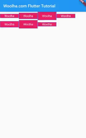
The below pictures show the differences between the supported crossAxisAlignment values.
start
end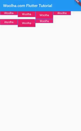
center
Set Spacing
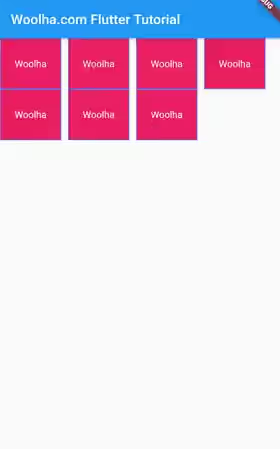
You can add main axis spacing between children in a run by passing spacing argument.
  SizedBox(
    width: double.infinity,
    child: Wrap(
      spacing: 10,
      children: _generateChildren(7),
    ),
  )
Output:
Set Run Spacing
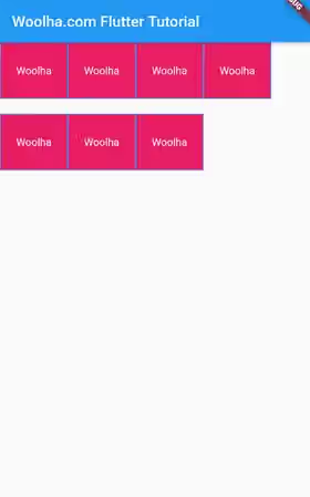
To set how much spacing between runs in the cross axis, you need to pass runSpacing argument.
  SizedBox(
    width: double.infinity,
    child: Wrap(
      runSpacing: 20,
      children: _generateChildren(7),
    ),
  )
Output:
Set Text Direction
The textDirection argument can be used to define how to lay the children horizontally. The example below sets the directions to rtl (right-to-left).
  SizedBox(
    width: double.infinity,
    child: Wrap(
      textDirection: TextDirection.rtl,
      children: _generateChildren(7),
    ),
  )
Output:

Wrap Parameters
Key key: The widget's key.Axis direction: The direction to use as the main axis. Defaults toAxis.horizontal.WrapAlignment alignment: How the children within a run should be placed in the main axis. Defaults toWrapAlignment.start.double spacing: Amount of space between children in a run in the main axis.. Defaults to0.0.WrapAlignment runAlignment: How the runs should be placed in the cross axis. Defaults toWrapAlignment.start.double runSpacing: Amount of space between the runs themselves in the cross axis. Defaults to0.0.WrapCrossAlignment crossAxisAlignment: How the children within a run should be aligned relative to each other in the cross axis. Defaults toWrapCrossAlignment.start.TextDirection textDirection: The order to lay children out horizontally and how to interpret start and end in the horizontal direction.Clip clipBehavior: How to content will be clipped. Defaults toVerticalDirection.down.List<Widget> children: The widgets below this widget in the tree which are the list of items.. Defaults toconst [].
Full Code
  import 'package:flutter/material.dart';

  void main() => runApp(MyApp());

  class MyApp extends StatelessWidget {

    @override
    Widget build(BuildContext context) {
      return MaterialApp(
        title: 'Woolha.com Flutter Tutorial',
        home: _WrapExample(),
      );
    }
  }

  class _WrapExample extends StatelessWidget {

    Widget _generateItem(double width, double height) {
      return Container(
        width: width,
        height: height,
        decoration: BoxDecoration(
          border: Border.all(color: Colors.blueAccent),
          color: Colors.pink,
        ),
        child: const Center(
          child: const Text('Woolha', style: TextStyle(color: Colors.white)),
        ),
      );
    }

    List<Widget> _generateChildren(int count) {
      List<Widget> items = [];

      for (int i = 0; i < count; i++) {
        items.add(_generateItem(90, 75));
      }

      return items;
    }

    List<Widget> _generateChildrenWithCustomHeight(int count) {
      List<Widget> items = [];

      for (int i = 0; i < count; i++) {
        items.add(_generateItem(90, 20.0 + (i % 3 * 10)));
      }

      return items;
    }

    @override
    Widget build(BuildContext context) {
      return Scaffold(
        appBar: AppBar(
          title: const Text('Woolha.com Flutter Tutorial'),
        ),
        body: Container(
          width: double.infinity,
          height: 500,
          color: Colors.grey,
          child: Wrap(
            direction: Axis.horizontal,
            alignment: WrapAlignment.spaceAround,
            runAlignment: WrapAlignment.spaceEvenly,
            crossAxisAlignment: WrapCrossAlignment.center,
            clipBehavior: Clip.antiAlias,
            spacing: 10,
            runSpacing: 20,
            textDirection: TextDirection.rtl,
            children: _generateChildrenWithCustomHeight(7),
          ),
        ),
      );
    }
  }
Summary
That's how to use Wrap widget in Flutter. It can be useful if you need a layout where the children should be placed in multiple horizontal and vertical runs. Setting the direction, alignment and spacing can be done easily by passing optional named arguments.
