
This tutorial shows you how to create a tab layout in Flutter using TabBar and TabBarView.
If your application needs to display some contents, it's quite common to separate the contents into multiple tabs. In Flutter, creating such a layout can be done easily thanks to TabBar and TabBarView widgets. TabBar is used to create the tabs, while TabBarView is used to define the content of each tab. Flutter already handles how to switch between tabs, which makes it easier for us. In addition, Flutter also makes it possible to customize the style and behavior of the tab layout. Below are the explanations and examples.
Basic Usage
Provide a TabController
TabBar and TabBarView require a TabController to work. There are two different ways to provide the controller. The first one is having a DefaultTabController as an ancestor widget. DefaultTabController can be created using the constructor below.
  const DefaultTabController({
    Key? key,
    required int length,
    int initialIndex = 0,
    required Widget child,
  })
The length argument is used to set the number of tabs you are going to create. It must be the same as the length of TabBar.tabs and TabBarView.children. Otherwise, you may get the following error.
  The following assertion was thrown building TabBar(dirty, dependencies: [_LocalizationsScope-[GlobalKey#7d8f8], _TabControllerScope, _InheritedTheme], state: _TabBarState#0360c):
  Controller's length property (3) does not match the number of tabs (2) present in TabBar's tabs property.
Then, you need to pass a widget as the child argument. The TabBar and TabBarView widgets have to be put as the descendant of the child widget (below the DefaultTabController node in the tree).
  MaterialApp(
    home: DefaultTabController(
      length: 3,
      child: Scaffold(
        appBar: AppBar(
          bottom: TabBar(
            tabs: [
              // Add Tabs here
            ],
          ),
          title: const Text('Woolha.com Flutter Tutorial'),
          backgroundColor: Colors.teal,
        ),
        body: const TabBarView(
          physics: BouncingScrollPhysics(),
          dragStartBehavior: DragStartBehavior.down,
          children: [
            // Add widgets here
          ],
        ),
      ),
    ),
  )
Another way to provide a controller is by using the controller argument of the TabBar. It provides more options to control the behavior of the TabBar and TabBarView compared to using DefaultTabController. For example, you can programatically trigger the controller to animate to a specific tab.
  TabController({
    int initialIndex = 0,
    required int length,
    required TickerProvider vsync
  })
To create your own TabController, you have to pass the length argument which indicates the number of tabs. It has the same rule which requires the value to be the same as the length of TabBar.tabs and TabBarView.children. Another required argument that you have to pass is vsync. You can obtain it by adding with TickerProviderStateMixin to your State class, so that you can use the this keyword as the value for vsync argument.
  class _TabLayoutExampleState extends State<TabLayoutExample> with TickerProviderStateMixin {

    late TabController _tabController;

    @override
    void initState() {
      super.initState();
      _tabController = TabController(length: 6, vsync: this);
      _tabController.animateTo(2);
    }

    @override
    Widget build(BuildContext context) {
      return MaterialApp(
        home: Scaffold(
          appBar: AppBar(
            bottom: TabBar(
              controller: _tabController,
              tabs: [
                // Put Tabs here
              ],
            ),
            title: const Text('Woolha.com Flutter Tutorial'),
            backgroundColor: Colors.teal,
          ),
          body: TabBarView(
            controller: _tabController,
            children: [
              // Put widgets here
            ],
          ),
        ),
      );
    }
  }
Create TabBar
If you want to implement tab layout, first you need to have a tab bar which contains the list of tabs. In Flutter, you can use the TabBar widget. The TabBar can be placed anywhere according to the design. If you want to place it right under the AppBar, you can pass it as the bottom argument of the AppBar. Below is the constructor.
  TabBar({
    Key? key,
    required List<Widget> tabs,
    TabController? controller,
    bool isScrollable,
    Color? indicatorColor,
    bool automaticIndicatorColorAdjustment,
    double indicatorWeight,
    EdgeInsetsGeometry indicatorPadding,
    Decoration? indicator,
    TabBarIndicatorSize? indicatorSize,
    Color? labelColor,
    TextStyle? labelStyle,
    EdgeInsetsGeometry? labelPadding,
    Color? unselectedLabelColor,
    TextStyle? unselectedLabelStyle,
    DragStartBehavior dragStartBehavior,
    MaterialStateProperty<Color?>? overlayColor,
    MouseCursor? mouseCursor,
    bool? enableFeedback,
    ValueChanged<int>? onTap,
    ScrollPhysics? physics
  })
The constructor has so many arguments, but most of them are optional. The only required argument is tabs for which you need to pass a list of Tab widgets. For each tab that you want to display, you need to create a Tab widget. The number of Tab widgets must be the same as the TabController.length and the length of TabBarView.children.
Create Tab
To create an instance of Tab, you can use the constructor below.
  const Tab({
    Key? key,
    String? text,
    Widget? icon,
    EdgeInsetsGeometry iconMargin = const EdgeInsets.only(bottom: 10.0),
    Widget? child,
  })
Flutter gives you flexibility to define a Tab by passing at least one of text (String), icon (Widget), or child (Widget) argument. So, you can only pass one of them or you can also combine them, However, you are not allowed to pass both text and child. That means you can pass text only, icon only, child only, text + icon, and icon + child.
  static const List<Tab> _tabs = [
    const Tab(icon: Icon(Icons.looks_one), child: const Text('Tab One')),
    const Tab(icon: Icon(Icons.looks_two), text: 'Tab Two'),
    const Tab(icon: Icon(Icons.looks_3), text: 'Tab Three'),
  ];
The list of Tabs needs to be passed as the tabs argument of the TabBar.
  TabBar(
    tabs: _tabs,
  )
Create TabBarView
Besides the TabBar, you also need to create a TabBarView using the constructor below.
  TabBarView({
    Key? key,
    required List<Widget> children,
    TabController? controller,
    ScrollPhysics? physics,
    DragStartBehavior dragStartBehavior
  })
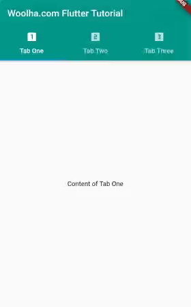
For each Tab passed as the tabs argument of TabBar, you need to define its corresponding view. To do so, you have to pass a list of Widgets as the children argument. The order of the passed widgets must be the same as the order of the tabs.
  static const List<Widget> _views = [
    const Center(child: const Text('Content of Tab One')),
    const Center(child: const Text('Content of Tab Two')),
    const Center(child: const Text('Content of Tab Three')),
  ];
The list of widgets needs to be passed as the tabs argument of the TabBarView.
  TabBarView(
    children: _views,
  )
After creating the TabBar and TabBarView properly, you should have a working tab layout.
Customize TabBar
The optional arguments of TabBar can be used to customize the appearance and behavior of the TabBar.
Set Styles
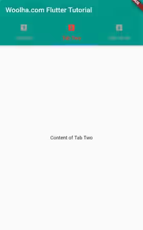
You can set the color of the icon and text by passing a Color value as the labelColor argument. For unselected tabs, you can set a different color for the icon and text by passing another Color as the unselectedLabelColor argument. You can also set the TextStyle by passing labelStyle argument. It also provides unselectedLabelStyle which can be used to set the style for unselected tabs. For setting the colors, you cannot use the labelStyle and unselectedLabelStyle arguments, even though a TextStyle can be used to define a color. You have to use labelColor and unselectedLabelColor arguments for that purpose.
  TabBar(
    labelColor: Colors.red,
    unselectedLabelColor: Colors.grey,
    labelStyle: const TextStyle(fontWeight: FontWeight.bold),
    unselectedLabelStyle: const TextStyle(fontStyle: FontStyle.italic),
    tabs: _tabs,
  )
Output:
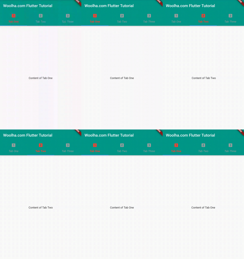
Still related to color, the Tab widget has a parameter called overlayColor which can be used to define the ink colors when the tab is in focused, hovered, and pressed states. You need to pass a function that accepts a Set<MaterialState> as the parameter and returns a Color based on the current state.
  TabBar(
    labelColor: Colors.red,
    unselectedLabelColor: Colors.grey,
    labelStyle: const TextStyle(fontWeight: FontWeight.bold),
    unselectedLabelStyle: const TextStyle(fontStyle: FontStyle.italic),
    overlayColor: MaterialStateColor.resolveWith((Set<MaterialState> states) {
      if (states.contains(MaterialState.pressed)) {
        return Colors.blue;
      } if (states.contains(MaterialState.focused)) {
        return Colors.orange;
      } else if (states.contains(MaterialState.hovered)) {
        return Colors.pinkAccent;
      }

      return Colors.transparent;
    }),
    tabs: _tabs,
  )
Output:
Customize Indicator
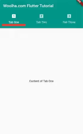
In this context, indicator is part of the layout used to indicate a tab is being selected. By default, Flutter will show a very thin horizontal bar at the bottom of the selected tab. If you want to make it look thicker, you can change the indicatorWeight whose default value is 2.0. The indicator color can be changed by passing a Color as the indicatorColor argument.
Another customization that you can apply for the indicator is the size by passing TabBarIndicatorSize enum value as the indicatorSize argument. If the value is tab, the indicator will be as wide as the tab. If the value is label, the indicator's width depends on the label's width. It's also possible to add padding around the indicator using the indicatorPadding argument whose type is EdgeInsetsGeometry.
  TabBar(
    indicatorWeight: 10,
    indicatorColor: Colors.red,
    indicatorSize: TabBarIndicatorSize.tab,
    indicatorPadding: const EdgeInsets.all(10),
    tabs: _tabs,
  )
Output:
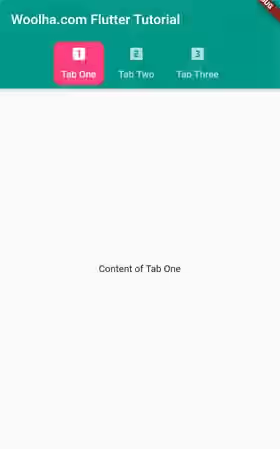
If you want to use a completely different design for the indicator rather than the default horizontal bar at the bottom of the tab, you can pass a Decoration as the indicator argument. If you create a custom indicator, the indicatorColor argument may have no effect if passed.
  TabBar(
    indicatorPadding: const EdgeInsets.all(5),
    indicator: BoxDecoration(
      border: Border.all(color: Colors.red),
      borderRadius: BorderRadius.circular(10),
      color: Colors.pinkAccent,
    ),
    tabs: _tabs,
  )
Output:
Make Tabs Scrollable
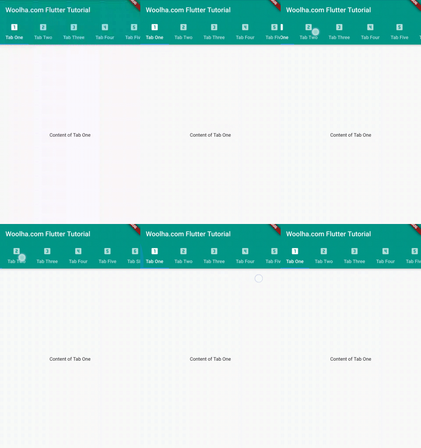
Sometimes, the tabs can be quite long and do not fit into the screen's width. By default, Flutter doesn't make it scrollable. As a result, each tab becomes very narrow and some parts are truncated. The solution is passing a named argument isScrollable with true as the value.
  TabBar(
    isScrollable: true,
    tabs: _tabs,
  )
Output:
Set Physics
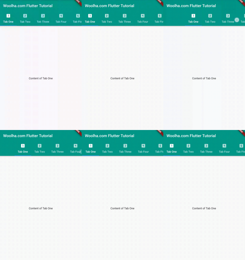
If you make the tabs scrollable, you can also set the physics behavior when the user scrolls the tabs. To do so, pass a ScrollPhysics value as the physics argument. The example below uses BouncingScrollPhysics.
  TabBar(
    isScrollable: true,
    physics: BouncingScrollPhysics(),
    tabs: _tabs,
  )
Output:
Handle on Tab
When a tab is pressed, Flutter will automatically switch to the respective TabView. If you want to trigger another thing when a tab is pressed, you can pass a callback function as the onTap argument.
  TabBar(
    onTap: (int index) {
      print('Tab $index is tapped');
    },
    tabs: _tabs,
  )
Enable Feedback
To enable haptic and/or acoustic feedback, you can pass the enableFeedback argument and set the value to true.
  TabBar(
    enableFeedback: true,
    tabs: _tabs,
  )
Customize TabBarView
The content of the TabBarView depends on the widgets that you pass as the children argument. So, it depends on how you create the widgets. Other than that, Flutter also allows you to customize the behavior of the TabBarView.
Set Physics
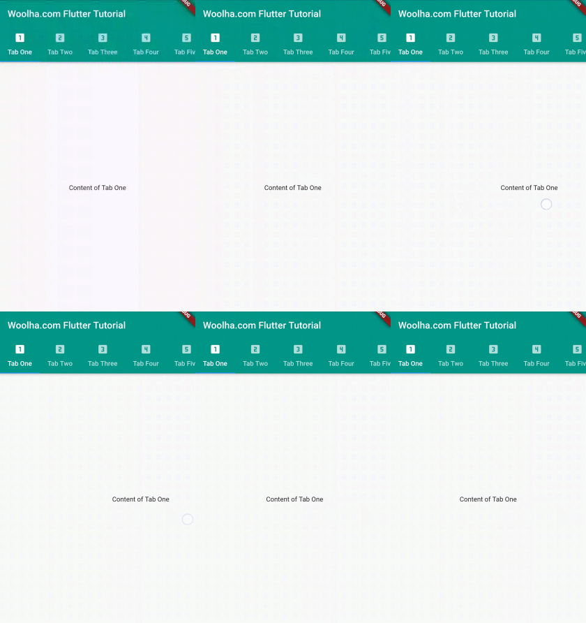
You can set the physics behavior when the user scrolls the TabBarView by passing physics argument to the constructor of TabBarView. The passed value must be a ScrollPhysics. The example below uses BouncingScrollPhysics.
  TabBarView(
    physics: BouncingScrollPhysics(),
    children: _views,
  )
Output:
DefaultTabController - Parameters
Key? key: The widget's key, used to control how a widget is replaced with another.required int length: The number of tabs.int initialIndex: The initial index of the selected tab. Defaults to 0.required Widget child: The widget below this widget in the tree which containsTabBarandTabBarView.
?: value can be null.
required: value must be passed.
TabController - Parameters
required int length: The number of tabs.int initialIndex: The initial index of the selected tab. Defaults to 0.required TickerProvider vsync: TheTickerProviderto use.
required: value must be passed.
TabBar - Parameters
Key? key: The widget's key, used to control how a widget is replaced withrequired List<Widget> tabs: The list of tabs.TabController? controller: Used to control the selection and animation state.bool isScrollable: Whether this tab bar can be scrolled horizontally. Defaults tofalse.Color? indicatorColor: The color of the line below the selected tab.bool automaticIndicatorColorAdjustment:Whether this tab bar should automatically adjust theindicatorColorto white if theindicatorColoris the same as the color of parent widget. Defaults totrue.double indicatorWeight: The thickness of the line below the selected tab. Defaults to 2.0.EdgeInsetsGeometry indicatorPadding: Padding of the indicator. Defaults toEdgeInsets.zero.Decoration? indicator: Used to create a custom indicator.TabBarIndicatorSize? indicatorSize: How to determine the indicator size.Color? labelColor: The color of selected tab labels.TextStyle? labelStyle: The text style of the selected tab labels.EdgeInsetsGeometry? labelPadding: The padding added to each of the tab labels.Color? unselectedLabelColor: The color of unselected tab labels.Color? unselectedLabelStyle: The text style of the unselected tab labels.DragStartBehavior dragStartBehavior: Determines the way that drag start behavior is handled. Defaults toDragStartBehavior.start.MaterialStateProperty<Color?>? overlayColor: Defines the ink response focus, hover, and splash colors.MouseCursor? mouseCursor: The mouse cursor when the pointer is hovering over the tabs..bool? enableFeedback: Whether gestures should provide acoustic and/or haptic feedback.ValueChanged<int>? onTap: A callback to be called when a tab is tapped.ScrollPhysics? physics: The physics effect which affects the amination when the user interacts.
?: value can be null.
required: value must be passed.
TabBarView - Parameters
Key? key: The widget's key, used to control how a widget is replaced with another widget.required List<Widget> children: The widgets for each tab.TabController? controller: Used to control the selection and animation state.ScrollPhysics? physics: The physics effect which affects the amination when the user interacts.DragStartBehavior dragStartBehavior: Determines the way that drag start behavior is handled. Defaults toDragStartBehavior.start.
?: value can be null.
required: value must be passed.
Full Code
  import 'package:flutter/gestures.dart';
  import 'package:flutter/material.dart';
  import 'package:flutter/rendering.dart';

  void main() => runApp(MyApp());

  class MyApp extends StatelessWidget {

    @override
    Widget build(BuildContext context) {
      return MaterialApp(
        title: 'Woolha.com Flutter Tutorial',
        home: TabLayoutExample(),
      );
    }
  }

  class TabLayoutExample extends StatefulWidget {
    @override
    State<StatefulWidget> createState() {
      return _TabLayoutExampleState();
    }

  }

  class _TabLayoutExampleState extends State<TabLayoutExample> with TickerProviderStateMixin {

    late TabController _tabController;

    @override
    void initState() {
      super.initState();
      _tabController = TabController(length: 6, vsync: this);
      _tabController.animateTo(2);
    }

    static const List<Tab> _tabs = [
      const Tab(icon: Icon(Icons.looks_one), child: const Text('Tab One')),
      const Tab(icon: Icon(Icons.looks_two), text: 'Tab Two'),
      const Tab(icon: Icon(Icons.looks_3), text: 'Tab Three'),
      const Tab(icon: Icon(Icons.looks_4), text: 'Tab Four'),
      const Tab(icon: Icon(Icons.looks_5), text: 'Tab Five'),
      const Tab(icon: Icon(Icons.looks_6), text: 'Tab Six'),
    ];

    static const List<Widget> _views = [
      const Center(child: const Text('Content of Tab One')),
      const Center(child: const Text('Content of Tab Two')),
      const Center(child: const Text('Content of Tab Three')),
      const Center(child: const Text('Content of Tab Four')),
      const Center(child: const Text('Content of Tab Five')),
      const Center(child: const Text('Content of Tab Six')),
    ];

    @override
    Widget build(BuildContext context) {
      return MaterialApp(
        home: DefaultTabController(
          length: 6,
          child: Scaffold(
            appBar: AppBar(
              bottom: TabBar(
                labelColor: Colors.white,
                unselectedLabelColor: Colors.grey,
                labelStyle: const TextStyle(fontWeight: FontWeight.bold),
                unselectedLabelStyle: const TextStyle(fontStyle: FontStyle.italic),
                overlayColor: MaterialStateColor.resolveWith((Set<MaterialState> states) {
                  if (states.contains(MaterialState.pressed)) {
                    return Colors.blue;
                  } if (states.contains(MaterialState.focused)) {
                    return Colors.orange;
                  } else if (states.contains(MaterialState.hovered)) {
                    return Colors.pinkAccent;
                  }

                  return Colors.transparent;
                }),
                indicatorWeight: 10,
                indicatorColor: Colors.red,
                indicatorSize: TabBarIndicatorSize.tab,
                indicatorPadding: const EdgeInsets.all(5),
                indicator: BoxDecoration(
                  border: Border.all(color: Colors.red),
                  borderRadius: BorderRadius.circular(10),
                  color: Colors.pinkAccent,
                ),
                isScrollable: true,
                physics: BouncingScrollPhysics(),
                onTap: (int index) {
                  print('Tab $index is tapped');
                },
                enableFeedback: true,
                // Uncomment the line below and remove DefaultTabController if you want to use a custom TabController
                // controller: _tabController,
                tabs: _tabs,
              ),
              title: const Text('Woolha.com Flutter Tutorial'),
              backgroundColor: Colors.teal,
            ),
            body: const TabBarView(
              physics: BouncingScrollPhysics(),
              // Uncomment the line below and remove DefaultTabController if you want to use a custom TabController
              // controller: _tabController,
              children: _views,
            ),
          ),
        ),
      );
    }
  }
Summary
That’s how to create a tab layout in Flutter. First, you need to have a TabController. Then, you need to create a TabBar which contains the list of tabs and a TabBarView which contains the views for each tab. The styles of behavior of the tabs can be customized by passing the optional arguments.
