
This tutorial shows you how to use Stack and IndexedStack widgets in Flutter.
In Flutter, Stack is a widget that positions its children relative to the edges of its box. It can be useful if you want to overlap several widgets in a simple way. Basically, you need to pass the widgets as the children of a Stack widget. There's also a related widget called IndexedStack, which can only show one child at the same time. This tutorial explains how to use those two widgets.
Using Stack
To use the Stack widget, you need to call its constructor.
  Stack({
    Key? key,
    AlignmentGeometry alignment = AlignmentDirectional.topStart,
    TextDirection? textDirection,
    StackFit fit = StackFit.loose,
    @Deprecated(
      'Use clipBehavior instead. See the migration guide in flutter.dev/go/clip-behavior. '
      'This feature was deprecated after v1.22.0-12.0.pre.'
    )
    Overflow overflow = Overflow.clip,
    Clip clipBehavior = Clip.hardEdge,
    List<Widget> children = const <Widget>[],
  })
In general, you need to pass the widgets to be rendered in the stack as the children argument. To set the position of a child, you can wrap it as the child of a Positioned widget. The Stack widget also allows you to customize several things such as the children alignment and the clip behavior.
Set Size
By default, the size of the Stack widget depends on the sizes of the widgets passed as the children argument, by creating a 'box' that can contain all of its children. You can change the size of a Stack widget by applying size constraints using another widget such as SizedBox, Container, or ConstrainedBox.
  Container(
    width: 200,
    height: 200,
    decoration: BoxDecoration(
      border: Border.all(),
    ),
    child: Stack(
      // put the arguments here
    ),
  )
For the next examples in this tutorial, let's assume the Stack widget is wrapped as the child of the above Container.
Create Children
The widgets that need to be put in a Stack must be passed as the children argument whose type is List<Widget>. The order of the widgets in the List is important. Flutter paints the widget from the first (the one with lowest index) to the last (the one with the highest index) in the same order they're defined in the list. That means if you want to paint widget X on the top of widget Y, the widget Y must be defined before widget X in the list. If you don't pass the children argument, it defaults to an empty list.
Each child in the list is either positioned or non-positioned. A positioned child must be wrapped in a Positioned widget and at least one of the Positioned's properties other than child is not null.
Using Positioned
Positioned is a widget used to position a child of a Stack widget. It must be a descendant of a Stack widget. There can only be StatelessWidget and StatefulWidget on the path between the Positioned widget and its enclosing Stack widget.
There are some properties of Positioned widget that determine the position and the dimension of the child widget. The properties are left, top, right, bottom, width, and height. The first four properties are used to set the position of the child relative from the respective edge. For example, the left property is used to set the position relative from the left edge. The last two properties, width and height, are used to set the child widget's width and the height respectively. This tutorial only shows you how to create a Positioned widget using the main constructor which can be seen below. For other ways to create a Positioned object, you can read our tutorial about Positioned widget.
  const Positioned({
    Key? key,
    double left,
    double top,
    double right,
    double bottom,
    double width,
    double height,
    required Widget child,
  })
You are required to pass a widget as the child argument. For horizontal values (left, right, and width), you can only set two of them (not all). The same also applies for the vertical values (top, bottom, and height).
Below is the example of how to create and pass the value for the children argument.
  Stack(
    children: [
      Container(width: 100, height: 150, color: Colors.red),
      Container(width: 150, height: 50, color: Colors.green),
      Positioned(
        top: 20,
        bottom: 20,
        left: 130,
        right: 20,
        child: Container(width: 1, height: 1, color: Colors.blue),
      ),
    ],
  )
Output:
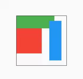
As you can see from the output, the red Container is painted first, followed by the green Container. The red and green Containers are non-positioned. Therefore, they use the default alignment (topStart). Later, we are going to change the alignment for non-positioned widgets. The blue Container is a positioned widget. You can see that it's placed according to the distance value from the respective edges. Even though the Container has its own width and height, Flutter uses the position and size constraints from the Positioned widget.
Set Alignment
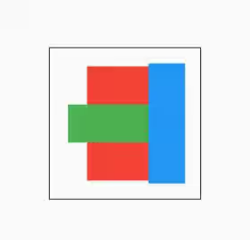
You can set how to align non-positioned children by passing the alignment argument whose type is AlignmentGeometry. The example below changes the alignment value to center. It causes all non-positioned widgets to be aligned to the center.
  Stack(
    alignment: Alignment.center,
    children: [
      Container(width: 100, height: 150, color: Colors.red),
      Container(width: 150, height: 50, color: Colors.green),
      Positioned(
        top: 20,
        bottom: 20,
        left: 130,
        right: 20,
        child: Container(width: 1, height: 1, color: Colors.blue),
      ),
    ],
  )
Output:
Set Text Direction
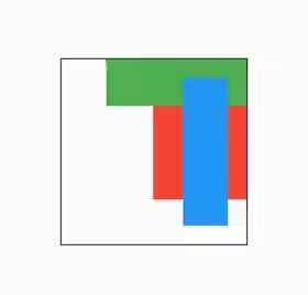
The text direction in this context is used for aligning non-positioned children. You can pass a TextDirection enum as the textDirection argument to change the value. In the example below, the value of textDirection is set to rtl. Therefore, Flutter places the non-positioned children from the right edge.
  Stack(
    textDirection: TextDirection.rtl,
    children: [
      Container(width: 100, height: 150, color: Colors.red),
      Container(width: 150, height: 50, color: Colors.green),
      Positioned(
        top: 20,
        bottom: 20,
        left: 130,
        right: 20,
        child: Container(width: 1, height: 1, color: Colors.blue),
      ),
    ],
  )
Output:
Set Clip Behavior
Sometimes there can be some children that overflow the size constraints of the Stack. You can control how to clip those overflown children by passing the clip argument. The value you need to pass is a Clip enum, whose possible values are:
none: No clip at all. It should be used if the children do not overflow the boundary.hardEdge: Clip, but do not apply anti-aliasing. It clips the overflow content with curves and non-axis-aligned straight lines are jagged. It's slower thannone, but faster than other clipping modes.antiAlias: Clip with anti-aliasing. It uses anti-aliased clipping edges to achieve a smoother look. It's slower thanhardEdge, but much faster thanantiAliasWithSaveLayer.antiAliasWithSaveLayer: Clip with anti-aliasing and saveLayer immediately following the clip. Besides using anti-aliasing, it also allocates an offscreen buffer. It's much slower thanantiAlias.
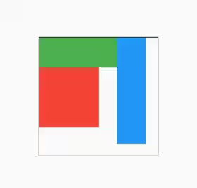
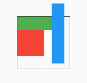
For example, let's try to change the top property of the Positioned widget to a negative value. By default, if you don't pass the clipBehavior argument, it defaults to Clip.hardEdge. In the result, you can see that the overflowing content is clipped.
  Stack(
    children: [
      Container(width: 100, height: 150, color: Colors.red),
      Container(width: 150, height: 50, color: Colors.green),
      Positioned(
        top: -50,
        bottom: 20,
        left: 130,
        right: 20,
        child: Container(width: 1, height: 1, color: Colors.blue),
      ),
    ],
  )
Output:
Below is another example where the clipBehavior is set to Clip.none. In the result, you can see that the overflowing content is not clipped.
  Stack(
    clipBehavior: Clip.none,
    children: [
      Container(width: 100, height: 150, color: Colors.red),
      Container(width: 150, height: 50, color: Colors.green),
      Positioned(
        top: -50,
        bottom: 20,
        left: 130,
        right: 20,
        child: Container(width: 1, height: 1, color: Colors.blue),
      ),
    ],
  )
Output:
Set Fit
You can set how non-positioned widgets should be sized by passing the fit argument whose type is StackFit enum. The enum has the following values:
loose: The constraints passed to theStackfrom its parent are loosened. For example, if theStackhas size constraints of 100 x 200, the width of each non-positioned child must be between 0 to 100, while the height must be between 0 to 200.expand: The constraints passed to theStackfrom its parent are tightened to the biggest size allowed. It forces all non-positioned children to use the maximum width and height constraints of theStack.passthrough: The constraints passed to theStackfrom its parent are passed unmodified to the non-positioned children.
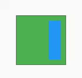
The default value if the argument is not passed is fit. In the example below, the fit value is set to expand. As a result, the non-positioned children will have the biggest size allowed.
  Stack(
    fit: StackFit.expand,
    children: [
      Container(width: 100, height: 150, color: Colors.red),
      Container(width: 150, height: 50, color: Colors.green),
      Positioned(
        top: 20,
        bottom: 20,
        left: 130,
        right: 20,
        child: Container(width: 1, height: 1, color: Colors.blue),
      ),
    ],
  )
Output:
Using IndexedStack
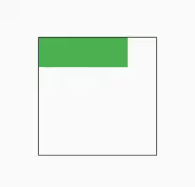
IndexedStack is a Stack that can only show at most one of its children at the same time. The currently displayed child is specified using the index argument. The valid values for index range from 0 (the first child) to size - 1 (the last child). If the index is null, no child will be displayed.
The constructor of IndexedStack can be seen below.
  IndexedStack({
    Key? key,
    AlignmentGeometry alignment = AlignmentDirectional.topStart,
    TextDirection? textDirection,
    StackFit sizing = StackFit.loose,
    int index = 0,
    List<Widget> children = const <Widget>[],
  })
Some of the arguments are similar to the constructor of Stack, but there are some differences as well. Since it only displays one child at the same time, you have to specify the index of the child that should be displayed as the index argument. If you don't pass the index argument, the value defaults to 0. Another difference is it doesn't have overflow and clipBehavior arguments.
  IndexedStack(
    index: 1,
    children: [
      Container(width: 100, height: 150, color: Colors.red),
      Container(width: 150, height: 50, color: Colors.green),
      Positioned(
        top: 20,
        bottom: 20,
        left: 130,
        right: 20,
        // width: 100,
        // height: 50,
        child: Container(width: 1, height: 1, color: Colors.blue),
      ),
    ],
  )
Output:
How to control the placement of the children is the same as explanation of the Stack widget. A child can be positioned or non-positioned. The textDirection and alignment arguments also have the same effect. Therefore, you can refer to the above explanation.
Stack - Parameters
Key? key: The widget's key, used to control how a widget is replaced with another widget.AlignmentGeometry alignment: How to align the non-positioned and partially-positioned children.TextDirection? textDirection: The text direction to resolve the alignment.StackFit fit: How to size the non-positioned children in the stack. Defaults toStackFit.loose.@Deprecated Overflow overflow: Whether overflowing children should be clipped. Defaults toOverflow.clip.Clip clipBehavior: How to clip the content. Defaults toClip.hardEdge.List<Widget> children: The widgets below this widget in the tree. Defaults toconst <Widget>[].
?: value can be null.
IndexedStack - Parameters
Key? key: The widget's key, used to control how a widget is replaced with another widget.AlignmentGeometry alignment: How to align the non-positioned and partially-positioned children.TextDirection? textDirection: The text direction to resolve the alignment.StackFit sizing: How to size the non-positioned children in the stack. Defaults toStackFit.loose.int index: The index of the child to show. Defaults to 0.List<Widget> children: The widgets below this widget in the tree. Defaults toconst <Widget>[].
?: value can be null.
Full Code
  import 'package:flutter/material.dart';

  void main() => runApp(MyApp());

  class MyApp extends StatelessWidget {

    @override
    Widget build(BuildContext context) {
      return MaterialApp(
        title: 'Woolha.com Flutter Tutorial',
        home: StackExample(),
        debugShowCheckedModeBanner: false,
      );
    }
  }

  class StackExample extends StatelessWidget {

    @override
    Widget build(BuildContext context) {
      return Scaffold(
        appBar: AppBar(
          title: const Text('Woolha.com Flutter Tutorial'),
        ),
        body: Center(
          child: Container(
            width: 200,
            height: 200,
            decoration: BoxDecoration(
              border: Border.all(),
            ),
            child: Stack(
              alignment: Alignment.center,
              textDirection: TextDirection.rtl,
              // fit: StackFit.expand,
              clipBehavior: Clip.hardEdge,
              children: [
                Container(width: 120, height: 150, color: Colors.red),
                Container(width: 150, height: 50, color: Colors.green),
                Positioned(
                  top: 20,
                  bottom: 20,
                  left: 130,
                  right: 20,
                  // width: 100,
                  // height: 50,
                  child: Container(width: 1, height: 1, color: Colors.blue),
                ),
              ],
            ),
          ),
          // child: Container(
          //   width: 200,
          //   height: 200,
          //   decoration: BoxDecoration(
          //     border: Border.all(),
          //   ),
          //   child: IndexedStack(
          //     index: null,
          //     children: [
          //       Container(width: 100, height: 150, color: Colors.red),
          //       Container(width: 150, height: 50, color: Colors.green),
          //       Positioned(
          //         top: -50,
          //         bottom: 20,
          //         left: 130,
          //         right: 20,
          //         // width: 100,
          //         // height: 50,
          //         child: Container(width: 1, height: 1, color: Colors.blue),
          //       ),
          //     ],
          //   ),
          // ),
        ),
      );
    }
  }
Summary
The Stack widget can be used if you need to place some widgets relative to a box. You need to pass a List<Widget> as the children argument and you can set each child to be positioned or non-positioned. For non-positioned children, you can specify the alignment and textDirection, and fit arguments in order to change their placement and size. The clipBehavior argument can be set to determine how overflowing content should be clipped. In case there can only be one widget displayed at the same time, you can use the IndexedStack widget instead.
It's recommended to read our tutorials about:
Positioned, a widget used to control where a child of aStackwidget should be placed.
