
This tutorial shows you how to use the SearchAnchor widget in Flutter for creating a search view with suggestion list.
If an application has search functionality, it's quite common to have a search bar where the user can type the search keyword. In many cases, displaying a dynamic suggestion list can be helpful for the users. Usually, when the search bar is tapped, the application will display a suggestion list in a search view. This tutorial shows you how to do it in Flutter.
Basically, there are two main components that you have to create. The first one is the initial widget to be displayed before the user performs a search. Typically, it's a SearchBar or a search icon. When the user clicks on the initial widget, the application should switch to display a search view. The search view contains a list of suggestions where the user can select any of them.
Actually, you can only have a search bar without the suggestion list. In that case, using the SearchBar widget should be enough. We have a tutorial about how to use and customize the SearchBar widget in Flutter.
For creating a search view, you can use Flutter's SearchAnchor widget. Below are the examples of how to use it.
Using SearchAnchor
Here is the constructor of SearchAnchor.
  SearchAnchor({
    Key? key,
    bool? isFullScreen,
    SearchController? searchController,
    ViewBuilder? viewBuilder,
    Widget? viewLeading,
    Iterable<Widget>? viewTrailing,
    String? viewHintText,
    Color? viewBackgroundColor,
    double? viewElevation,
    Color? viewSurfaceTintColor,
    BorderSide? viewSide
    OutlinedBorder? viewShape,
    TextStyle? headerTextStyle,
    TextStyle? headerHintStyle,
    Color? dividerColor,
    BoxConstraints? viewConstraints,
    required SearchAnchorChildBuilder builder
    required SuggestionsBuilder suggestionsBuilder
  })
There are two required arguments. The first one is bulider, for which you need to pass a function that returns the initial widget that can open the search view. The other one is suggestionsBuilder which requires a function that returns the widget for displaying the suggestion list.
Basic Usage
First, we need to create a function to be passed as the builder argument. It has to return the initial widget to be displayed before the user taps on it. The function must have two parameters whose types in order are BuildContext and SearchController. That means you are able to access the BuildContext and the SearchController of the SearchAnchor for building the initial widget.
In this example, we are going to use a SearchBar as the initial widget. However, you can use any widget such as an IconButton or a button. Since the widget is responsible to open the search view when it's tapped, you need to programmatically open the search view. It can be done by using the openView method of the SearchAnchor's SearchController. The SearchController itself can be set by using the searchController argument. Therefore, even though the searchController argument is not required, most likely you will need to use it.
For the suggestionsBuilder builder, you have to pass a function that returns a list of widgets, each representing a suggestion item. The function also has two parameters of type BuildContext and SearchController.
The widgets returned by the function are laid out in a ListView. If you want to use a different widget other than the ListView, you can use the viewBuilder argument. I'm going to explain how to use the viewBuilder later. For a ListView, it's quite common to have ListTile widgets as the children. Therefore, we are going to make the suggestionsBuilder returns a list of ListTile widgets.
The list of suggestions usually depends on the current text in the search bar. Since the function is called with a SearchController argument, you can obtain the current value from it.
Based on the explanation above, we are going to create a basic SearchAnchor implementation. First, create a SearchController using the constructor.
final SearchController _searchController = SearchController();Below is a basic example that only passes the required arguments and the searchController argument.
  class _SearchAnchorExampleState extends State<SearchAnchorExample> {

    final SearchController _searchController = SearchController();

    // these will be reused later
    final leading = const Icon(Icons.search);
    final trailing = [
      IconButton(
        icon: const Icon(Icons.keyboard_voice),
        onPressed: () {
          print('Use voice command');
        },
      ),
      IconButton(
        icon: const Icon(Icons.camera_alt),
        onPressed: () {
          print('Use image search');
        },
      ),
    ];

    @override
    Widget build(BuildContext context) {
      return Column(
        mainAxisAlignment: MainAxisAlignment.center,
        children: <Widget>[
          SearchAnchor(
            searchController: _searchController,
            builder: (BuildContext context, SearchController controller) {
              return SearchBar(
                leading: leading,
                trailing: trailing,
                onTap: () {
                  _searchController.openView();
                },
              );
            },
            suggestionsBuilder: (BuildContext context, SearchController controller) {
              final keyword = controller.value.text;
              return List.generate(5, (index) => 'Item $index')
                .where((element) => element.toLowerCase().startsWith(keyword.toLowerCase()))
                .map((item) => ListTile(
                  title: Text(item),
                  onTap: () {
                    setState(() {
                      controller.closeView(item);
                      FocusScope.of(context).unfocus();
                    });
                  },
                ));
            },
          ),
          Expanded(
            child: Center(
              child: _searchController.text.isEmpty
                  ? const Text('No keyword')
                  : Text('Keyword: ${_searchController.value.text}'),
            ),
          ),
        ],
      );
    }
  }
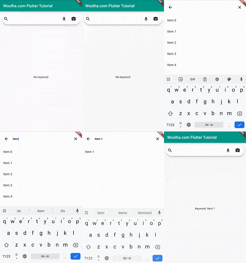
Output:
Set Leading and Trailing Widgets
When the search view is open, you can set a widget to be put before the input field by passing it as the viewLeading argument. If you don't pass the argument, Flutter will display a back button.
In addition, you can also pass a list of widgets as the viewTrailing argument and they will be placed after the input field. It defaults to a clear icon that clears the text.
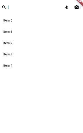
If the initial widget is a search bar with some leading and trailing widgets, you probably want to keep the same leading and trailing widgets to make the transition seamless.
In the example below, the leading and trailing variables are from the previous example.
  SearchAnchor(
    viewLeading: leading,
    viewTrailing: trailing,
    // other arguments
  )
Output:
Set Text Style
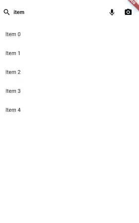
The text style used on the input field can be set by passing a TextStyle as the headerTextStyle argument. If you don't pass the argument, it defaults to the theme's bodyLarge text style. The default text color is ColorScheme.onSurface.
  SearchAnchor(
    headerTextStyle: const TextStyle(fontWeight: FontWeight.bold),
    // other arguments
  )
Output:
Set Hint Text
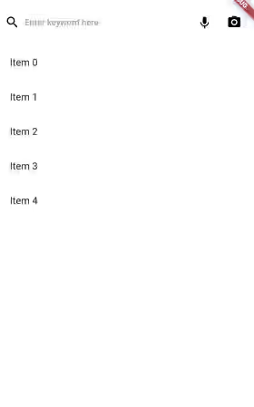
You can pass a hint text as the hintText argument and it will be displayed if the input field is empty.
The text style for the hint text can be set by using the headerHintStyle argument. If null, the default values in order are SearchViewThemeData.headerHintStyle, value of headerTextStyle argument, and the theme's bodyLarge text style. The default text color is ColorScheme.onSurfaceVariant.
  SearchAnchor(
    viewHintText: 'Enter keyword here',
    headerHintStyle: const TextStyle(color: Colors.grey),
    // other arguments
  )
Output:
Set Background Color
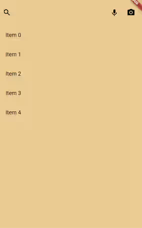
The background color of the search view can be set by using the viewBackgroundColor argument. The default value is SearchViewThemeData.backgroundColor. If that's also null, Flutter will use the value of ColorScheme.surface.
  SearchAnchor(
    viewBackgroundColor: const Color.fromARGB(255, 234, 204, 146),
    // other arguments
  )
Output:
Set Divider Color
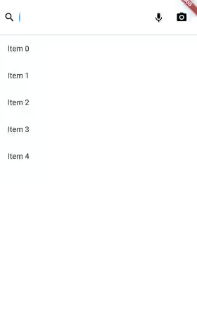
There is a divider between the input field and the search view. The color can be set by using the dividerColor property. It defaults to SearchViewThemeData.dividerColor if it's not null, otherwise it falls back to ColorScheme.outline.
  SearchAnchor(
    dividerColor: Colors.teal,
    // other arguments
  )
Output:
Enable/Disable Full Screen
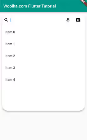
By default, the search view fills the entire screen on mobile devices. On other platforms, the size is determined by the anchor and the default size. To change that behavior, you can pass a boolean value as the isFullScreen argument.
  SearchAnchor(
    isFullScreen: false,
    // other arguments
  )
Output:
Set Elevation
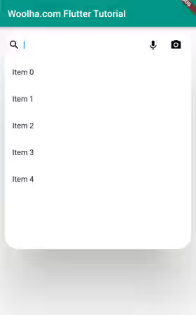
The elevation of the search view can be set by passing a double value as the viewElevation argument. The default value is obtained from the SearchViewThemeData.elevation which falls back to 6.0 if the default value is null. The elevation is only visible if isFullScreen is false.
  SearchAnchor(
    isFullScreen: false,
    viewElevation: 100,
    // other arguments
  )
Output:
Set Outline
There is another argument named viewSide for setting the outline of the search view. It allows you to define and pass a custom BorderSide value. Flutter uses SearchViewThemeData.side as the default value and there will be no outline if the theme's value is null. Keep in mind that it will not have any effect if the widget is set to full screen.
  SearchAnchor(
    isFullScreen: false,
    viewSide: const BorderSide(color: Colors.pinkAccent),
    // other arguments
  )
Output:
Set Shape
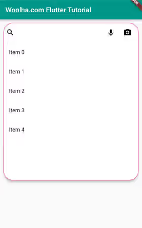
The shape of the search view can be set by passing an OutlinedBorder value as the viewShape argument. If it's not passed, Flutter will use the value of SearchViewThemeData.shape. If the theme doesn't have the value, the shape is a rectangle for full-screen and a RoundedRectangleBorder with a radius of 28.0 for non full-screen. While it's possible to set the outline using this argument, it will be replaced by the one set using the viewSide argument if it's not null.
  SearchAnchor(
    isFullScreen: false,
    viewShape: const ContinuousRectangleBorder(
      borderRadius: BorderRadius.all(Radius.circular(20)),
      side: BorderSide(color: Colors.pinkAccent),
    ),
    // other arguments
  )
Output:
Set Size Constraints
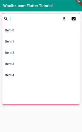
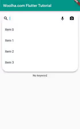
When the view is not full screen, by default the width is the same as the anchor, while the height is 2/3 of the screen. You can set different size constraints by defining a BoxConstraints and pass it as the viewConstraints argument. The value of SearchViewThemeData.constraints will be used as the default value. If the theme's constraints value is null, it defaults to const BoxConstraints(minWidth: 360.0, minHeight: 240.0).
  SearchAnchor(
    isFullScreen: false,
    viewConstraints: const BoxConstraints(
      maxHeight: 300,
    ),
    // other arguments
  )
Output:
Set View Builder
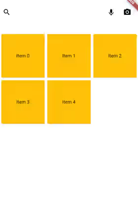
By default, the widgets returned by the suggestionsBuilder will be set as the children of a ListView. If you want to use a different parent widget other than a ListView (or if you want to customize the ListView, you can do it by passing a function as the viewBuilder argument.
The function has a parameter whose value is the list of widgets returned by the suggestionsBuilder function. Inside the function, you have to return the parent widget that contains the suggestions. In the example below, we use a GridView to put the suggestions.
  SearchAnchor(
    suggestionsBuilder: (BuildContext context, SearchController controller) {
      final keyword = controller.value.text;
      return List.generate(5, (index) => 'Item $index')
        .where((element) => element.toLowerCase().startsWith(keyword.toLowerCase()))
        .map((item) => GestureDetector(
          onTap: () {
            setState(() {
              controller.closeView(item);
            });
          },
          child: Card(
            color: Colors.amber,
            child: Center(child: Text(item)),
          ),
        ));
    },
    viewBuilder: (Iterable<Widget> suggestions) {
      return GridView.builder(
          gridDelegate: const SliverGridDelegateWithFixedCrossAxisCount(
            crossAxisCount: 3,
          ),
          itemCount: suggestions.length,
          itemBuilder: (BuildContext context, int index) {
            return suggestions.elementAt(index);
          }
      );
    },
    // other arguments
  )
Output:
Using SearchAnchor.bar
There is another constructor that's suitable for cases when the initial widget is a search bar. With this constructor, you don't have to manually create the SearchBar and handle the tap events for opening the search view.
  SearchAnchor.bar({
    Widget? barLeading,
    Iterable<Widget>? barTrailing,
    String? barHintText,
    GestureTapCallback? onTap,
    MaterialStateProperty<double?>? barElevation,
    MaterialStateProperty<Color?>? barBackgroundColor,
    MaterialStateProperty<Color?>? barOverlayColor,
    MaterialStateProperty<BorderSide?>? barSide,
    MaterialStateProperty<OutlinedBorder?>? barShape,
    MaterialStateProperty<EdgeInsetsGeometry?>? barPadding,
    MaterialStateProperty<TextStyle?>? barTextStyle,
    MaterialStateProperty<TextStyle?>? barHintStyle,
    Widget? viewLeading,
    Iterable<Widget>? viewTrailing,
    String? viewHintText,
    Color? viewBackgroundColor,
    double? viewElevation,
    BorderSide? viewSide,
    OutlinedBorder? viewShape,
    TextStyle? viewHeaderTextStyle,
    TextStyle? viewHeaderHintStyle,
    Color? dividerColor,
    BoxConstraints? constraints,
    BoxConstraints? viewConstraints,
    bool? isFullScreen,
    SearchController searchController,
    required SuggestionsBuilder suggestionsBuilder
  })
The constructor has a lot of arguments. The only required argument is suggestionsBuilder. Those started with bar are used to customize the SearchBar, while those started with view are used to customize the search view. The exception is the constraints argument which is used to add constraints for the SearchBar widget only, even though it doesn't have the bar prefix.
The SearchAnchor's arguments with the bar prefix are equivalent to the respective arguments of SearchBar without the bar. For example, SearchAnchor's barLeading is equivalent to SearchBar's leading. I'm not going to explain those arguments one by one in this tutorial. Instead, you can read our tutorial about SearchBar.
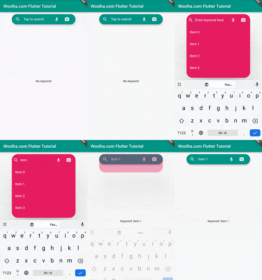
Below is the usage example of the named constructor.
  class _SearchAnchorBarExampleState extends State<SearchAnchorExample> {

    final SearchController _searchController = SearchController();

    final trailing = [
      IconButton(
        icon: const Icon(Icons.keyboard_voice, color: Colors.white),
        onPressed: () {
          print('Use voice command');
        },
      ),
      IconButton(
        icon: const Icon(Icons.camera_alt, color: Colors.white),
        onPressed: () {
          print('Use image search');
        },
      ),
    ];

    @override
    Widget build(BuildContext context) {
      return Column(
        mainAxisAlignment: MainAxisAlignment.center,
        children: <Widget>[
          SearchAnchor.bar(
            searchController: _searchController,
            barTrailing: trailing,
            barLeading: const Icon(Icons.search, color: Colors.white),
            barBackgroundColor: MaterialStateProperty.all(Colors.teal),
            barTextStyle: MaterialStateProperty.all(
                const TextStyle(color: Colors.white)
            ),
            barHintText: 'Tap to search',
            barHintStyle: MaterialStateProperty.all(
                const TextStyle(color: Colors.white)
            ),
            constraints: const BoxConstraints(
              maxWidth: 300,
            ),
            viewLeading: const Icon(Icons.search, color: Colors.white),
            viewTrailing: trailing,
            viewBackgroundColor: Colors.pink,
            viewHeaderTextStyle: const TextStyle(color: Colors.white),
            viewHintText: 'Enter keyword here',
            viewHeaderHintStyle: const TextStyle(color: Colors.white),
            viewConstraints: const BoxConstraints(
              maxWidth: 300,
              maxHeight: 300,
            ),
            viewElevation: 100,
            dividerColor: Colors.teal,
            isFullScreen: false,
            suggestionsBuilder: (BuildContext context, SearchController controller) {
              final keyword = controller.value.text;
              return List.generate(5, (index) => 'Item $index')
                  .where((element) => element.toLowerCase().startsWith(keyword.toLowerCase()))
                  .map((item) => GestureDetector(
                onTap: () {
                  setState(() {
                    controller.closeView(item);
                  });
                },
                child: ListTile(
                  title: Text(item, style: const TextStyle(color: Colors.white)),
                  onTap: () {
                    setState(() {
                      controller.closeView(item);
                      FocusScope.of(context).unfocus();
                    });
                  },
                ),
              ));
            },
          ),
          Expanded(
            child: Center(
              child: _searchController.text.isEmpty
                  ? const Text('No keyword')
                  : Text('Keyword: ${_searchController.value.text}'),
            ),
          ),
        ],
      );
    }
  }
Output:
Set SearchViewThemeData
If the application has more than one search views and you want to apply a general theme, you can define a SearchViewThemeData. Below is the constructor.
  const SearchViewThemeData({
    Color? backgroundColor,
    double? elevation,
    Color? surfaceTintColor,
    BoxConstraints? constraints,
    BorderSide? side,
    OutlinedBorder? shape,
    TextStyle? headerTextStyle,
    TextStyle? headerHintStyle,
    Color? dividerColor,
  })
You need to pass it as the searchViewTheme argument of a ThemeData. The ThemeData itself has to be passed as the theme argument of the MaterialApp.
  MaterialApp(
    title: 'Woolha.com Flutter Tutorial',
    theme: ThemeData.light().copyWith(
      searchViewTheme: const SearchViewThemeData(
        dividerColor: Colors.teal,
      ),
    ),
    home: const Home(),
  )
SearchAnchor Parameters
Key? key: The widget's key, used to control how a widget is replaced with another.bool? isFullScreen: Whether the search view should fill the entire screen.SearchController? searchController: A controller that can be used to open and close the search view.ViewBuilder? viewBuilder: A function to return the widget to lay out the suggestion list of the search view.Widget? viewLeading: The widget to be displayed before the input field.Iterable<Widget>? viewTrailing: List of widgets to be displayed after the input field when the search view is open.String? viewHintText: The hint text to be displayed when the search bar is empty and the search view is open.Color? viewBackgroundColor: The background color of the search view.double? viewElevation: The elevation of the search view.Color? viewSurfaceTintColor: The surface tint color of the search view.BorderSide? viewSide: The outline of the search view.OutlinedBorder? viewShape: The shape of the search view.TextStyle? headerTextStyle: The style for the inputted text on search view.TextStyle? headerHintStyle: The style for the hint text on search view.Color? dividerColor: The color of the search view divider.BoxConstraints? viewConstraints: The size constraints for the search view.required SearchAnchorChildBuilder builder: A function to create a widget that can open the search view when tapped.required SuggestionsBuilder suggestionsBuilder: A function to return the widgets for displaying suggestion item.
SearchAnchor.bar Parameters
Widget? barLeading: A widget to be displayed before the input field of the search bar.Iterable<Widget>? barTrailing: List of widgets to be displayed after the input field of the search bar.String? barHintText: Text that suggests what should be inputted.GestureTapCallback? onTap: The hint text to be displayed when the search bar is empty and the search view is closed.MaterialStateProperty<double?>? barElevation: The elevation of the search bar when the search view is closed.MaterialStateProperty<Color?>? barBackgroundColor: The background color of the search bar when the search view is closed.MaterialStateProperty<Color?>? barOverlayColor: The highlight color to indicate the state of the search bar when the search view is closed.MaterialStateProperty<BorderSide?>? barSide: The outline of the search bar when the search view is closed.MaterialStateProperty<OutlinedBorder?>? barShape: The shape of the search bar when the search view is closed.MaterialStateProperty<EdgeInsetsGeometry?>? barPadding: The padding between the search bar's boundary and the contents when the search view is closed.MaterialStateProperty<TextStyle?>? barTextStyle: The style for the inputted text.MaterialStateProperty<TextStyle?>? barHintStyle: The style for thebarHintText.Widget? viewLeading: The widget to be displayed before the input field.Iterable<Widget>? viewTrailing: List of widgets to be displayed after the input field when the search view is open.String? viewHintText: The hint text to be displayed when the search bar is empty and the search view is open.Color? viewBackgroundColor: The background color of the search view.double? viewElevation: The elevation of the search view.BorderSide? viewSide: The outline of the search view.OutlinedBorder? viewShape: The shape of the search view.TextStyle? viewHeaderTextStyle: The style for the inputted text on search view.TextStyle? viewHeaderHintStyle: The style for the hint text on search view.Color? dividerColor: The color of the search view divider.BoxConstraints? constraints: The size constraints for the search bar.BoxConstraints? viewConstraints: The size constraints for the search view.bool? isFullScreen: Whether the search view should fill the entire screen.SearchController searchController: The controller that can be used to open or close the search view.required SuggestionsBuilder suggestionsBuilder: A function to return the widgets for displaying suggestion item.
SearchViewThemeData Parameters
Color? backgroundColor: The background color of the search view.double? elevation: The elevation of the search view.Color? surfaceTintColor: The surface tint color of the search view.BoxConstraints? constraints: The size constraints for the search view.BorderSide? side: The outline of the search view.OutlinedBorder? shape: The shape of the search view.OutlinedBorder? viewShape: The shape of the search view.TextStyle? headerTextStyle: The style for the inputted text on search view.TextStyle? headerHintStyle: The style for the hint text on search view.Color? dividerColor: The color of the search view divider.
Full Code
  import 'package:flutter/material.dart';

  void main() => runApp(const MyApp());

  class MyApp extends StatelessWidget {

    const MyApp({Key? key}) : super(key: key);

    @override
    Widget build(BuildContext context) {
      return MaterialApp(
        title: 'Woolha.com Flutter Tutorial',
        theme: ThemeData.light().copyWith(
          searchViewTheme: const SearchViewThemeData(
            dividerColor: Colors.teal,
          ),
        ),
        home: Scaffold(
          appBar: AppBar(
            title: const Text('Woolha.com Flutter Tutorial'),
            backgroundColor: Colors.teal,
          ),
          body: const Padding(
            padding: EdgeInsets.all(10),
            child: SearchAnchorExample(),
          ),
        ),
      );
    }
  }

  class SearchAnchorExample extends StatefulWidget {

    const SearchAnchorExample({super.key});

    @override
    State<StatefulWidget> createState() {
      return _SearchAnchorExampleState();
      // return _SearchAnchorBarExampleState();
    }
  }

  class _SearchAnchorExampleState extends State<SearchAnchorExample> {

    final SearchController _searchController = SearchController();

    final leading = const Icon(Icons.search);
    final trailing = [
      IconButton(
        icon: const Icon(Icons.keyboard_voice),
        onPressed: () {
          print('Use voice command');
        },
      ),
      IconButton(
        icon: const Icon(Icons.camera_alt),
        onPressed: () {
          print('Use image search');
        },
      ),
    ];

    @override
    Widget build(BuildContext context) {
      return Column(
        mainAxisAlignment: MainAxisAlignment.center,
        children: <Widget>[
          SearchAnchor(
            searchController: _searchController,
            headerTextStyle: const TextStyle(fontWeight: FontWeight.bold),
            viewHintText: 'Enter keyword here',
            headerHintStyle: const TextStyle(color: Colors.grey),
            viewBackgroundColor: const Color.fromARGB(255, 234, 204, 146),
            dividerColor: Colors.teal,
            isFullScreen: false,
            viewElevation: 100,
            viewSide: const BorderSide(color: Colors.pinkAccent),
            viewShape: const ContinuousRectangleBorder(
              borderRadius: BorderRadius.all(Radius.circular(20)),
              side: BorderSide(color: Colors.pinkAccent),
            ),
            viewConstraints: const BoxConstraints(
              maxHeight: 300,
            ),
            viewLeading: leading,
            viewTrailing: trailing,
            builder: (BuildContext context, SearchController controller) {
              return SearchBar(
                leading: const Icon(Icons.search),
                trailing: trailing,
                onTap: () {
                  _searchController.openView();
                },
              );
            },
            suggestionsBuilder: (BuildContext context, SearchController controller) {
              final keyword = controller.value.text;
              return List.generate(5, (index) => 'Item $index')
                .where((element) => element.toLowerCase().startsWith(keyword.toLowerCase()))
                .map((item) => ListTile(
                  title: Text(item),
                  onTap: () {
                    setState(() {
                      controller.closeView(item);
                      FocusScope.of(context).unfocus();
                    });
                  },
                ));
            },
            // suggestionsBuilder: (BuildContext context, SearchController controller) {
            //   final keyword = controller.value.text;
            //   print('keyword:$keyword');
            //   return List.generate(5, (index) => 'Item $index')
            //     .where((element) => element.toLowerCase().startsWith(keyword.toLowerCase()))
            //     .map((item) => GestureDetector(
            //       onTap: () {
            //         setState(() {
            //           controller.closeView(item);
            //         });
            //       },
            //       child: Card(
            //         color: Colors.amber,
            //         child: Center(child: Text(item)),
            //       ),
            //     ));
            // },
            // viewBuilder: (Iterable<Widget> suggestions) {
            //   return GridView.builder(
            //       gridDelegate: const SliverGridDelegateWithFixedCrossAxisCount(
            //         crossAxisCount: 3,
            //       ),
            //       itemCount: suggestions.length,
            //       itemBuilder: (BuildContext context, int index) {
            //         return suggestions.elementAt(index);
            //       }
            //   );
            // },
          ),
          Expanded(
            child: Center(
              child: _searchController.text.isEmpty
                  ? const Text('No keyword')
                  : Text('Keyword: ${_searchController.value.text}'),
            ),
          ),
        ],
      );
    }
  }

  class _SearchAnchorBarExampleState extends State<SearchAnchorExample> {

    final SearchController _searchController = SearchController();

    final leading = const Icon(Icons.search, color: Colors.white);
    final trailing = [
      IconButton(
        icon: const Icon(Icons.keyboard_voice, color: Colors.white),
        onPressed: () {
          print('Use voice command');
        },
      ),
      IconButton(
        icon: const Icon(Icons.camera_alt, color: Colors.white),
        onPressed: () {
          print('Use image search');
        },
      ),
    ];

    @override
    Widget build(BuildContext context) {
      return Column(
        mainAxisAlignment: MainAxisAlignment.center,
        children: <Widget>[
          SearchAnchor.bar(
            searchController: _searchController,
            barTrailing: trailing,
            barLeading: leading,
            barBackgroundColor: MaterialStateProperty.all(Colors.teal),
            barTextStyle: MaterialStateProperty.all(
                const TextStyle(color: Colors.white)
            ),
            barHintText: 'Tap to search',
            barHintStyle: MaterialStateProperty.all(
                const TextStyle(color: Colors.white)
            ),
            constraints: const BoxConstraints(
              maxWidth: 300,
            ),
            viewLeading: leading,
            viewTrailing: trailing,
            viewBackgroundColor: Colors.pink,
            viewHeaderTextStyle: const TextStyle(color: Colors.white),
            viewHintText: 'Enter keyword here',
            viewHeaderHintStyle: const TextStyle(color: Colors.white),
            viewConstraints: const BoxConstraints(
              maxWidth: 300,
              maxHeight: 300,
            ),
            viewElevation: 100,
            dividerColor: Colors.teal,
            isFullScreen: false,
            suggestionsBuilder: (BuildContext context, SearchController controller) {
              final keyword = controller.value.text;
              return List.generate(5, (index) => 'Item $index')
                  .where((element) => element.toLowerCase().startsWith(keyword.toLowerCase()))
                  .map((item) => GestureDetector(
                onTap: () {
                  setState(() {
                    controller.closeView(item);
                  });
                },
                child: ListTile(
                  title: Text(item, style: const TextStyle(color: Colors.white)),
                  onTap: () {
                    setState(() {
                      controller.closeView(item);
                      FocusScope.of(context).unfocus();
                    });
                  },
                ),
              ));
            },
          ),
          Expanded(
            child: Center(
              child: _searchController.text.isEmpty
                  ? const Text('No keyword')
                  : Text('Keyword: ${_searchController.value.text}'),
            ),
          ),
        ],
      );
    }
  }
Summary
In this tutorial, we have learned about how to use the SearchAnchor widget in Flutter. It allows you to build a search view with a suggestion list. The widget has a lot of arguments for customizations such as changing the text style, enabling/disabling full screen, changing the shape, and much more. There is also a named constructor SearchAnchor.bar that's easier to use if the initial widget is a SearchBar. Flutter also allows you to create a SearchViewThemeData to be set as the default theme for all SearchAnchor widgets in your application.
You can also read about:
