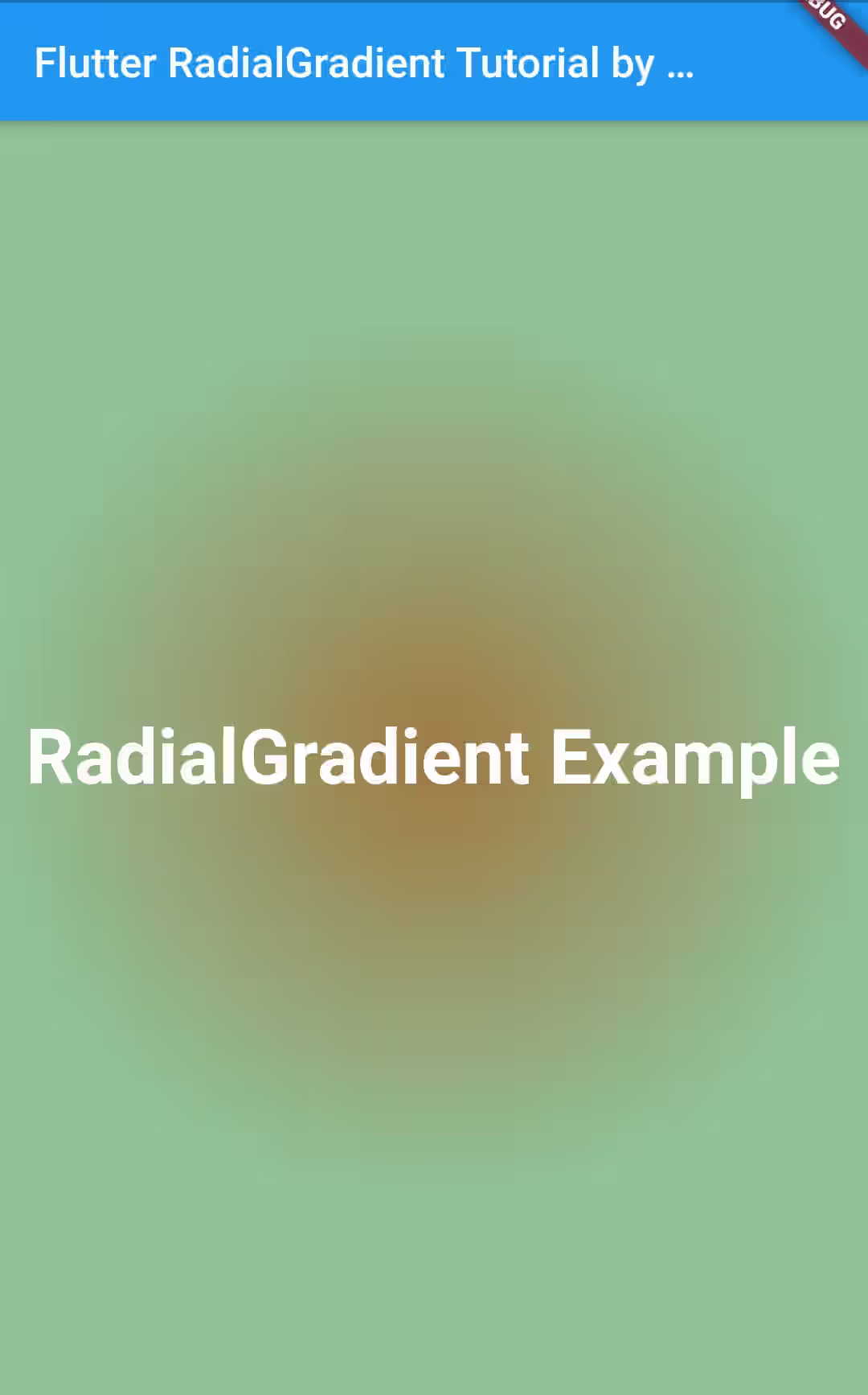
This tutorial shows you how to use RadialGradient in Flutter.
Some Flutter widgets can be decorated with Gradient background. There are some kinds of Gradient implementations provided by Flutter which include LinearGradient, RadialGradient, and SweepGradient. This tutorial only covers RadialGradient which is used to create 2D radial gradient. In this tutorial, I'm going to show you how to use RadialGradient including how to set the colors, radius, proportion of each fractions, etc.
Using Constructor
You can create a RadialGradient using its constructor. Below are what you can do with the constructor to create a customized instance.
Setting Colors
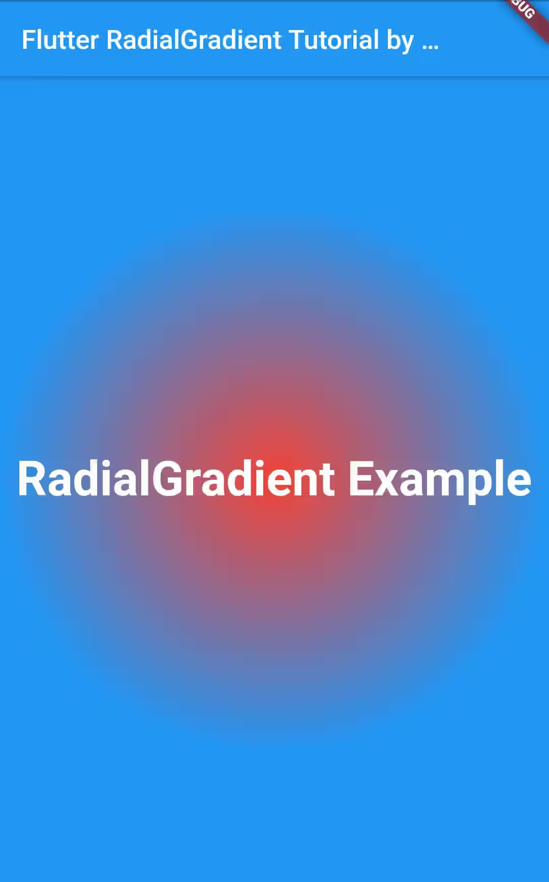
The only required properties of the constructor is colors which accepts a list of Flutter's Colors. To make it a gradient, you need to pass at least two colors.
First of all, here's the layout used in this tutorial which contains a Container where the gradient will be applied on. The important part used to set the gradient is highlighted in bold.
  import 'package:flutter/material.dart';

  void main() => runApp(MyApp());

  class MyApp extends StatelessWidget {
    @override
    Widget build(BuildContext context) {
      return MaterialApp(
        title: 'Welcome to Flutter',
        home: RadialGradientApp(),
      );
    }
  }

  class RadialGradientApp extends StatelessWidget {
    @override
    Widget build(BuildContext context) {
      return Scaffold(
        appBar: AppBar(
          title: Text('Flutter RadialGradient Tutorial by Woolha.com'),
        ),
        body: Center(
          child: Container(
            decoration: BoxDecoration(
              gradient:  RadialGradient(
                colors: [
                  Colors.red,
                  Colors.blue,
                ],
              )
            ),
            child: Center(
              child: Text(
                'RadialGradient Example',
                style: TextStyle(
                  color: Colors.white,
                  fontSize: 36.0,
                  fontWeight: FontWeight.bold,
                ),
              ),
            ),
          )
        )
      );
    }
  }
Output:
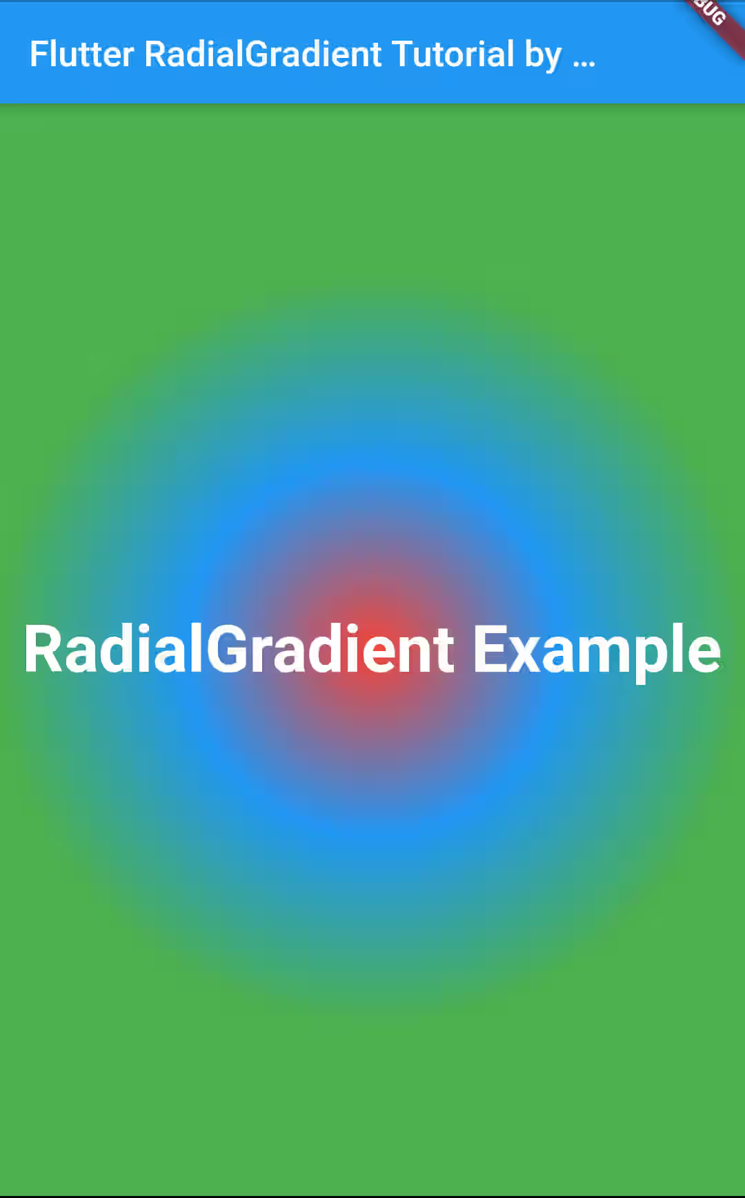
You can pass more colors if you want. Below is another example with three colors.
  gradient: RadialGradient(
    colors: [
      Colors.red,
      Colors.blue,
      Colors.green,
    ],
  )
Output:
Setting Center
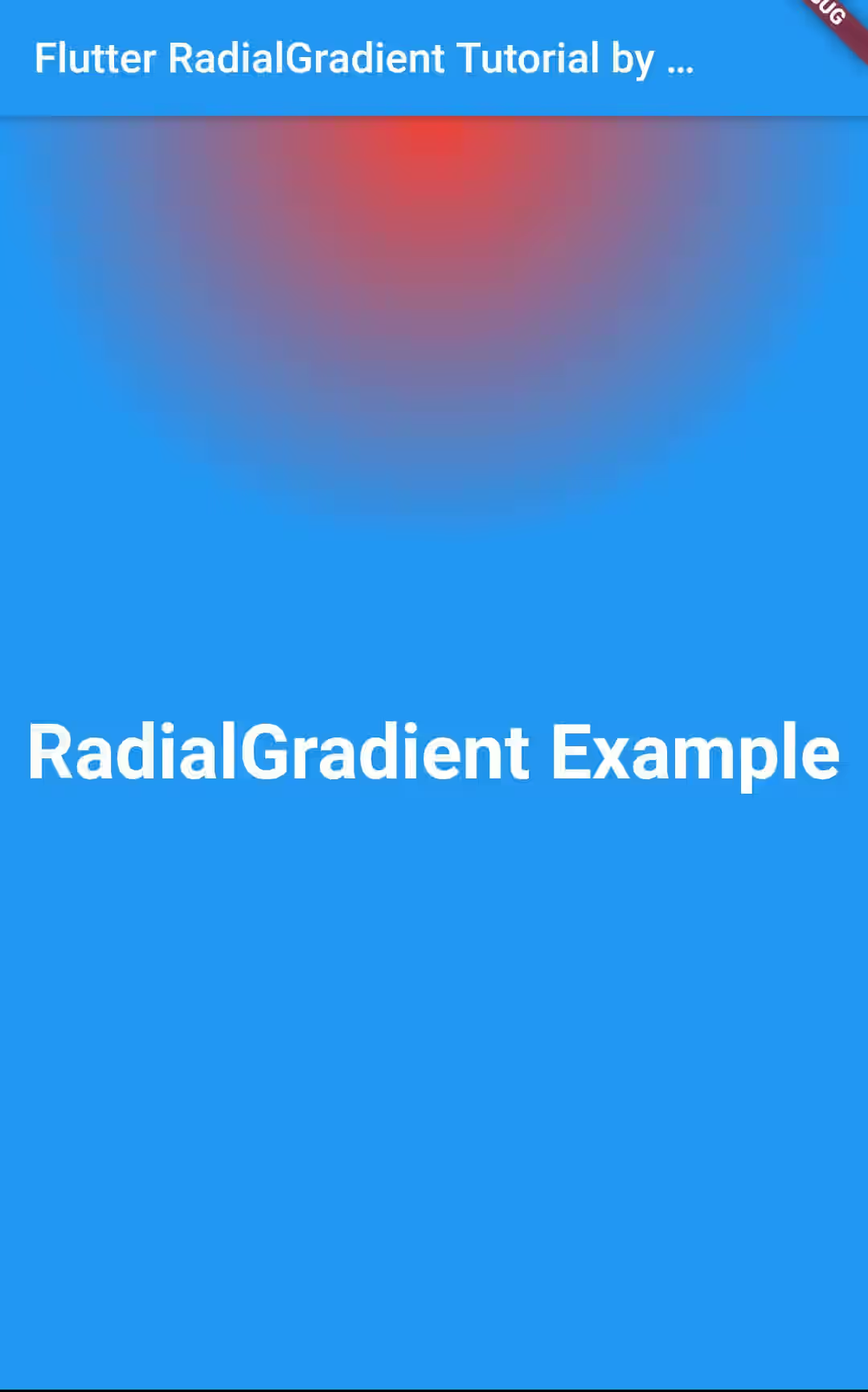
By default, the circle's center is in the middle of the widget where the decoration is applied on. To change the center location, you can pass center property whose type is Alignment.
  gradient: RadialGradient(
    center: Alignment.topCenter,
    colors: [
      Colors.red,
      Colors.blue,
      Colors.green,
    ],
  )
Output:
Setting Radius
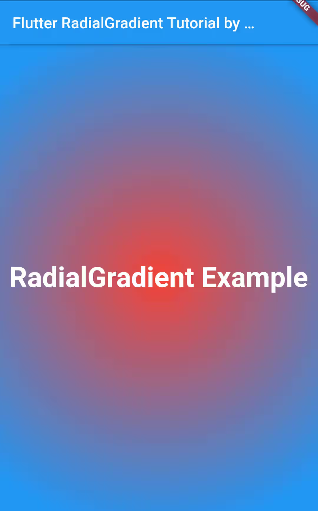
To make the circle bigger or smaller, you can pass radius property. The default value is 0.5.
  gradient: RadialGradient(
    radius: 0.8,
    colors: [
      Colors.red,
      Colors.blue,
    ],
  )
Output:
Setting Fraction Sizes Using stops
For gradient with two colors, there are three fractions. The first one is for the first color only which is the center of the gradient. The second is a gradation of the first and the second colors. The last fraction, the most outer, is for the second color only.
It's possible to set the proportion of each fragment using stops property. It accepts a list of doubles where the number of passed values must be the same as the number of colors. Beforehand, you need to understand what values should be passed. In Flutter's RadialGradient, 0 means the center of the circle which is also the center of the gradient, whereas 1 is the outermost area of the gradient.
The first passed value is used to set where the first fraction (the first color only) stops, while the second value is used to set where the second fraction stops. No need to set where the last fraction stops as it's supposed to stop at 1.
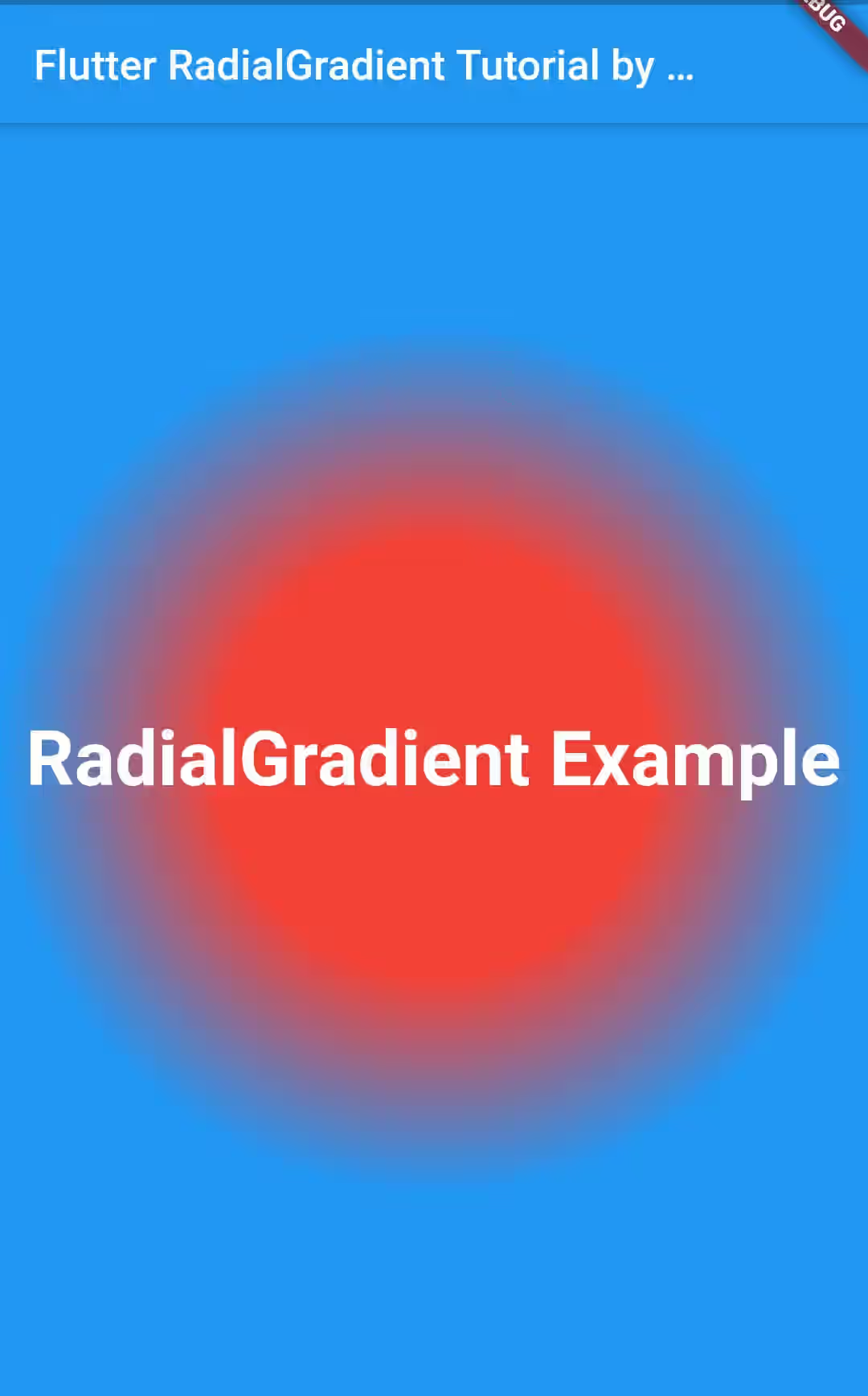
Look at the below example to see the result of using stops.
  gradient: RadialGradient(
    colors: [
      Colors.red,
      Colors.blue,
    ],
    stops: [
      0.5,
      1,
    ]
  )
Output:
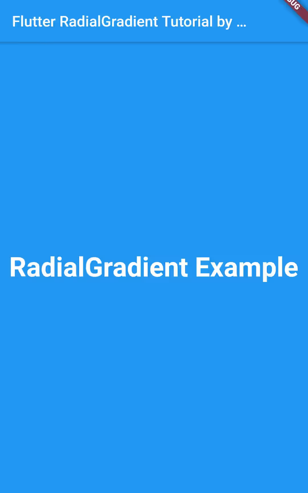
If both values are set to 0, there will be no place for the first and second fragments.
  gradient: RadialGradient(
    colors: [
      Colors.red,
      Colors.blue,
    ],
    stops: [
      0,
      0,
    ]
  )
Output:
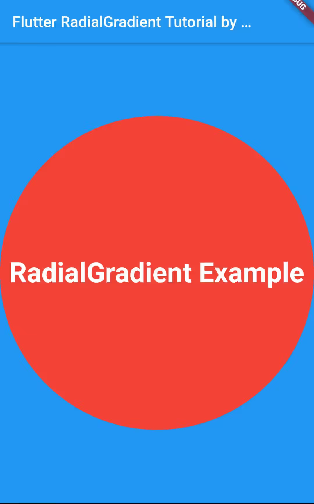
If both values are set to 1, the circle area will be occupied entirely by the first fraction only. However, the area outisde the circle is still occupied by the second color.
  gradient: RadialGradient(
    colors: [
      Colors.red,
      Colors.blue,
    ],
    stops: [
      1,
      1,
    ]
  )
Output:
Setting tileMode
tileMode property can be used to set how the gradient should tile the plane beyond the outer ring. The default one if you don't specify the property is TileMode.clamp. The output can be seen in the first example of this tutorial.
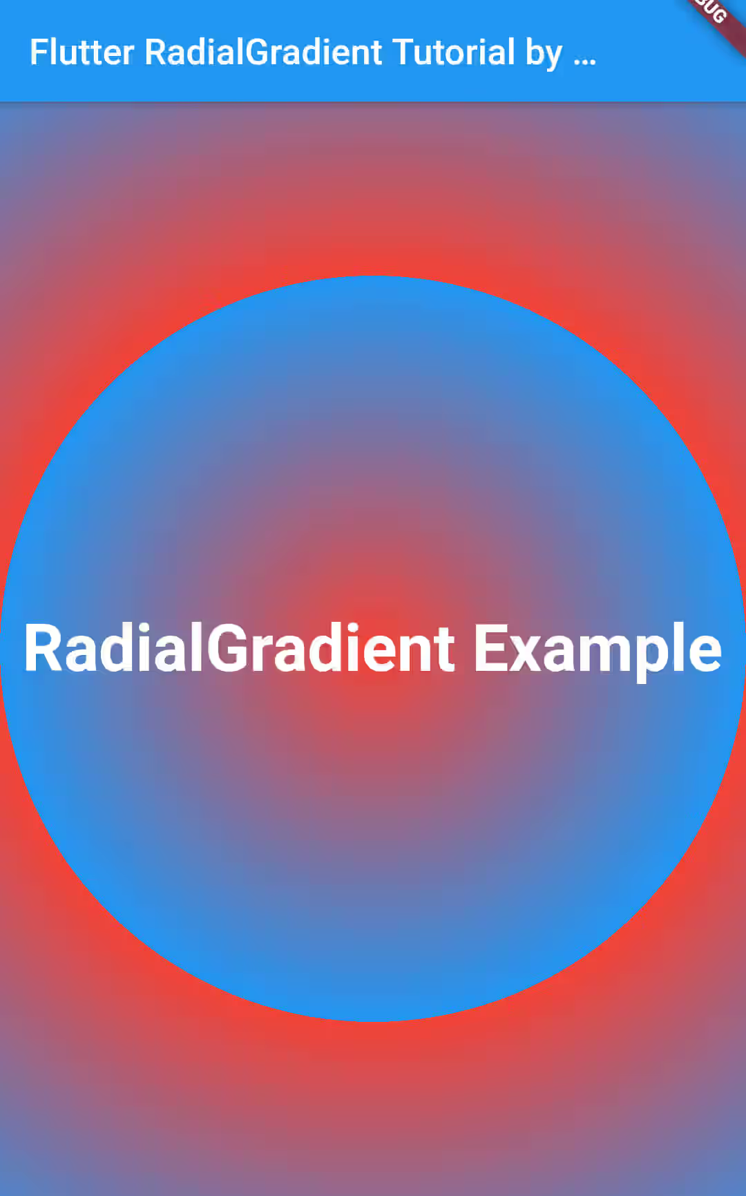
With TileMode.repetaed, edge is repeated from first color to last.
  gradient: RadialGradient(
    colors: [
      Colors.red,
      Colors.blue,
    ],
    tileMode: TileMode.repetaed,
  )
Output:
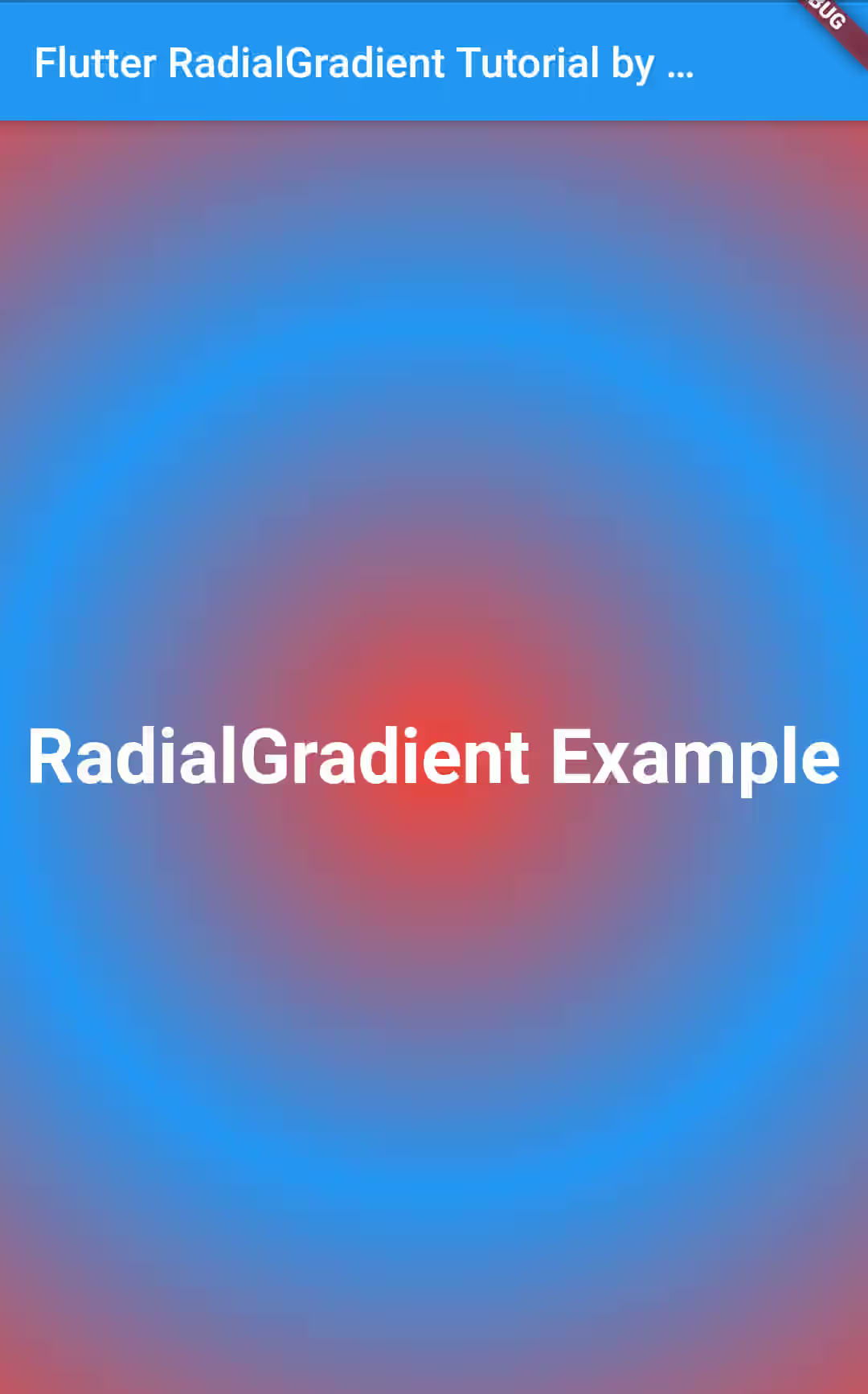
In contrast, if you need the edge to be mirrored from last color to first, use TileMode.mirror
  gradient: RadialGradient(
    colors: [
      Colors.red,
      Colors.blue,
    ],
    tileMode: TileMode.mirror,
  )
Output:
Setting Focal
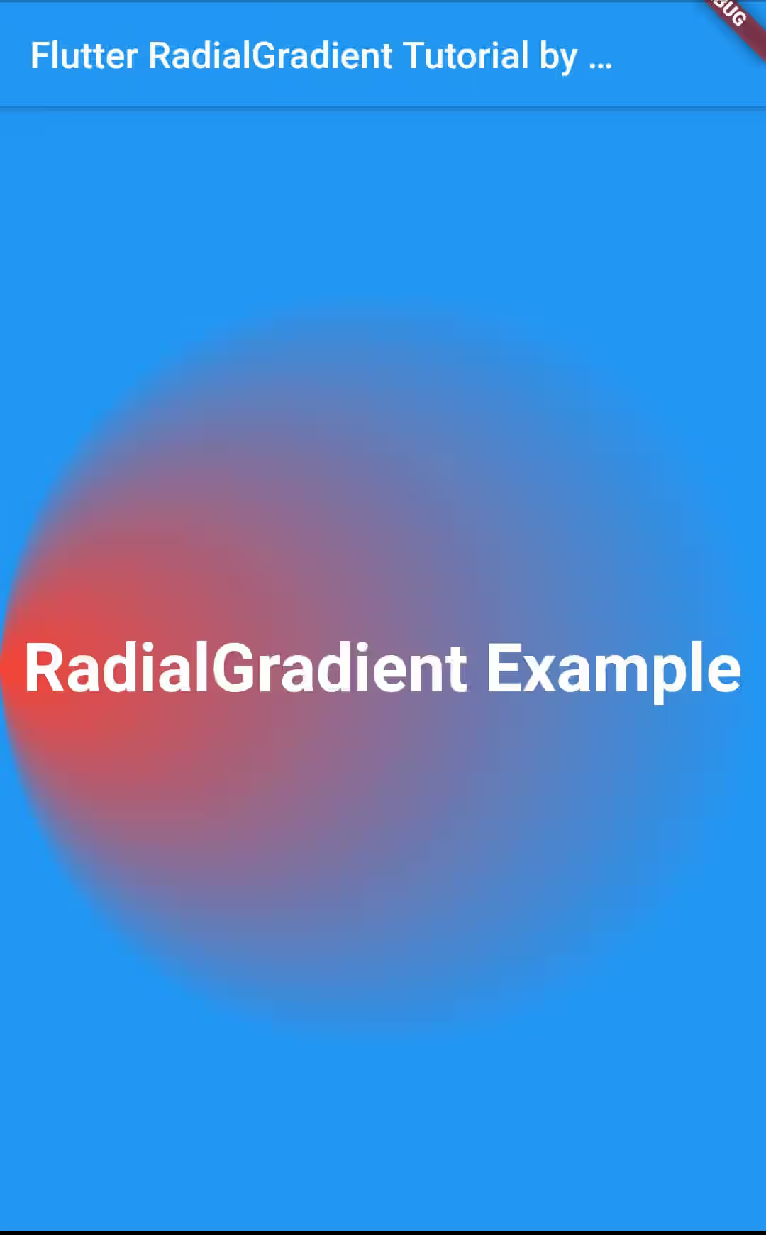
You can use focal property (AlignmentGeometry) to set the focal point of the gradient.
  gradient: RadialGradient(
    colors: [
      Colors.red,
      Colors.blue,
    ],
    focal: Alignment.centerLeft,
  )
Output:
LinearGradientConstructor Properties
Below are the available properties you can pass in the constructor.
List<Color> colors: The colors that compose the gradient.Alignment center: The center of the gradient.double radius: The radius of the circle.List<double> stops: Specifies the fraction for each color from begin (0.0) to end (1.0).TileMode tileMode: How this gradient should tile the plane beyond the outer ring.AlignmentGeometry focal: The focal point of the gradient.double focalRadius: The radius of the focal point of gradient, as a fraction of the shortest side of the paint box.GraidentTransform transform: The transform to be applied to the gradient
Using lerp
lerp static method can be used to linearly interpolate between two instances of RadialGradient
static RadialGradient lerp(RadialGradient a, RadialGradient b, double t) The first two parameters are the instances to be interpolated. The last parameter is the interpolation. If it's set to 0.5, it will use the styles of a and b equally. If it's set to 0, it will only use the styles of a. If it's set to 1, it will only use the styles of b.
  RadialGradient rg1 = RadialGradient(
    colors: [
      Colors.red,
      Colors.blue,
    ]
  );
  RadialGradient rg2 = RadialGradient(
    colors: [
      Colors.green,
      Colors.yellow,
    ]
  );
gradient: RadialGradient.lerp(rg1, rg2, 0.5),Output:
