
Do you need to show placeholders in your Flutter app? Find out in this tutorial.
If you're developing an application with complex layout, you may need some time to build the complete layout. What if you don't want to show a blank page. Flutter provides a Placeholder widget that can be used to temporarily replace under development widgets with a placeholder. This tutorial shows you how to use Flutter's Placeholder widget.
Using Placeholder
To create a Placeholder in Flutter, just call the constructor.
  const Placeholder({
    Key key,
    this.color = const Color(0xFF455A64), // Blue Grey 700
    this.strokeWidth = 2.0,
    this.fallbackWidth = 400.0,
    this.fallbackHeight = 400.0,
  })
Below is the description of the arguments you can pass on the constructor.
Key key: The widget key, used to control if it should be replaced.Color color: The width of the placeholder's lines.double strokeWidth: yy.double fallbackWidth: The width to use if the placeholder has unbounded width.double fallbackHeight: The height to use if the placeholder has unbounded height.
Below is a basic example that uses multiple Placeholder widgets, with no argument passed to the constructor.
  Column(
    children: <Widget>[
      Container(
        child: Placeholder()
      ),
      Expanded(
        child: Row(
          children: <Widget>[
            Flexible(
              flex: 1,
              child: Placeholder(),
            ),
            Flexible(
              flex: 4,
              child: Placeholder(),
            ),
          ],
        ),
      )
    ],
  )
Output:
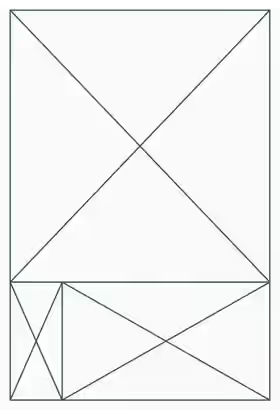
As you can see in the output, the first Placeholder looks very big. That's because it doesn't have height constraint. In that case, it uses the default value of fallbackWidth which is 400.
Setting Fallback Width and Height
  Column(
    children: <Widget>[
      Container(
        width: 200,
        child: Placeholder(
          fallbackHeight: 100,
          fallbackWidth: 100,
        )
      ),
      Expanded(
        child: Row(
          children: <Widget>[
            Flexible(
              flex: 1,
              child: Placeholder(),
            ),
            Flexible(
              flex: 4,
              child: Placeholder(),
            ),
          ],
        ),
      )
    ],
  )
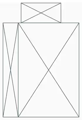
Output:
Setting Color
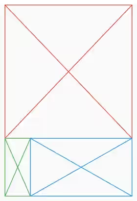
The default color of the lines is blue grey. You can change it using color property.
  Column(
    children: <Widget>[
      Container(
        child: Placeholder(
          color: Colors.red,
        )
      ),
      Expanded(
        child: Row(
          children: <Widget>[
            Flexible(
              flex: 1,
              child: Placeholder(
                color: Colors.green,
              ),
            ),
            Flexible(
              flex: 4,
              child: Placeholder(
                color: Colors.blue,
              ),
            ),
          ],
        ),
      )
    ],
  )
Output:
Setting Stroke Width
To set the thickness of a placeholder's lines, you need to set the strokeWidth property. If you don't set the property, it will use the default value of 2.0.
  Column(
    children: <Widget>[
      Container(
        child: Placeholder(
          strokeWidth: 5,
        )
      ),
      Expanded(
        child: Row(
          children: <Widget>[
            Flexible(
              flex: 1,
              child: Placeholder(
                strokeWidth: 10,
              ),
            ),
            Flexible(
              flex: 4,
              child: Placeholder(
                strokeWidth: 15,
              ),
            ),
          ],
        ),
      )
    ],
  )
Output:
