
This tutorial shows you how to use NavigationRail widget in Flutter.
NavigationRail is a widget introduced in Flutter v1.17. It's used to help you creating a material design navigation rail. A navigation rail consists of several destinations. In this tutorial, I'm going to show you how to create the destinations, handle when the user presses another destination, customize styles, as well as handle extended state.
Using NavigationRail
To use NavigationRail, you need to import package:flutter/material.dart. After that, you can call the constructor.
  const NavigationRail({
    this.backgroundColor,
    this.extended = false,
    this.leading,
    this.trailing,
    @required this.destinations,
    @required this.selectedIndex,
    this.onDestinationSelected,
    this.elevation,
    this.groupAlignment,
    this.labelType,
    this.unselectedLabelTextStyle,
    this.selectedLabelTextStyle,
    this.unselectedIconTheme,
    this.selectedIconTheme,
    this.minWidth,
    this.minExtendedWidth,
  })
There are two required arguments. The first one is destinations whose type is List<NavigationRailDestination>. It's used to define the list of items on the navigation rail. The other required argument is selectedIndex, an integer used to set which item/destination is being selected.
Setting Navigation Rail Destinations
A navigation rail has multiple button items arrayed within. Those items are called destinations. As I have stated above, you are required to pass destinations argument whose type is List<NavigationRailDestination>. That means you have to create multiple instances of NavigationRailDestination using the constructor below.
 const NavigationRailDestination({
    @required this.icon,
    Widget selectedIcon,
    this.label,
  })
You have to pass icon which is a Widget typically an Icon. If the destination is being selected, you can define another icon as selectedIcon. The other argument, label, though it doesn't annoteted with @required, you also need to pass it to avoid getting assertion error.
Setting Selected Index
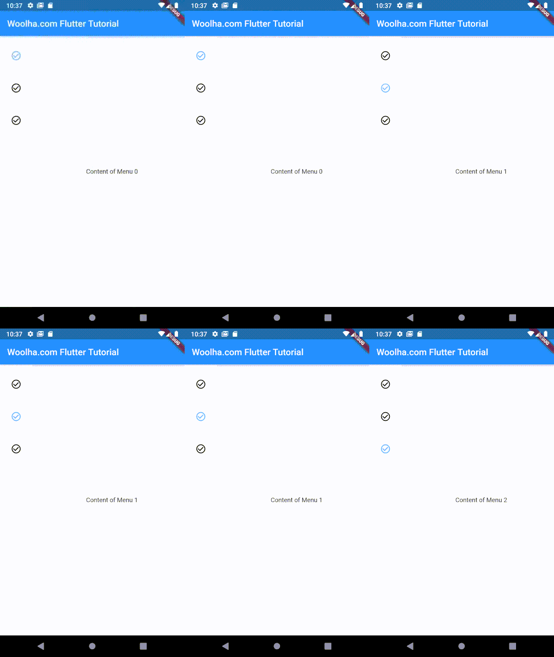
In a navigation rail, there must be one selected item. For setting which index is currently being selected or active, you can pass an integer which represents the index as selectedIndex. Usually the selected index changes when the user presses on the icon of another destination. To handle the change of index, you need to pass onDestinationSelected which is a function accepting one parameter of type integer. When the user selects another destination, the function will be invoked with the index of the newly selected destination as the argument. Usually you need a state variable for storing what's the current selected index and you need to update the value inside the function passed as onDestinationSelected.
  import 'package:flutter/material.dart';

  class _NavigationRailExample extends StatefulWidget {
     _NavigationRailExampleState createState() => _NavigationRailExampleState();
  }

  class _NavigationRailExampleState extends State<_NavigationRailExample> {

    int _selectedIndex;

    initState() {
      super.initState();

      _selectedIndex = 0;
    }

    Widget build(BuildContext context) {
      return Scaffold(
        appBar: AppBar( title: Text('Woolha.com Flutter Tutorial')),
        body: Row(
          children: <Widget>[
            NavigationRail(
              selectedIndex: _selectedIndex,
              destinations: _buildDestinations(),
              onDestinationSelected: (int index) {
                setState(() {
                  _selectedIndex = index;
                });
              },
            ),
            VerticalDivider(),
            Expanded(
              child: Center(
                child: Text('Content of Menu $_selectedIndex'),
              ),
            ),
          ],
        ),
      );
    }

    List<NavigationRailDestination> _buildDestinations() {
      Icon icon = Icon(Icons.check_circle_outline);

      return [
        NavigationRailDestination(
          icon: icon,
          label: Text('Menu 1'),
        ),
        NavigationRailDestination(
          icon: icon,
          label: Text('Menu 2'),
        ),
        NavigationRailDestination(
          icon: icon,
          label: Text('Menu 3'),
        ),
      ];
    }
  }
Output:
Setting Label Type
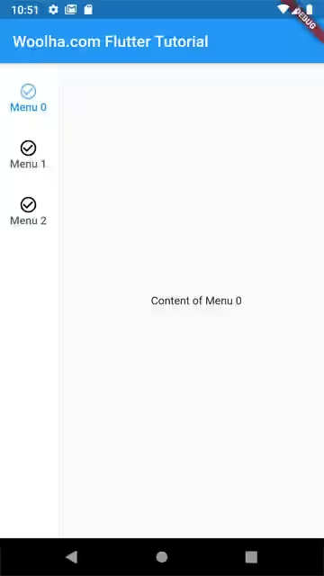
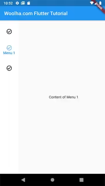
To control whether the label should be shown below the icon, you can pass NavigationRailLabelType enum as labelType to the constructor of NavigationRail. The available values for the enum are:
none: Labels are not shownselected: Only show the label of selected destination.all: Show label of all destinations.
When the rail is in extended state, the labels are always shown. You must set the labelType to NavigationRailLabelType.none or leave it null to avoid assertion error.
Below is the result with NavigationRailLabelType.all.
Output:
And below is the result with NavigationRailLabelType.selected.
Output:
Setting Selected & Unselected Icon and Text Styles
If you want to show a different icon when a destination is selected, you can pass selectedIcon in the constructor of NavigationRailDestination. With this way, you can control the icons of each destination.
  Icon icon = Icon(Icons.check_circle_outline);
  Icon selectedIcon = Icon(Icons.check_circle);

  NavigationRailDestination(
    icon: icon,
    selectedIcon: selectedIcon,
    label: Text('Menu 1'),
  )
Output:
![]()
For applying default theme or style to all destinations, you can pass IconThemeData as selectedIconTheme and unselectedIconTheme arguments which define the visual properties of the icons in selected and unselected states respectively.
const IconThemeData({this.color, double opacity, this.size}) : _opacity = opacity;This is an example of NavigationRail with IconThemeData .
  NavigationRail(
    selectedIndex: _selectedIndex,
    destinations: _buildDestinations(),
    unselectedIconTheme: IconThemeData(size: 20),
    selectedIconTheme: IconThemeData(color: Colors.red, opacity: 1.0, size: 30),
    onDestinationSelected: (int index) {
      setState(() {
        _selectedIndex = index;
      });
    },
  )
What will happen if IconThemeData and icon or selectedIcon in the destination have different styles. For example, in the above codes, IconThemeData of selectedIconTheme has red color, while selectedIcon in destination has color property set to teal. As you can see in the below output, it turns out the the style defined in the NavigationRailDestination's icons can override the styles of IconThemeData.
Output:
![]()
Setting Leading and Trailing Widgets
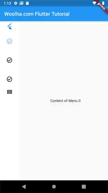
You can add a widget to be shown before the destinations by passing it as leading argument. For the widget below the destinations, you can use trailing argument.
  NavigationRail(
    selectedIndex: _selectedIndex,
    destinations: _buildDestinations(),
    leading: Center(child: const FlutterLogo()),
    trailing: Icon(Icons.view_comfy),
    onDestinationSelected: (int index) {
      setState(() {
        _selectedIndex = index;
      });
    },
  )
Output:
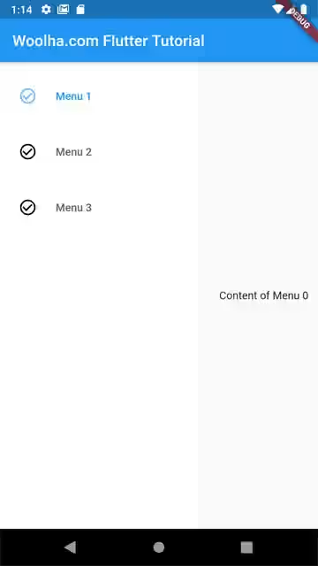
Setting Extend State
By default, the navigation rail is not in extended state. You can use extended argument to control whether the rail should be expanded or not.
const IconThemeData({this.color, double opacity, this.size}) : _opacity = opacity; NavigationRail(
selectedIndex: _selectedIndex,
destinations: _buildDestinations(),
extended: true,
onDestinationSelected: (int index) {
setState(() {
_selectedIndex = index;
});
},
)Output:
Setting Background Color
The background color of the rail can be set by passing a Color as backgroundColor argument.
  NavigationRail(
    selectedIndex: _selectedIndex,
    destinations: _buildDestinations(),
    backgroundColor: Colors.pinkAccent.withOpacity(0.3),
    onDestinationSelected: (int index) {
      setState(() {
        _selectedIndex = index;
      });
    },
  )
Output:

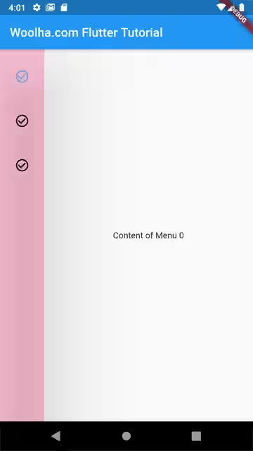
Setting Elevation
You can set the elevation (z-coordinate) of the rail by passing a positive double value as elevation argument.
  NavigationRail(
    selectedIndex: _selectedIndex,
    destinations: _buildDestinations(),
    backgroundColor: Colors.pinkAccent.withOpacity(0.3),
    elevation: 100,
    onDestinationSelected: (int index) {
      setState(() {
        _selectedIndex = index;
      });
    },
  )
Output:
Full Code
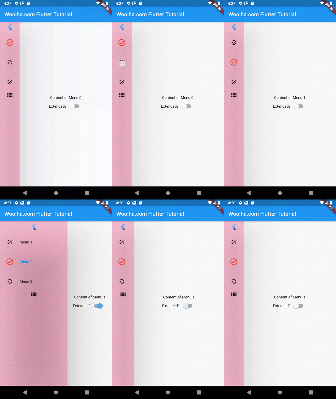
Here's the full code that uses custom styles for selected destination's icon, custom background color, custom elevation, as well as a Switch for toggling the extended state.
NavigationRail Properties
Color backgroundColor: Color of theNavigationRail's container.bool extended: Whether theNavigationRailis in extended state. Defaults tofalse.Widget leading: A widget placed above the destinations.Widget trailing: A widget placed below the destinations.List<NavigationRailDestination> destinations*: The button items.int selectedIndex*: Index of the current selected destination.ValueChanged onDestinationSelected: Function called when a destination is selected.double elevation: The rail's elevation.double groupAlignment: The vertical alignment for the group of destinations within the rail. Set the value to -1.0 for top alignment, 0.0 for center alignment, and 1.0 for bottom alignment..NavigationRailLabelType labelType: Defines the label when the rail is not extended.TextStyle unselectedLabelTextStyle:Text style of the label when it is unselected.TextStyle selectedLabelTextStyle: Text style of the label when it is selected.IconThemeData unselectedIconTheme: The visual properties of the icon when it is unselected.IconThemeData selectedIconTheme: The visual properties of the icon when it is selected..double minWidth: The smallest possible width for the rail.double minExtendedWidth: The width when the rail is extended.
*: required
