This tutorial is about how to use FittedBox widget in Flutter.
FittedBox is a widget used to scale and position its child within the parent's box according to specified fit type and alignment. In this tutorial, I'm going to show you how to use the widget including how to set the fit types and alignment.
Using FittedBox Widget
Below is the constructor of FittedBox.
  const FittedBox({
    Key key,
    this.fit = BoxFit.contain,
    this.alignment = Alignment.center,
    Widget child,
  })
As you can see, there's no required argument. However, you will need to pass child in most cases.
Setting Fit Type
The property fit which is of type FitType is used to define how the child should be inscribed within the parent's box. Below are the available FitType values.
Using BoxFit.none
BoxFit.none aligns the child within its parent box and discards portions outside its parent box.
In the first example below, the child (100 x 50) is smaller than its parent (200 x 200). In the output, you can see that the size remains unchanged.
  Container(
    color: Colors.black26,
    width: 200.0,
    height: 200.0,
    child: FittedBox(
      fit: BoxFit.none,
      child: Container(
        color: Colors.teal,
        width: 100.0,
        height: 50.0,
        child: Center(
          child: Text('Woolha.com', style: TextStyle(color: Colors.white)),
        )
      ),
    ),
  )
Output:

In the second example, the child's width is bigger than the parent's width. With BoxFit.none, the child's area that lies outside the parent is discarded.
  Container(
    color: Colors.black26,
    width: 200.0,
    height: 200.0,
    child: FittedBox(
      fit: BoxFit.none,
      child: Container(
        color: Colors.teal,
        width: 400.0,
        height: 150.0,
        child: Center(
          child: Text('Woolha.com', style: TextStyle(color: Colors.white)),
        )
      ),
    ),
  )
Output:

Using BoxFit.fill
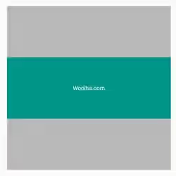
BoxFit.fill makes the child fills the parent's box, with the aspect ratio may be distorted if necessary.
  Container(
    color: Colors.black26,
    width: 200.0,
    height: 200.0,
    child: FittedBox(
      fit: BoxFit.fill,
      child: Container(
          color: Colors.teal,
          width: 100.0,
          height: 50.0,
          child: Center(
            child: Text('Woolha.com', style: TextStyle(color: Colors.white)),
          )
      ),
    ),
  )
Output:

Using BoxFit.cover
BoxFit.cover sets the child's size to be as small as possible while still covering the entire box of the parent. It doesn't distort the child's aspect ratio.
  Container(
    color: Colors.black26,
    width: 200.0,
    height: 200.0,
    child: FittedBox(
      fit: BoxFit.cover,
      child: Container(
          color: Colors.teal,
          width: 100.0,
          height: 50.0,
          child: Center(
            child: Text('Woolha.com', style: TextStyle(color: Colors.white)),
          )
      ),
    ),
  )
Output:

Using BoxFit.contain
BoxFit.contain sets the child's size to be as big as possible while still containing the child within the parent's box. It doesn't distort the child's aspect ratio.
  Container(
    color: Colors.black26,
    width: 200.0,
    height: 200.0,
    child: FittedBox(
      fit: BoxFit.contain,
      child: Container(
          color: Colors.teal,
          width: 100.0,
          height: 50.0,
          child: Center(
            child: Text('Woolha.com', style: TextStyle(color: Colors.white)),
          )
      ),
    ),
  )
Output:

Using BoxFit.fitWidth
BoxFit.fitWidth scales the child so that its width is the same as the height of the parent's box while keeping the aspect ratio.
Container(
    color: Colors.black26,
    width: 200.0,
    height: 200.0,
    child: FittedBox(
      fit: BoxFit.fitWidth,
      child: Container(
          color: Colors.teal,
          width: 100.0,
          height: 50.0,
          child: Center(
            child: Text('Woolha.com', style: TextStyle(color: Colors.white)),
          )
      ),
    ),
  )
Output:

Using BoxFit.fitHeight
BoxFit.fitWidth scales the child so that its height is the same as the width of the parent's box while keeping the aspect ratio.
Container(
    color: Colors.black26,
    width: 200.0,
    height: 200.0,
    child: FittedBox(
      fit: BoxFit.fitHeight,
      child: Container(
          color: Colors.teal,
          width: 100.0,
          height: 50.0,
          child: Center(
            child: Text('Woolha.com', style: TextStyle(color: Colors.white)),
          )
      ),
    ),
  )
Output:

Using BoxFit.scaleDown
BoxFit.scaleDown scales down the size of the child so that it fits within the parent's box while keeping the aspect ratio.
  Container(
    color: Colors.black26,
    width: 200.0,
    height: 200.0,
    child: FittedBox(
      fit: BoxFit.scaleDown,
      child: Container(
        color: Colors.teal,
        width: 400.0,
        height: 250.0,
        child: Center(
          child: Text('Woolha.com', style: TextStyle(color: Colors.white)),
        )
      ),
    ),
  )
Output:

Setting Alignment
By default, the child is aligned to the center. You can change it by setting another alignment type, like the below example.
  Container(
    color: Colors.black26,
    width: 200.0,
    height: 200.0,
    child: FittedBox(
      fit: BoxFit.none,
      alignment: Alignment.bottomLeft,
      child: Container(
        color: Colors.teal,
        width: 100.0,
        height: 50.0,
        child: Center(
          child: Text('Woolha.com', style: TextStyle(color: Colors.white)),
        )
      ),
    ),
  )
Output:

FittedBox Properties
Key key: The widget's key, used to control if it should be replaced.BoxFit fit: How to inscribe the child within the parent's box. Defaults toBoxFit.contain.Alignment alignment: How to align the child within the parent's box. Defaults toAlignment.center.Widget child: The widget under this widget in tree, it will be scaled and positioned according tofitandalignmentvalues.
