This tutorial shows you how to use ExpansionPanelList in Flutter, including how to create ExpansionPanel as its children and handle expanded/collapsed state. Other things in this article include how to change the divider color, set animation duration, and set the padding when the header is expanded.
Sometimes, you may need to create a list view where the items can have collapsible additional details. In Flutter, there is a widget that allows you to create such a list. The widget is ExpansionPanelList, which is a material expansion panel list. It contains a list of items as its children, with each item can be expanded and collapsed. In addition, it also plays animation when the state of a list item changes from collapsed to expanded or vice versa. Below are the explanation and examples of how to use the widget.
Using ExpansionPanelList Widget
WidgetHere is the constructor of ExpansionPanelList.
  const ExpansionPanelList({
    Key? key,
    List<ExpansionPanel> children = const <ExpansionPanel>[],
    ExpansionPanelCallback? expansionCallback,
    Duration animationDuration = kThemeAnimationDuration,
    EdgeInsets expandedHeaderPadding = _kPanelHeaderExpandedDefaultPadding,
    Color? dividerColor,
    int elevation = 2,
  })
There is no required argument. However, the children and expansionCallback arguments are usually passed in most cases. For the children argument, you need to pass a list of ExpansionPanel items. Meanwhile, the expansionCallback argument is important for handling the state of each item.
The widget cannot be placed anywhere in the tree since it uses RenderListBody for the children. RenderListBody requires unlimited space along its main axis. In other words, the main axis should not be constrained. Below is the assertion error if you do not fulfil the requirement.
  ======== Exception caught by rendering library =====================================================
  The following assertion was thrown during performLayout():
RenderListBody must have unlimited space along its main axis.

  RenderListBody does not clip or resize its children, so it must be placed in a parent that does not constrain the main axis.

  You probably want to put the RenderListBody inside a RenderViewport with a matching main axis.
The easiest solution is to put the ExpansionPanelList as the child of SingleChildScrollView, which allows a single widget to be scrolled if the container is too small.
  SingleChildScrollView(
    child: ExpansionPanelList(
      // put the arguments here
    )
  )
In this tutorial, we are going to create a list using the below class as the data structure.
  class Item {
    Item({
      this.id,
      this.name,
      this.description,
      this.isExpanded = false,
    });

    int id;
    String name;
    String description;
    bool isExpanded;
  }
id is a unique identifier. The name property is used for the title, while the collapsible content is stored in the description property. The state whether an item is in expanded or collapsed state is stored in a property called isExpanded. Below is the code for populating the list and storing the data in a state variable _items.
  List<Item> _items;

  @override
  void initState() {
    super.initState();
    setState(() {
      _items = _generateItems();
    });
  }

  List<Item> _generateItems() {
    return List.generate(20, (int index) {
      return Item(
        id: index,
        name: 'Item $index',
        description: 'Details of item $index',
      );
    });
  }
Create ExpansionPanel
An ExpansionPanelList usually have some ExpansionPanels as its children. Therefore, you need to know how to build an ExpansionPanel using the constructor below.
  ExpansionPanel({
    required ExpansionPanelHeaderBuilder headerBuilder,
    required Widget body,
    bool isExpanded = false,
    bool canTapOnHeader = false,
    Color backgroundColor,
  })
The constructor requires you to pass two named arguments: headerBuilder and body. For the headerBuilder, you need to pass a ExpansionPanelHeaderBuilder function. The passed function needs to accept two parameters whose types in order are BuildContext and isExpanded. The return type is a Widget which will be set as the header of the ExpansionPanel.
Widget Function(BuildContext context, bool isExpanded)The other required argument body is the widget to be displayed below the header in expanded state.
Apart from those two required arguments, another essential argument that you need to pass is isExpanded. It's used to control whether the current state is collapsed or expanded.
The method below is used to create an ExpansionPanel given an Item instance. It uses ListTile, which is very common to be used as a list item, as the return type of the headerBuilder function as well as the body. It also passes the isExpanded argument, making it possible to dynamically set whether the ExpansionPanel is expanded or not.
  ExpansionPanel _buildExpansionPanel(Item item) {
    return ExpansionPanel(
      isExpanded: item.isExpanded,
      headerBuilder: (BuildContext context, bool isExpanded) {
        return ListTile(
          title: Text(item.name),
          subtitle: Text(item.name),
        );
      },
      body: ListTile(
        title: Text(item.description),
      ),
    );
  }
Then, we can map the _items data to ExpansionPanel as you can see on the code below.
  ExpansionPanelList(
    children: _items.map((item) => _buildExpansionPanel(item))
        .toList(),
    // other arguments
  )
Allow Tap on Header
By default, the users can only tap on the expand/collapse icon in order to make a list item expanded or collapsed. If you also want to make a tap on the header does the same thing, you can pass isExpanded argument with true as the value.
  ExpansionPanel _buildExpansionPanel(Item item) {
    return ExpansionPanel(
      canTapOnHeader: true,
      // other arguments
    );
  }
Set Background Color
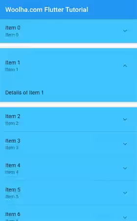
The background color of an ExpansionPanel can be set by passing backgroundColor argument whose type is Color. It affects the entire area, including the header, body, and the area surrounding the expand/collapse icon.
  ExpansionPanel _buildExpansionPanel(Item item) {
    return ExpansionPanel(
      backgroundColor: Colors.lightBlueAccent,
      // other arguments
    );
  }
Output:
Create ExpansionPanelCallback
When a user presses the expand/collapse icon, the state of the panel should change. Since the state of a panel depends on the value passed as isExpanded argument, you also need to change the value of the variable passed as isExpanded. In order to know if a user presses the expand/collapse icon, you need to pass a callback function as expansionCallback. The passed function must have two parameters whose types in order are int and bool. The first parameter is the index of the panel in the list, while the second parameter is the expanded state. The code below changes the isExpanded property of an item at the given index..
  ExpansionPanelList(
    expansionCallback: (int index, bool isExpanded) {
      setState(() {
        _items[index].isExpanded = !isExpanded;
      });
    },
    // other arguments
  )
Set Animation Duration
When the state of a panel changes from collapsed to expanded or vice versa, there will be an animation played for a certain amount of time. You can change the duration of the animation by passing a Duration value as the animationDuration argument.
  ExpansionPanelList(
    animationDuration: const Duration(seconds: 2),
    // other arguments
  )
Set Expanded Header Padding
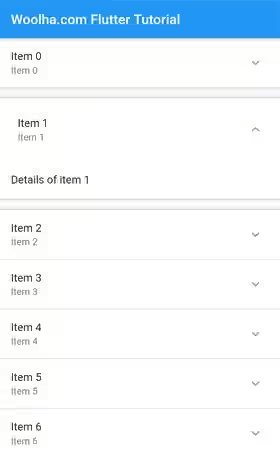
When the panel is in expanded state, you can set the padding for the header by passing expandedHeaderPadding. The argument type is EdgeInsets, which is the same as the type used on Padding widget.
  ExpansionPanelList(
    expandedHeaderPadding: EdgeInsets.all(10),
    // other arguments
  )
Output:
Set Divider Color
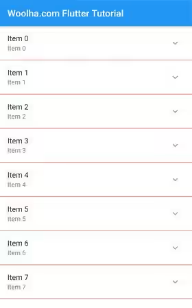
Each item in the list is separated by a divider. The color of the divider can be set by passing a Color value as dividerColor argument.
  ExpansionPanelList(
    dividerColor: Colors.red,
    // other arguments
  )
Set Elevation
When a panel is expanded, you can set the elevation by passing the elevation argument. Despite the type is double, you can only pass certain values as defined in kElevationToShadow.
  ExpansionPanelList(
    elevation: 4,
    // other arguments
  )
Putting the above code together, below is an example of how to use the ExpansionPanelList widget.
  ExpansionPanel _buildExpansionPanel(Item item) {
    return ExpansionPanel(
      isExpanded: item.isExpanded,
      backgroundColor: Colors.lightBlueAccent,
      canTapOnHeader: true,
      headerBuilder: (BuildContext context, bool isExpanded) {
        return Container(
          child: ListTile(
            title: Text(item.name),
            subtitle: Text(item.name),
          ),
        );
      },
      body: ListTile(
        title: Text(item.description),
      ),
    );
  }

  @override
  Widget build(BuildContext context) {
    return Scaffold(
      appBar: AppBar(
        title: const Text("Woolha.com Flutter Tutorial"),
      ),
      body: SingleChildScrollView(
        child: ExpansionPanelList(
          animationDuration: const Duration(seconds: 2),
          expandedHeaderPadding: EdgeInsets.all(10),
          dividerColor: Colors.red,
          elevation: 4,
          expansionCallback: (int index, bool isExpanded) {
            setState(() {
              _items[index].isExpanded = !isExpanded;
            });
          },
          children: _items.map((item) => _buildExpansionPanel(item))
              .toList(),
        ),
      ),
    );
  }
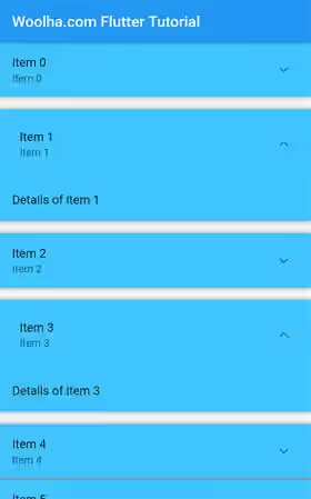
Output:
Using ExpansionPanelList.radio
What if you want to allow only one ExpansionPanel in expanded state at the same time? It's possible to change the logic inside the function passed as expansionCallback. However, there is an easier way to do that. You can use ExpansionPanelList.radio named constructor.
  const ExpansionPanelList.radio({
    Key? key,
    List<ExpansionPanelRadio> children = const <ExpansionPanelRadio>[],
    ExpansionPanelCallback? expansionCallback,
    Duration animationDuration = kThemeAnimationDuration,
    Object? initialOpenPanelValue
    EdgeInsets expandedHeaderPadding = _kPanelHeaderExpandedDefaultPadding,
    Color? dividerColor,
    int elevation = 2,
  })
The parameters of the named constructor are very similar to the ExpansionPanel's constructor, except the type of the children's element is ExpansionPanelRadio. It also has an additional argument initialOpenPanelValue which is used to set which panel should be opened initially.
Create ExpansionPanelRadio
Below is the constructor of ExpansionPanelRadio.
  ExpansionPanelRadio({
    required Object value,
    required ExpansionPanelHeaderBuilder headerBuilder,
    required Widget body,
    bool canTapOnHeader = false,
    Color? backgroundColor,
  })
Using ExpansionPanelRadio is similar to using ExpansionPanel. One of the differences is you are required to pass an Object as the value argument. It's used to identify which radio panel is currently selected. The other difference is it doesn't have isExpanded parameter, since it becomes Flutter's responsibility to handle which panel should be opened.
Below is an example of how to use ExpansionPanelList.Radio.
  ExpansionPanelRadio _buildExpansionPanelRadio(Item item) {
    return ExpansionPanelRadio(
      value: item.id,
      backgroundColor: Colors.lightBlueAccent,
      canTapOnHeader: true,
      headerBuilder: (BuildContext context, bool isExpanded) {
        return Container(
          child: ListTile(
            title: Text(item.name),
            subtitle: Text(item.name),
          ),
        );
      },
      body: ListTile(
        title: Text(item.description),
      ),
    );
  }

  @override
  Widget build(BuildContext context) {
    return Scaffold(
        appBar: AppBar(
          title: const Text("Woolha.com Flutter Tutorial"),
        ),
        body: SingleChildScrollView(
          child: ExpansionPanelList.radio(
            animationDuration: const Duration(seconds: 2),
            expandedHeaderPadding: EdgeInsets.all(10),
            dividerColor: Colors.red,
            elevation: 4,
            initialOpenPanelValue: 3,
            expansionCallback: (int index, bool isExpanded) {
              setState(() {
                _items[index].isExpanded = !isExpanded;
              });
            },
            children: _items.map((item) => _buildExpansionPanelRadio(item))
                .toList(),
          ),
        )
    );
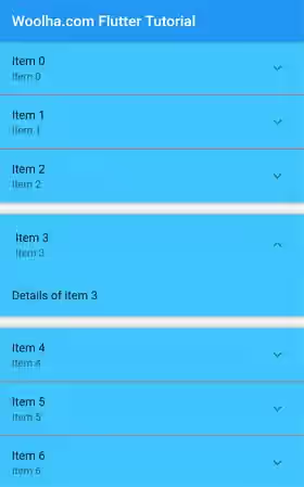
  }
Output:
Full Code
  import 'package:flutter/material.dart';

  void main() => runApp(MyApp());

  class MyApp extends StatelessWidget {

    @override
    Widget build(BuildContext context) {
      return MaterialApp(
        title: 'Woolha.com Flutter Tutorial',
        home: ExpansionPanelListExample(),
        debugShowCheckedModeBanner: false,
      );
    }
  }

  class Item {
    Item({
      this.id,
      this.name,
      this.description,
      this.isExpanded = false,
    });

    int id;
    String name;
    String description;
    bool isExpanded;
  }

  class ExpansionPanelListExample extends StatefulWidget {

    @override
    State<StatefulWidget> createState() {
      return ExpansionPanelListExampleState();
    }
  }

  class ExpansionPanelListExampleState extends State<ExpansionPanelListExample> {

    List<Item> _items;

    @override
    void initState() {
      super.initState();
      setState(() {
        _items = _generateItems();
      });
    }

    List<Item> _generateItems() {
      return List.generate(20, (int index) {
        return Item(
          id: index,
          name: 'Item $index',
          description: 'Details of item $index',
        );
      });
    }

    ExpansionPanel _buildExpansionPanel(Item item) {
      return ExpansionPanel(
        isExpanded: item.isExpanded,
        backgroundColor: Colors.lightBlueAccent,
        canTapOnHeader: true,
        headerBuilder: (BuildContext context, bool isExpanded) {
          return Container(
            child: ListTile(
              title: Text(item.name),
              subtitle: Text(item.name),
            ),
          );
        },
        body: ListTile(
          title: Text(item.description),
        ),
      );
    }

    ExpansionPanelRadio _buildExpansionPanelRadio(Item item) {
      return ExpansionPanelRadio(
        value: item.id,
        backgroundColor: Colors.lightBlueAccent,
        canTapOnHeader: true,
        headerBuilder: (BuildContext context, bool isExpanded) {
          return Container(
            child: ListTile(
              title: Text(item.name),
              subtitle: Text(item.name),
            ),
          );
        },
        body: ListTile(
          title: Text(item.description),
        ),
      );
    }

    @override
    Widget build(BuildContext context) {
      return Scaffold(
          appBar: AppBar(
            title: const Text("Woolha.com Flutter Tutorial"),
          ),
          body: SingleChildScrollView(
            child: ExpansionPanelList(
              animationDuration: const Duration(seconds: 2),
              expandedHeaderPadding: EdgeInsets.all(10),
              dividerColor: Colors.red,
              elevation: 4,
              expansionCallback: (int index, bool isExpanded) {
                setState(() {
                  _items[index].isExpanded = !isExpanded;
                });
              },
              children: _items.map((item) => _buildExpansionPanel(item))
                  .toList(),
            ),
          ),
          // body: SingleChildScrollView(
          //   child: ExpansionPanelList.radio(
          //     animationDuration: const Duration(seconds: 2),
          //     expandedHeaderPadding: EdgeInsets.all(10),
          //     dividerColor: Colors.red,
          //     elevation: 4,
          //     initialOpenPanelValue: 3,
          //     expansionCallback: (int index, bool isExpanded) {
          //       setState(() {
          //         _items[index].isExpanded = !isExpanded;
          //       });
          //     },
          //     children: _items.map((item) => _buildExpansionPanelRadio(item))
          //         .toList(),
          //   ),
          // ),
      );
    }
  }
ExpansionPanelList - Parameters
Key? key: The widget's key, used to control how a widget is replaced with another widget.List<ExpansionPanel> children: The children of the expansion panel list. Defaults toconst <ExpansionPanel>[].ExpansionPanelCallback? expansionCallback: A callback that will be called whenever an expand/collapse button is pressed.Duration animationDuration: The duration of the animation. Defaults tokThemeAnimationDuration.EdgeInsets expandedHeaderPadding: The padding that surrounds the panel header when expanded. Defaults to_kPanelHeaderExpandedDefaultPadding.Color? dividerColor: Color for the divider.int elevation: The elevation for theExpansionPanelwhile it's expanded. Defaults to 2.
?: value can be null.
ExpansionPanel - Parameters
required ExpansionPanelHeaderBuilder headerBuilder: A widget builder for building the header.required Widget body: The body which is displayed below the header.bool isExpanded: Whether the panel is expanded.bool canTapOnHeader: Whether tapping on the panel's header will expand/collapse it.Color backgroundColor: Defines the background color of the panel.
?: value can be null.
required: value must be passed.
ExpansionPanelList.radio - Parameters
Key? key: The widget's key, used to control how a widget is replaced with another widget.List<ExpansionPanelRadio> children: The children of the expansion panel list. Defaults toconst <ExpansionPanelRadio>[].ExpansionPanelCallback? expansionCallback: A callback that will be called whenever an expand/collapse button is pressed.Duration animationDuration: The duration of the animation. Defaults tokThemeAnimationDuration.Object? initialOpenPanelValue: A value that indicates which panel should be opened initially.EdgeInsets expandedHeaderPadding: The padding that surrounds the panel header when expanded. Defaults to_kPanelHeaderExpandedDefaultPadding.Color? dividerColor: Color for the divider.int elevation: The elevation for theExpansionPanelwhile it's expanded. Defaults to 2.
?: value can be null.
ExpansionPanelRadio - Parameters
required Object value: The identifier for the panel.required ExpansionPanelHeaderBuilder headerBuilder: A widget builder for building the header.required Widget body: The body which is displayed below the header.bool canTapOnHeader: Whether tapping on the panel's header will expand/collapse it.Color backgroundColor: Defines the background color of the panel.
?: value can be null.
required: value must be passed.
Summary
This tutorial explains how to use ExpansionPanelList in Flutter. Basically, you need to define a list of ExpansionPanel instances which will be rendered as the children. It's also necessary to correctly handle the expanded state of each item by implementing correct logic inside the function passed as expansionCallback. You can also customize a few things such as the elevation of the expanded items, the animation duration, and the divider color. If you only allow one panel in expanded state at the same time, you can use ExpansionPanelList.radio.
