
This tutorial shows you how to use Divider and VerticalDivider in Flutter.
If you have a list of widgets, you may need to add a separator between the widgets. In Flutter, there are two widgets suitable for that purpose: Divider and VerticalDivider. Divider is used to create a horizontal line divider, while VerticalDivider is used to create a vertical line divider. The examples below show you how to use those widgets.
Divider
Creating Divider
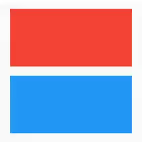
To use the Divider widget, just call the constructor. Below is the constructor.
  const Divider({
    Key key,
    this.height,
    this.thickness,
    this.indent,
    this.endIndent,
    this.color,
  })
Since there is no required argument, you can call the constructor without passing anything.
  child: Column(
    children: <Widget>[
      Container(
        height: 100,
        color: Colors.red,
      ),
      Divider(),
      Container(
        height: 100,
        color: Colors.blue,
      ),
    ],
  )
Output:
Setting Divider's Height and Thickness
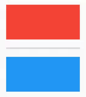
For adjusting the height of the area that will be occupied by the divider, use height property. It doesn't affect the thickness of the line which can be set using thickness property.
  Column(
    children: <Widget>[
      Container(
        height: 100,
        color: Colors.red,
      ),
      Divider(
        height: 50,
        thickness: 5,
      ),
      Container(
        height: 100,
        color: Colors.blue,
      ),
    ],
  )
Output:
Setting Divider's Color
color property can be used to set the color of the line.
  Column(
    children: <Widget>[
      Container(
        height: 100,
        color: Colors.red,
      ),
      Divider(
        thickness: 5,
        color: Colors.black,
      ),
      Container(
        height: 100,
        color: Colors.blue,
      ),
    ],
  )
Output:

Setting Divider's Indent
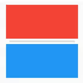
In case you want to change the indent of the line, use indent property to adjust the indent on the leading edge and endIndent property for the indent on the trailing edge.
  Column(
    children: <Widget>[
      Container(
        height: 100,
        color: Colors.red,
      ),
      Divider(
        thickness: 5,
        indent: 10,
        endIndent: 10,
      ),
      Container(
        height: 100,
        color: Colors.blue,
      ),
    ],
  )
Output:
Using Divider as Separator of ListView
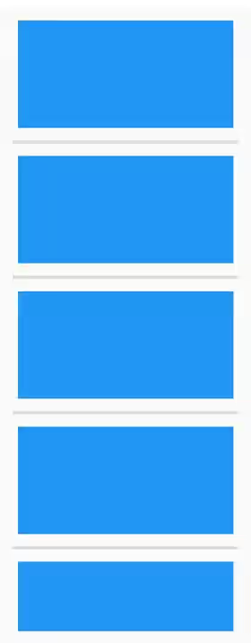
It can also be used as the separator of a ListView. Here's the example.
  ListView.separated(
    separatorBuilder: (context, index) => Divider(
      thickness: 3,
    ),
    itemCount: 5,
    itemBuilder: (context, index) => Padding(
      padding: EdgeInsets.all(5),
      child: Container(color: Colors.blue, height: 100),
    ),
  )
Output:
Properties
Here's the list of properties of Divider you can pass to the constructor.
Key key: The widget key, used to control if it should be replaced.double height: Height of the divider.double thickness: Thickness of the line.double indent: Empty space to the leading edge of the divider.double endIndent: Empty space to the trailing edge of the divider.Color color: Color of the line.
VerticalDivider
In general, using VerticalDivider is very similar to using Divider. The only difference is VerticalDivider has width property instead of height.
Creating VerticalDivider
Below is the constructor of VerticalDivider.
  const VerticalDivider({
    Key key,
    this.width,
    this.thickness,
    this.indent,
    this.endIndent,
    this.color,
  })
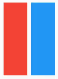
Here's the most basic example of how to use the constructor. There is no required parameter.
  Row(
    children: <Widget>[
      Container(
        width: 100,
        color: Colors.red,
      ),
      VerticalDivider(),
      Container(
        width: 100,
        color: Colors.blue,
      ),
    ],
  )
Output:
Setting VerticalDivider's Width and Thickness
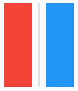
You can set the width of the area occupied by the divider using width property. However, it doesn't change the thickness of the line. You need to use thickness property for the line's thickness.
  Row(
    children: <Widget>[
      Container(
        width: 100,
        color: Colors.red,
      ),
      VerticalDivider(
        width: 50,
        thickness: 5,
      ),
      Container(
        width: 100,
        color: Colors.blue,
      ),
    ],
  )
Output:
Setting VerticalDivider's Color
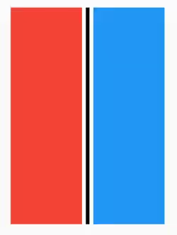
The color of the line can be set using color property.
  Row(
    children: <Widget>[
      Container(
        width: 100,
        color: Colors.red,
      ),
      VerticalDivider(
        thickness: 5,
        color: Colors.black,
      ),
      Container(
        width: 100,
        color: Colors.blue,
      ),
    ],
  )
Output:
Setting VerticalDivider's Indent
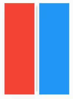
The indent on the leading edge can be set using indent property. To set the indent on the trailing edge, use endIndent property.
  Row(
    children: <Widget>[
      Container(
        width: 100,
        color: Colors.red,
      ),
      VerticalDivider(
        thickness: 5,
        endIndent: 10,
        indent: 10,
      ),
      Container(
        width: 100,
        color: Colors.blue,
      ),
    ],
  )
Output:
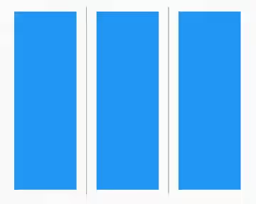
Using VerticalDivider as Separator of ListView
Here's how to use the divider as the separator of a ListView with horizontal direction.
  ListView.separated(
    scrollDirection: Axis.horizontal,
    separatorBuilder: (context, index) => VerticalDivider(
      color: Colors.black,
    ),
    itemCount: 5,
    itemBuilder: (context, index) => Padding(
      padding: EdgeInsets.all(8.0),
      child: Container(color: Colors.blue, width: 100),
    ),
  )
Output:
Properties
Below is the list of properties of VerticalDivider you can pass to the constructor.
Key key: The widget key, used to control if it should be replaced.double width: Width of the divider.double thickness: Thickness of the line.double indent: Empty space to the leading edge of the divider.double endIndent: Empty space to the trailing edge of the divider.Color color: Color of the line.
