
This tutorial shows you how to use Autocomplete widget in Flutter.
If you have a text field in your Flutter application, for some cases, it would be nice if you can provide a list of options that users can select from. Therefore, the users do not need to type the complete text and hence can improve the user experience. In Flutter, that can be done by using Autocomplete widget. It's a widget that allows the user to type on a text input and choose from a list of options. In this tutorial, I am going to show you how to use the widget, including how to set the options, customize the TextField, and handle option selected event.
Using Autocomplete
To use the Autocomplete widget, you need to call the constructor.
  const Autocomplete({
    Key? key,
    required AutocompleteOptionsBuilder<T> optionsBuilder,
    AutocompleteOptionToString<T> displayStringForOption = RawAutocomplete.defaultStringForOption,
    AutocompleteFieldViewBuilder fieldViewBuilder = _defaultFieldViewBuilder,
    AutocompleteOnSelected<T>? onSelected,
    AutocompleteOptionsBuilder<T>? optionsViewBuilder,
  })
The Autocomplete class itself has a generic type T extends Object. That means the option item can be any type of object, not necessarily a string.
In this tutorial, we are going to create a class named Continent to be used as the option items.
  class Continent {

    const Continent({
      @required this.name,
      @required this.size,
    });

    final String name;
    final int size;

    @override
    String toString() {
      return '$name ($size)';
    }
  }

  const List continentOptions = &;lt;Continent>[
    Continent(name: 'Africa', size: 30370000),
    Continent(name: 'Antarctica', size: 14000000),
    Continent(name: 'Asia', size: 44579000),
    Continent(name: 'Australia', size: 8600000),
    Continent(name: 'Europe', size: 10180000),
    Continent(name: 'North America', size: 24709000),
    Continent(name: 'South America', size: 17840000),
  ];
When calling the constructor, you need to pass Continent as the generic type.
  Autocomplete<Continent>(
    // Put the arguments here
  )
There is a required named argument optionsBuilder. For that argument, you need to pass a function that returns the list of options that can be selected by the user. Below are the examples of how to create the options builder and pass the other arguments supported by Flutter's Autocomplete widget.
Set Options Builder
You can control the list of options available to choose by creating your own AutocompleteOptionsBuilder and pass it as optionsBuilder. The AutocompleteOptionsBuilder is a function that accepts a parameter of type TextEditingValue and returns an Iterable of T. By utilizing the passed TextEditingValue, you can filter the list of options to be displayed based on the current text.
  Autocomplete<Continent>(
    optionsBuilder: (TextEditingValue textEditingValue) {
      return continentOptions
        .where((Continent continent) => continent.name.toLowerCase()
          .startsWith(textEditingValue.text.toLowerCase())
        )
        .toList();
    },
  )
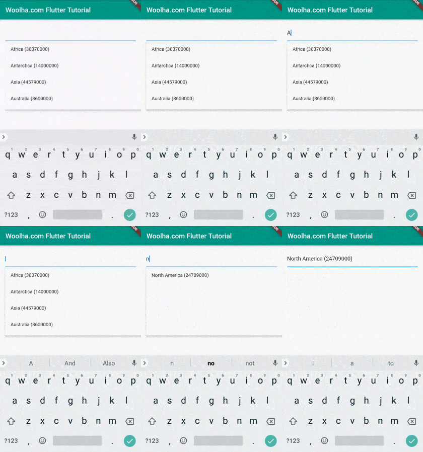
Output:
Set Displayed String Options
By default, Flutter will use the toString method of the generic type as the displayed string for each option, as you can see from the previous output. However, it's possible to set the string to be displayed by passing displayStringForOption argument. You need to pass a function which accepts a parameter of type T and returns the string that you want to show in the options.
In the code below, the function passed as displayStringForOption returns the name property of the Continent class.
  Autocomplete<Continent>(
    optionsBuilder: (TextEditingValue textEditingValue) {
      return continentOptions
        .where((Continent continent) => continent.name.toLowerCase()
          .startsWith(textEditingValue.text.toLowerCase())
        )
        .toList();
    },
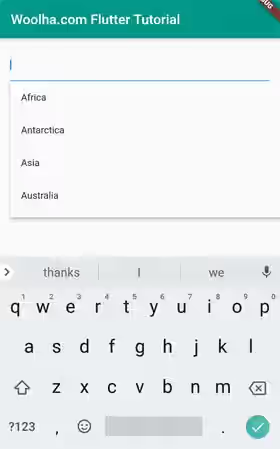
    displayStringForOption: (Continent option) => option.name,
  )
Output:
Set Field View Builder
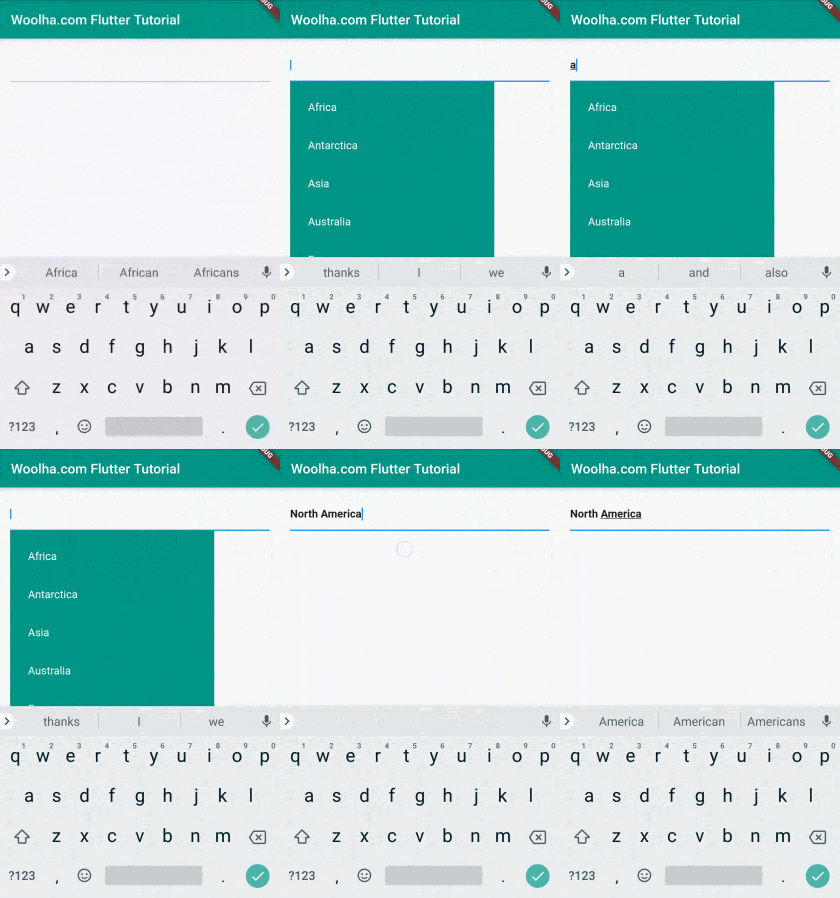
For the text field, Flutter will build a standard Material-style text field by default. If you want to use a customized TextView, you can pass fieldViewBuilder argument. The value for the argument is a function with four parameters whose type in order are BuildContext, TextEditingController, FocusNode, and VoidCallback. The return type of the function is a Widget.
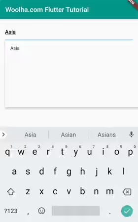
The below example passes the fieldViewBuilder argument with the passed function returns a TextField with a custom text style.
  Autocomplete<Continent>(
    optionsBuilder: (TextEditingValue textEditingValue) {
      return continentOptions
        .where((Continent continent) => continent.name.toLowerCase()
          .startsWith(textEditingValue.text.toLowerCase())
        )
        .toList();
    },
    displayStringForOption: (Continent option) => option.name,
    fieldViewBuilder: (
      BuildContext context,
      TextEditingController fieldTextEditingController,
      FocusNode fieldFocusNode,
      VoidCallback onFieldSubmitted
    ) {
      return TextField(
        controller: fieldTextEditingController,
        focusNode: fieldFocusNode,
        style: const TextStyle(fontWeight: FontWeight.bold),
      );
    },
  )
Output:
Set Options View Builder
How about creating a custom layout for the options? It can be done by passing a function as optionsViewBuilder. The function must have three parameters whose type in order are BuildContext,AutocompleteOnSelected<T>, and Iterable<T>. The second parameter is the function to be called when an item is selected, while the third parameter is the list of options. The return type of the function is a Widget.
Usually, you need to use the passed options (the third parameter) to build a list of widgets. In addition, the Autocomplete widget needs to be notified when the user selects an option. To notify the Autocomplete widget, call the AutocompleteOnSelected function (passed as the second parameter) and pass the selected item as the argument.
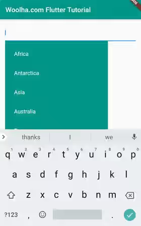
The below example creates a custom view for the options by creating a ListView wrapped as the child of a Container. Each list item is wrapped as the child of a GestureDetector widget, making it possible to call the AutocompleteOnSelected function when a tap gesture occurs.
  Autocomplete<Continent>(
    optionsBuilder: (TextEditingValue textEditingValue) {
      return continentOptions
        .where((Continent continent) => continent.name.toLowerCase()
          .startsWith(textEditingValue.text.toLowerCase())
        )
        .toList();
    },
    displayStringForOption: (Continent option) => option.name,
    optionsViewBuilder: (
      BuildContext context,
      AutocompleteOnSelected<Continent> onSelected,
      Iterable<Continent> options
    ) {
      return Align(
        alignment: Alignment.topLeft,
        child: Material(
          child: Container(
            width: 300,
            color: Colors.teal,
            child: ListView.builder(
              padding: EdgeInsets.all(10.0),
              itemCount: options.length,
              itemBuilder: (BuildContext context, int index) {
                final Continent option = options.elementAt(index);

                return GestureDetector(
                  onTap: () {
                    onSelected(option);
                  },
                  child: ListTile(
                    title: Text(option.name, style: const TextStyle(color: Colors.white)),
                  ),
                );
              },
            ),
          ),
        ),
      );
    },
  )
Output:
Set On Selected Callback
When the user selects an item from the options, you can catch the event by passing a callback function as onSelected argument. The callback function accepts a parameter of type T and returns void
  Autocomplete<Continent>(
    optionsBuilder: (TextEditingValue textEditingValue) {
      return continentOptions
        .where((Continent continent) => continent.name.toLowerCase()
          .startsWith(textEditingValue.text.toLowerCase())
        )
        .toList();
    },
    onSelected: (Continent selection) {
      print('Selected: ${selection.name}');
    },
  )
Autocomplete Properties
Key key: The widget's key, used to control how a widget is replaced with another widget.@required AutocompleteOptionsBuilder<T> optionsBuilder: Returns the selectable options objects given the current TextEditingValue.AutocompleteOptionToString<T> displayStringForOption: Returns the string to be displayed for option.AutocompleteFieldViewBuilder fieldViewBuilder: Used to build the field whose input is used to get the options. If not provided, will build a standard Material-style text field by default.AutocompleteOnSelected<T>? onSelected: A function that will be called when an option is selected by the user.AutocompleteOptionsBuilder<T>? optionsViewBuilder: Used to build the selectable options widgets from a list of options objects.
@required: must be passed
?: allows null value
Full Code
  import 'package:flutter/material.dart';

  void main() => runApp(MyApp());

  class MyApp extends StatelessWidget {

    @override
    Widget build(BuildContext context) {
      return MaterialApp(
        title: 'Woolha.com Flutter Tutorial',
        home:  Scaffold(
          appBar: AppBar(
            title: const Text('Woolha.com Flutter Tutorial'),
            backgroundColor: Colors.teal,
          ),
          body: Column(
            children: [
              AutoCompleteExample(),
            ],
          ),
        ),
      );
    }
  }

  class Continent {

    const Continent({
      @required this.name,
      @required this.size,
    });

    final String name;
    final int size;

    @override
    String toString() {
      return '$name ($size)';
    }
  }

  const List<Continent> continentOptions = <Continent>[
    Continent(name: 'Africa', size: 30370000),
    Continent(name: 'Antarctica', size: 14000000),
    Continent(name: 'Asia', size: 44579000),
    Continent(name: 'Australia', size: 8600000),
    Continent(name: 'Europe', size: 10180000),
    Continent(name: 'North America', size: 24709000),
    Continent(name: 'South America', size: 17840000),
  ];

  class AutoCompleteExample extends StatefulWidget {

    @override
    State<StatefulWidget> createState() => _AutoCompleteExampleState();
  }

  class _AutoCompleteExampleState extends State<AutoCompleteExample> {

    @override
    Widget build(BuildContext context) {
      return Padding(
        padding: EdgeInsets.all(15.0),
        child: Autocomplete<Continent>(
          optionsBuilder: (TextEditingValue textEditingValue) {
            return continentOptions
              .where((Continent continent) => continent.name.toLowerCase()
                .startsWith(textEditingValue.text.toLowerCase())
              )
              .toList();
          },
          displayStringForOption: (Continent option) => option.name,
          fieldViewBuilder: (
            BuildContext context,
            TextEditingController fieldTextEditingController,
            FocusNode fieldFocusNode,
            VoidCallback onFieldSubmitted
          ) {
            return TextField(
              controller: fieldTextEditingController,
              focusNode: fieldFocusNode,
              style: const TextStyle(fontWeight: FontWeight.bold),
            );
          },
          onSelected: (Continent selection) {
            print('Selected: ${selection.name}');
          },
          optionsViewBuilder: (
            BuildContext context,
            AutocompleteOnSelected<Continent> onSelected,
            Iterable<Continent> options
          ) {
            return Align(
              alignment: Alignment.topLeft,
              child: Material(
                child: Container(
                  width: 300,
                  color: Colors.teal,
                  child: ListView.builder(
                    padding: EdgeInsets.all(10.0),
                    itemCount: options.length,
                    itemBuilder: (BuildContext context, int index) {
                      final Continent option = options.elementAt(index);

                      return GestureDetector(
                        onTap: () {
                          onSelected(option);
                        },
                        child: ListTile(
                          title: Text(option.name, style: const TextStyle(color: Colors.white)),
                        ),
                      );
                    },
                  ),
                ),
              ),
            );
          },
        ),
      );
    }
  }
Output:
Summary
The AutoComplete widget can be used to provide a better user experience for the users by allowing them to select from a list of values. If necessary, you can also generate the options dynamically (e.g. from API response) instead of using static options like in this tutorial. You can also consider to use RawAutocomplete which allows you to pass FocusNode and TextEditingController as arguments when using an external field.
