
This tutorial shows you how to use AnimatedContainer in Flutter.
Most of you have already known about Container, a very popular widget in Flutter. It's a widget that combines common painting, positioning, and sizing widgets. It has some properties such as color, alignment, padding, width, and height. What if you want to create an animation every time the value of a property changes? There's a widget called AnimatedContainer for that purpose. AnimatedContainer works by starting an animation which plays for the given duration when the value of a property changes. Below are the usage examples.
Using AnimatedContainer
Here is the constructor of AnimatedContainer.
  AnimatedContainer({
    Key? key,
    AlignmentGeometry? alignment,
    EdgeInsetsGeometry? padding,
    Color? color,
    Decoration? decoration,
    Decoration? foregroundDecoration,
    double? width,
    double? height,
    BoxConstraints? constraints,
    EdgeInsetsGeometry? margin,
    Matrix4? transform,
    AlignmentGeometry? transformAlignment,
    Widget? child,
    Clip clipBehavior = Clip.none,
    Curve curve = Curves.linear,
    required Duration duration,
    VoidCallback? onEnd,
  })
The only required argument is duration for which you need to pass a Duration value which specifies how long the animation should play. To start an animation, you need to change one of the property values. For example, you can change the value of color and Flutter will create an animation that changes the color gradually over the given duration.
For this tutorial, we are going to use the State class below. It creates a layout that consists of an AnimatedContainer and an OutlinedButton inside a Column. There is a state variable _isInitialValue which is used to determine the current value of the property to be animated.
  class _AnimatedContainerExampleState extends State<AnimatedContainerExample> {

    bool _isInitialValue = true;

    @override
    Widget build(BuildContext context) {
      return Scaffold(
        appBar: AppBar(
          title: const Text('Woolha.com Flutter Tutorial'),
        ),
        body: SizedBox(
          width: double.infinity,
          child: Column(
            crossAxisAlignment: CrossAxisAlignment.center,
            mainAxisAlignment: MainAxisAlignment.center,
            children: [
              AnimatedContainer(
                duration: const Duration(seconds: 2),
                ...
              ),
              OutlinedButton(
                child: const Text('Change value'),
                onPressed: () {
                  setState(() {
                    _isInitialValue = !_isInitialValue;
                  });
                },
              ),
            ],
          ),
        ),
      );
    }
  }
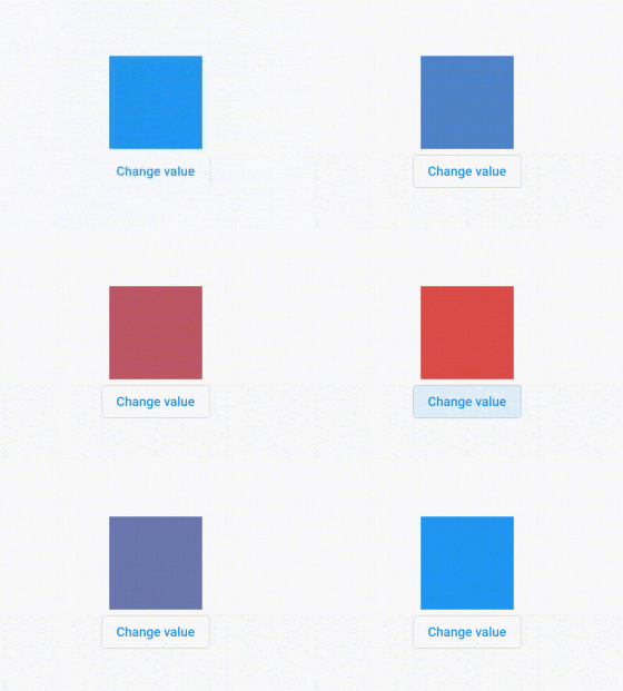
Animate Color
You can animate the color by changing the value of color argument.
  AnimatedContainer(
    duration: const Duration(seconds: 2),
    color: _isInitialValue ? Colors.blue : Colors.red,
    child: const SizedBox(width: 100, height: 100),
  )
Output:
Animate Width
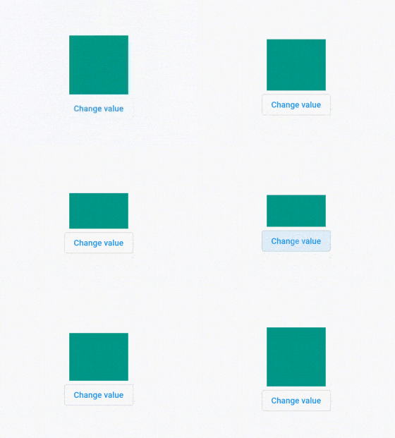
To animate the width, you need to change the value of the width argument.
  AnimatedContainer(
    duration: const Duration(seconds: 2),
    color: Colors.teal,
    width: _isInitialValue ? 150 : 50,
    child: const SizedBox(width: 100, height: 100),
  )
Output:

Animate Height
To animate the height, you need to change the value of the height argument.
  AnimatedContainer(
    duration: const Duration(seconds: 2),
    color: Colors.teal,
    height: _isInitialValue ? 100 : 50,
    child: const SizedBox(width: 100, height: 100),
  )
Output:
Animate Alignment
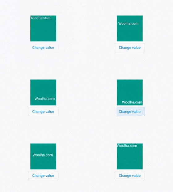
The alignment of the child will be animated if the value of alignment changes.
  AnimatedContainer(
    duration: const Duration(seconds: 2),
    color: Colors.teal,
    width: 100,
    height: 100,
    alignment: _isInitialValue ? Alignment(-1.0, -1.0) : Alignment(1.0, 1.0),
    child: const Text('Woolha.com', style: const TextStyle(color: Colors.white)),
  )
Output:
Animate Padding
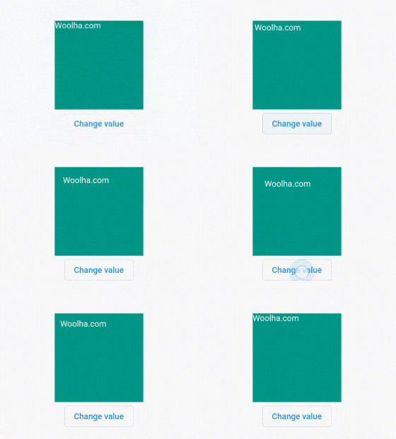
The widget also supports to create an animation when the passed padding changes.
  AnimatedContainer(
    duration: const Duration(seconds: 2),
    color: Colors.teal,
    width: 150,
    height: 150,
    padding: EdgeInsets.all(_isInitialValue ? 0 : 20),
    child: const Text('Woolha.com', style: const TextStyle(color: Colors.white)),
  )
Output:
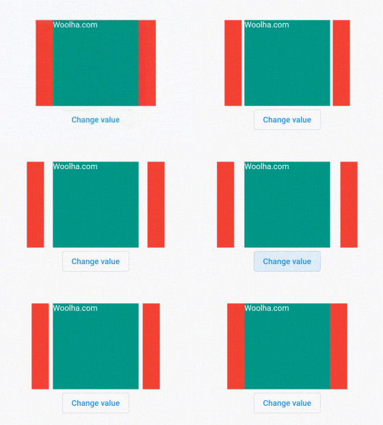
Animate Margin
It can also create an animation when the passed margin changes.
  Row(
    mainAxisAlignment: MainAxisAlignment.center,
    children: [
      Container(height: 150, width: 30, color: Colors.red),
      AnimatedContainer(
        duration: const Duration(seconds: 2),
        color: Colors.teal,
        width: 150,
        height: 150,
        margin: EdgeInsets.symmetric(horizontal: _isInitialValue ? 0 : 20),
        child: const Text('Woolha.com', style: const TextStyle(color: Colors.white)),
      ),
      Container(height: 150, width: 30, color: Colors.red),
    ],
  )
Output:
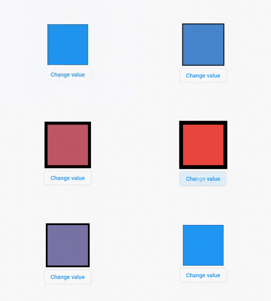
Animate Decoration
decoration argument is usually passed to add decorations such as color and border. If one or more properties of the BoxDecoration changes, an animation will be played.
  AnimatedContainer(
    duration: const Duration(seconds: 2),
    decoration: BoxDecoration(
      color: _isInitialValue ? Colors.blue : Colors.red,
      border: Border.all(width: _isInitialValue ? 0 : 10),
    ),
    child: const SizedBox(width: 100, height: 100),
  )
Output:
Animate Foreground Decoration
The similar thing also applies when the passed foregroundDecoration changes.
  AnimatedContainer(
    duration: const Duration(seconds: 2),
    foregroundDecoration: BoxDecoration(
      color: _isInitialValue ? Colors.blue : Colors.red,
      border: Border.all(width: _isInitialValue ? 0 : 10),
    ),
    child: const SizedBox(width: 100, height: 100),
  )
Output:

Animate Constraints
It will also create an animation when the passed constraint changes.
  AnimatedContainer(
    duration: const Duration(seconds: 2),
    color: Colors.teal,
    constraints: BoxConstraints(
      maxWidth: _isInitialValue ? 100 : 50,
      maxHeight: _isInitialValue ? 100 : 50,
    ),
    child: const SizedBox(width: 100, height: 100),
  )
Output:

Animate Transform
If the transformation matrix passed as transform argument changes, Flutter will animate the change.
  AnimatedContainer(
    duration: const Duration(seconds: 2),
    color: Colors.teal,
    transform: _isInitialValue ? Matrix4.identity() : Matrix4.rotationX(radians(45)),
    child: const SizedBox(width: 100, height: 100),
  )
Output:
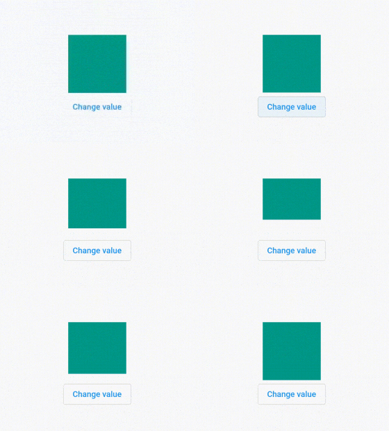
Set Animation Curve
Just like other Flutter animation widgets, you can also set the animation curve. You can parse a Curve constant as the curve argument.
  AnimatedContainer(
    duration: const Duration(seconds: 2),
    color: Colors.teal,
    width: _isInitialValue ? 150 : 50,
    child: const SizedBox(width: 100, height: 100),
    curve: Curves.bounceInOut,
  ),
Output:
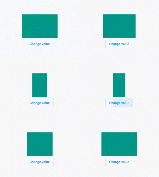
Set Callback
You can pass a callback function that will be called when an animation ends as onEnd argument.
  AnimatedContainer(
    duration: const Duration(seconds: 2),
    color: Colors.teal,
    width: _isInitialValue ? 150 : 50,
    child: const SizedBox(width: 100, height: 100),
    onEnd: () {
      print('Animation ends');
    },
  ),
AnimatedContainer - Parameters
Key? key: The widget's key.AlignmentGeometry? alignment: How to align the child within the container.EdgeInsetsGeometry padding: Empty space to inscribe inside the decoration. The child, if any, is placed inside this padding.Color color: Background color of the container.Decoration? decoration: The decoration to paint behind the child.Decoration? foregroundDecoration: The decoration to paint in front of the child.double? width: The width of the container.double? height: The height of the container.BoxConstraints? constraints: Additional constraints to apply to the child.EdgeInsetsGeometry? margin: Empty space to surround the decoration and child.Matrix4? transform: The transformation matrix to apply before painting the container.AlignmentGeometry? transformAlignment: The alignment of the origin, relative to the size of the container, if transform is specified.Widget? child: The child contained by the container.Clip clipBehavior: The clip behavior whenAnimatedContainer.decorationis not null. Defaults toClip.none.Curve curve: The curve to apply when animating the parameters of this container. Defaults toCurves.linear.required Duration duration: The duration to animate the parameters of this container.VoidCallback? onEnd: Called every time an animation completes.
Full Code
  import 'package:flutter/material.dart';
  import 'package:flutter/rendering.dart';
  import 'package:vector_math/vector_math.dart' show radians;

  void main() => runApp(MyApp());

  class MyApp extends StatelessWidget {

    @override
    Widget build(BuildContext context) {
      return MaterialApp(
        title: 'Woolha.com Flutter Tutorial',
        home: AnimatedContainerExample(),
      );
    }
  }

  class AnimatedContainerExample extends StatefulWidget {

    @override
    State<StatefulWidget> createState() {
      return _AnimatedContainerExampleState ();
    }
  }

  class _AnimatedContainerExampleState extends State<AnimatedContainerExample> {

    bool _isInitialValue = true;

    @override
    Widget build(BuildContext context) {
      return Scaffold(
        appBar: AppBar(
          title: const Text('Woolha.com Flutter Tutorial'),
        ),
        body: SizedBox(
          width: double.infinity,
          child: Column(
            crossAxisAlignment: CrossAxisAlignment.center,
            mainAxisAlignment: MainAxisAlignment.center,
            children: [
              AnimatedContainer(
                duration: const Duration(seconds: 2),
                color: _isInitialValue ? Colors.blue : Colors.red,
                width: _isInitialValue ? 150 : 50,
                height: _isInitialValue ? 100 : 50,
                alignment: _isInitialValue ? Alignment(-1.0, -1.0) : Alignment(1.0, 1.0),
                padding: EdgeInsets.all(_isInitialValue ? 0 : 20),
  //              decoration: BoxDecoration(
  //                color: _isInitialValue ? Colors.blue : Colors.red,
  //                border: Border.all(width: _isInitialValue ? 0 : 10),
  //              ),
                foregroundDecoration: BoxDecoration(
                  color: _isInitialValue ? Colors.blue : Colors.red,
                  border: Border.all(width: _isInitialValue ? 0 : 10),
                ),
                constraints: BoxConstraints(
                  maxWidth: _isInitialValue ? 100 : 50,
                  maxHeight: _isInitialValue ? 100 : 50,
                ),
                transform: _isInitialValue ? Matrix4.identity() : Matrix4.rotationX(radians(45)),
                curve: Curves.bounceInOut,
                child: const SizedBox(width: 100, height: 100),
                onEnd: () {
                  print('Animation ends');
                },
              ),
  //            Row(
  //              mainAxisAlignment: MainAxisAlignment.center,
  //              children: [
  //                Container(height: 150, width: 30, color: Colors.red),
  //                AnimatedContainer(
  //                  duration: const Duration(seconds: 2),
  //                  color: Colors.teal,
  //                  width: 150,
  //                  height: 150,
  //                  margin: EdgeInsets.symmetric(horizontal: _isInitialValue ? 0 : 20),
  //                  child: const Text('Woolha.com', style: const TextStyle(color: Colors.white)),
  //                ),
  //                Container(height: 150, width: 30, color: Colors.red),
  //              ],
  //            ),
              OutlinedButton(
                child: const Text('Change value'),
                onPressed: () {
                  setState(() {
                    _isInitialValue = !_isInitialValue;
                  });
                },
              ),
            ],
          ),
        ),
      );
    }
  }
Summary
That's all for this tutorial. The AnimatedContainer widget provides an easy way to have a Container that automatically animates when any property value changes.
You can also read about:
AnimatedCrossFade, which is used to create fade transition effects between two widgets.AnimatedAlign, a widget for creating animation when the alignment of a widget changes.AnimatedPadding, a widget for creating aniamation when the padding of a widget changes.AnimatedSwitcher, a widget for creating animation when switching between two widgets.AnimatedOpacity, a widget for creating animation when the opacity of a widget changes.AnimatedSize, a widget that animates its size to match the size of its child.
