This tutorial gives you examples of how to display SnackBar in Flutter, including how to customize the snackbar.
SnackBar is a widget used to display a short message. It's usually displayed at the bottom of the screen. Sometimes it can also have a clickable action button. In Flutter, there is a widget called SnackBar that makes it easy for us to show snackbars. This tutorial gives you examples of how to display a SnackBar in Flutter, including how to customize the visual of the snackbar, set the display duration, add an action button, and set the theme data to configure the default property values.
Showing SnackBar Examples
There are two steps for displaying a SnackBar. First, you have to create a SnackBar which can be done by calling the following constructor.
  const SnackBar({
    Key? key,
    @required this.content,
    Color? backgroundColor,
    double? elevation,
    EdgeInsetsGeometry? margin,
    EdgeInsetsGeometry? padding,
    double? width,
    ShapeBorder? shape,
    SnackBarBehavior? behavior,
    SnackBarAction? action,
    Duration duration = _snackBarDisplayDuration,
    Animation<double>? animation,
    VoidCallback? onVisible,
  })
The only required parameter is content which is the widget to be displayed inside the snackbar. In most cases, the widget is a Text widget, but you can also use other types of Flutter widget.
  final _snackBar = SnackBar(
    content: Text('Welcome to woolha.com')
  );
Using ScaffoldMessenger
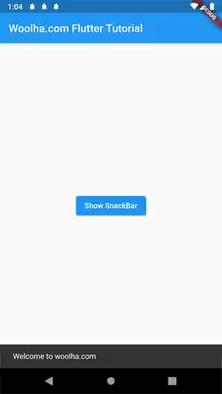
The second step is displaying the SnackBar. A SnackBar is not always displayed on screen. It's usually triggered by certain events such as a button click. To display a snackbar, use ScaffoldMessengerState's showSnackBar method. To get the ScaffoldMessengerState, you can use ScaffoldMessenger.of(BuildContext context). ScaffoldMessenger itself is a widget used to manage SnackBars for descendant Scaffolds.
ScaffoldMessenger.of(context).showSnackBar(_snackBar);ScaffoldMessenger was introduced in Flutter 2. The previous way to show a SnackBar is by using ScaffoldState like the code below.
Scaffold.of(context).showSnackBar(_snackBar);There was a problem of using the old way which limits a SnackBar to be only displayed on the current Scaffold. It would not persist across routes with different Scaffolds. Another problem is it may cause errors if showSnackBar is called while calling an asynchronous event, in which the BuildContext is invalidated and the Scaffold is disposed. ScaffoldMessenger works by creating a scope. All descendant Scaffolds will register to the scope to so that they can receive SnackBars. If you use the root ScaffoldMessenger provided by the MaterialApp, the SnackBars will be received by all Scaffolds. If you need to control which Scaffolds can receive SnackBars, you can create your own ScaffoldMessenger.
Output:
You can read our tutorial about ScaffoldMessenger to get a better understanding about it.
Set Background Color
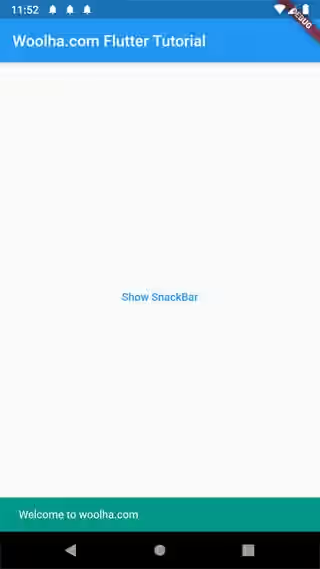
You can set the background color of the snackbar by passing backgroundColor property. If you don't pass the parameter, it will use backgroundColor of ThemeData.snackBarTheme. If that value is also not specified, it will use a dark variation of ColorScheme.surface in light themes or ColorScheme.onSurface in dark themes.
  SnackBar(
    content: Text('Welcome to woolha.com'),
    backgroundColor: Colors.teal,
  )
Output:
Set Padding
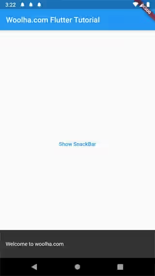
To set the padding for the snackbar's content and action, you can pass padding parameter (EdgeInsetsGeometry). Without passing this parameter, the default padding depends on behavior and action. If the behavior is fixed, the start padding is 24. If the behavior is floating, the start padding is 16. The same amount of padding will be added to the end if there is no action.
  SnackBar(
    content: Text('Welcome to woolha.com'),
    padding: EdgeInsets.all(15.0),
  )
Output:
Set Shape
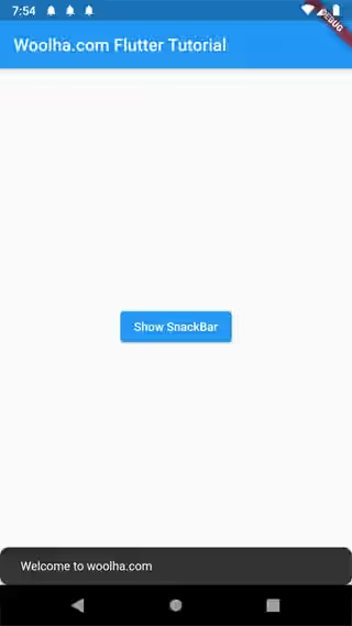
You can change the shape of the snacbar's Material by passing a BorderShape as shape parameter. Without that parameter, it will use shape of ThemeData.snackBarTheme. If the theme data doesn't have that value, it depends on the used SnackBarBehavior. If the behavior is fixed, the default shape is rectangular. If the behavior is floating, it uses a RoundedRectangleBorder with a radius of 4.0..
  SnackBar(
    content: Text('Welcome to woolha.com'),
    shape: RoundedRectangleBorder(borderRadius: BorderRadius.all(Radius.circular(10))),
  )
Output:
Set Behavior, Width, and Margin
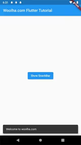
You can define how the snackbar should appear within a Scaffold by setting the value of behavior whose type is SnackBarBehaviorSnackBarBehavior with two values: fixed and floating.
If the value of behavior is fixed, the snackbar is fixed at the bottom of the Scaffold. The presence of the snackbar causes other non-fixed widgets such as FloatingActionButton to be pushed above. There is an exception when the Scaffold has a BottomNavigationBar, the snackbar will be displayed above the BottomNavigationBar. If you don't pass this parameter, behavior of ThemeData.snackBarTheme is used. If that value is also null, it will use fixed behavior.
  SnackBar(
    content: Text('Welcome to woolha.com'),
    behavior: SnackBarBehavior.floating,
  )
Output:
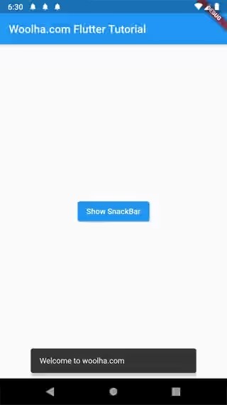
If you set the snackbar behavior to floating, you can also set the width of the snackbar.
  SnackBar(
    content: Text('Welcome to woolha.com'),
    behavior: SnackBarBehavior.floating,
    width: 300,
  )
Output:
Or you can set the margin.
  SnackBar(
    content: Text('Welcome to woolha.com'),
    behavior: SnackBarBehavior.floating,
    margin: EdgeInsets.all(30.0),
  )
Output:
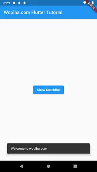
width and margin can only be set if the behavior is set to floating. But you cannot define both width and margin as setting both properties causes assertion error.
Set Action
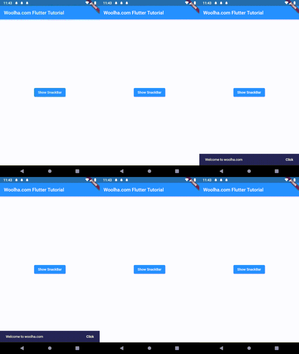
You can add a clickable button inside the snackbar along with the action when the button is clicked. To do so, you need to create a SnackBarAction and passing it as action in the constructor of SnackBar. Creating a SnackBarAction can be done by calling its constructor which has the following named parameters.
Key key: The widget's key, used to control if it should be replaced.Color textColor: The text color.Color disabledTextColor: The text color when disabled.String label*: The label of the button.VoidCallback onPressed*: The callback to be called when the button is pressed.
*: required
Clicking the action button will cause the snackbar to be dismissed. Here is the example of how to define a SnackBarAction.
  SnackBar(
    content: Text('Welcome to woolha.com'),
    duration: const Duration(seconds: 10),
    action: SnackBarAction(
      label:'Click',
      onPressed: () {
        print('Action is clicked');
      },
      textColor: Colors.white,
      disabledTextColor: Colors.grey,
    ),
  )
Output:
Set Duration
By default, a snackbar is shown for 4 seconds. To change the how long the snackbar should be displayed, you can define a Duration as duration parameter.
  SnackBar(
    content: Text('Welcome to woolha.com'),
    duration: const Duration(seconds: 10),
  )
Adding On Visible Callback
You can pass a callback function that will be called every time the snackbar becomes visible.
  SnackBar(
    content: Text('Welcome to woolha.com'),
    onVisible: () {
      print('Snackbar is visible');
    }
  )
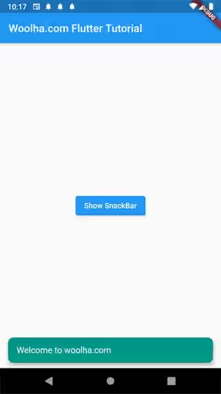
Set Theme Data
The customizations in the previous examples only apply to a specific button. What if you want to add a default style for all snackbars in your application. The solution is creating a SnackBarThemeData and pass it as snackBarTheme in the constructor of ThemeData. The constructor of SnackBarThemeData has the following parameters.
Color backgroundColor: Default value forSnackBar.backgroundColor.Color actionTextColor: Default value forSnackBarAction.textColor.Color disabledActionTextColor: Default value forSnackBarAction.disabledActionTextColor.TextStyle contentTextStyle: DefaultTextStyleforSnackBar.content.double elevation: Default value forSnackBar.elevation.ShapeBorder shape: Default value forSnackBar.shape.SnackBarBehavior: Default value forSnackBar.behavior.
Below is the example of how to set ElevatedButtonThemeData.
  theme: ThemeData(
    snackBarTheme: SnackBarThemeData(
      backgroundColor: Colors.teal,
      actionTextColor: Colors.white,
      disabledActionTextColor: Colors.grey,
      contentTextStyle: TextStyle(fontSize: 16),
      shape: RoundedRectangleBorder(borderRadius: BorderRadius.all(Radius.circular(10))),
      behavior: SnackBarBehavior.floating,
    )
  )
Output:
Full Code
import 'package:flutter/material.dart';

  void main() => runApp(MyApp());

  class MyApp extends StatelessWidget {

    @override
    Widget build(BuildContext context) {
      return MaterialApp(
        title: 'Woolha.com Flutter Tutorial',
        home: _SnackBarAppExample(),
        theme: ThemeData(
          snackBarTheme: SnackBarThemeData(
            backgroundColor: Colors.teal,
            actionTextColor: Colors.white,
            disabledActionTextColor: Colors.grey,
            contentTextStyle: TextStyle(fontSize: 16),
            shape: RoundedRectangleBorder(borderRadius: BorderRadius.all(Radius.circular(10))),
            behavior: SnackBarBehavior.floating,
          )
        ),
      );
    }
  }

  class _SnackBarAppExample extends StatelessWidget {

    @override
    Widget build(BuildContext context) {
      return Scaffold(
        appBar: AppBar(
          title: Text('Woolha.com Flutter Tutorial'),
        ),
        body: _MySnackBar(),
      );
    }
  }

  class _MySnackBar extends StatelessWidget {

    @override
    Widget build(BuildContext context) {
      final _snackBar1 = SnackBar(
        content: Text('Welcome to woolha.com'),
      );

      final _snackBar2 = SnackBar(
        content: Text('Welcome to woolha.com'),
        duration: const Duration(seconds: 10),
        action: SnackBarAction(
          label:'Click',
          onPressed: () {
            print('Action is clicked');
          },
          textColor: Colors.white,
          disabledTextColor: Colors.grey,
        ),
          onVisible: () {
            print('Snackbar is visible');
          },
        shape: RoundedRectangleBorder(borderRadius: BorderRadius.all(Radius.circular(10))),
        behavior: SnackBarBehavior.floating,
        margin: EdgeInsets.all(30.0),
        padding: EdgeInsets.all(15.0),
      );

      return Center(
        child: Column(
          mainAxisAlignment: MainAxisAlignment.center,
          children: [
            ElevatedButton(
              child: Text('Show SnackBar 1'),
              onPressed: () {
                ScaffoldMessenger.of(context).showSnackBar(_snackBar1);
              },
            ),
            ElevatedButton(
              child: Text('Show SnackBar 2'),
              onPressed: () {
                ScaffoldMessenger.of(context).showSnackBar(_snackBar2);
              },
            )
          ],
        )
      );
    }
  }
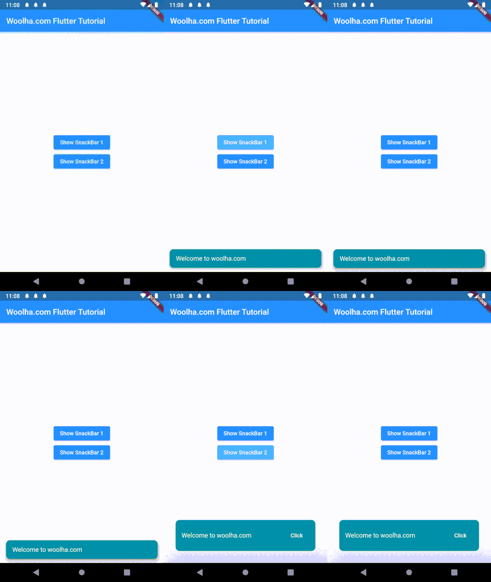
Output:
SnackBar Properties
Key? key: The widget's key, used to control if it should be replaced.@required Widget content: The content of theSnackBar.Color? backgroundColor: The background color of theSnackBar.double? elevation: The z-coordinate of theSnackBarwhich affects the size of the shadow.EdgeInsetsGeometry? margin: Empty space outside theSnackBar.EdgeInsetsGeometry? padding: Padding to be applied to theSnackBar's content and action.double? width: The width of theSnackBar.ShapeBorder? shape: The shape of theSnackBar'sMaterial.SnackBarBehavior? behavior: Defines the behavior and the location of the snackbar.SnackBarAction? action: An action that the user can take by clicking a button inside theSnackBar.Duration duration: How long theSnackBaris displayed. Defaults to 4 seconds.Animation<double>? animation: Defines the entrance and exit animations of theSnackBar.VoidCallback? onVisible: A callback function called when theSnackBarbecomes visible in aScaffoldfor the first time.
@required: value must be passed
?: value can be null
