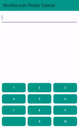
This tutorial shows you how to create a custom in-app keyboard in Flutter.
By default, a Flutter application uses the system keyboard when a text field is on focus. For certain reasons, an application may need to use a different custom keyboard. For example, to make it easier for the users to type or to make it matches the application layout style. Another reason is for inputting sensitive values such as PIN in which the numbers are usually shuffled. In this tutorial, I'm going to show you how to create a custom keyboard in Flutter.
Create Custom Keyboard
The idea is quite simple. You need to have a TextEditingController instance and set it as the controller of the text fields that use the custom keyboard. Then, create a widget that renders a custom keyboard with any layout and keys. The widget needs to be able to access the controller instance. When a key is pressed, use the controller instance to update the displayed value.
In this example, we are going to create a StatefulWidget. In the State class, we need to create several variables.
Create TextEditingController, FocusNode, and ListenableBuilder.
First, create a TextEditingController as I've explained above. It has to be passed as the controller of the text field. In addition, it will be used by the custom keyboard to manipulate the value and the cursor position.
Another thing that you need to create is a FocusNode which has to be set as the focus node of the text field. When it has the focus, the keyboard should be shown to the user. When it doesn't have the focus, do not display the keyboard.
Since we only need to toggle the keyboard visibility, only the keyboard widget needs to be rebuilt when the focus changes. To avoid rebuilding unnecessary widgets, we can use a ListenableBuilder that listens to a ValueNotifier. The ValueNotifier holds a boolean value that indicates whether the text field has the focus or not. In order to change the value of the ValueNotifier, add a listener to the FocusNode, which will be invoked every time the text field gets or loses the focus. Inside the listener, set the value of the ValueNotifier.
  class MyPage extends StatefulWidget {

    const MyPage({super.key});

    @override
    State<StatefulWidget> createState() {
      return _MyPageState();
    }
  }

  class _MyPageState extends State<MyPage> {

    final TextEditingController _controller = TextEditingController();
    final FocusNode _focus = FocusNode();
    late ValueNotifier<bool> _focusValueNotifier;

    @override
    void initState() {
      super.initState();
      _focus.addListener(_handleFocusChange);
      _focusValueNotifier = ValueNotifier<bool>(_focus.hasFocus);
    }

    @override
    void dispose() {
      super.dispose();
      _focus.removeListener(_handleFocusChange);
      _focus.dispose();
    }

    void _handleFocusChange() {
      _focusValueNotifier.value = _focus.hasFocus;
    }

    @override
    Widget build(BuildContext context) {
      return Scaffold(
        appBar: AppBar(
          title: const Text('Woolha.com Flutter Tutorial'),
          backgroundColor: Colors.teal,
        ),
        body: Column(
          mainAxisAlignment: MainAxisAlignment.start,
          children: [
            Padding(
              padding: const EdgeInsets.all(10.0),
              child: TextField(
                controller: _controller,
                keyboardType: TextInputType.none,
                focusNode: _focus,
              ),
            ),
            const Spacer(),
            ListenableBuilder(
              listenable: _focusValueNotifier,
              builder: (BuildContext context, Widget? child) {
                return _focus.hasFocus ? NumericKeypad(controller: _controller) : Container();
              },
            ),
          ],
        ),
      );
    }
  }
Create Keyboard Widget
Next, create the widget that renders the custom keyboard. In this example, we are going to create a numeric keypad that contains number 0-9 and a backspace. The widget needs to have access to the controller instance, so that it can update the value of the text field and the cursor position based on the pressed key.
When typing, if the current value is empty, set the pressed key as the value. If the current value is not empty, insert the pressed key after the current cursor position. To update the value, just set the value property of the controller. Then, move the cursor position to the next index by setting the value of the controller's selection property.
For the backspace key, if the value is not empty and the current cursor position is greater than 0, remove the character before the cursor. Then, move the cursor position to the previous index.
  class NumericKeypad extends StatefulWidget {

    final TextEditingController controller;

    const NumericKeypad({super.key, required this.controller});

    @override
    State<NumericKeypad> createState() => _NumericKeypadState();
  }

  class _NumericKeypadState extends State<NumericKeypad> {

    late TextEditingController _controller;

    final Widget _horizontalPadding = const SizedBox(width: 10.0);
    final Widget _verticalPadding = const SizedBox(height: 10.0);

    @override
    void initState() {
      super.initState();
      _controller = widget.controller;
    }

    void _handleType(String text) {
      int position = _controller.selection.base.offset;
      var value = _controller.text;

      if (value.isEmpty) {
        _controller.text = text;
      } else {
        _controller.text = value.substring(0, position) + text + value.substring(position, value.length);
      }

      _controller.selection = TextSelection.fromPosition(TextPosition(offset: position + 1));
    }

    void _handleBackspace() {
      int position = _controller.selection.base.offset;
      final value = _controller.text;

      if (value.isNotEmpty && position > 0) {
        _controller.text = value.substring(0, position - 1) + value.substring(position, value.length);
        _controller.selection = TextSelection.fromPosition(TextPosition(offset: position - 1));
      }
    }

    Widget _buildButton(String text, { VoidCallback? onPressed }) {
      return Expanded(
        child: Container(
          decoration: const BoxDecoration(
            color: Colors.teal,
            borderRadius: BorderRadius.all(Radius.circular(10.0)),
          ),
          child: TextButton(
            onPressed: onPressed ?? () => _handleType(text),
            child: Text(text, style: const TextStyle(color: Colors.white)),
          ),
        ),
      );
    }

    @override
    Widget build(BuildContext context) {
      return Container(
        color: Colors.white54,
        child: Column(
          children: [
            _verticalPadding,
            Row(
              mainAxisAlignment: MainAxisAlignment.spaceEvenly,
              children: [
                _horizontalPadding,
                _buildButton('1'),
                _horizontalPadding,
                _buildButton('2'),
                _horizontalPadding,
                _buildButton('3'),
                _horizontalPadding,
              ],
            ),
            _verticalPadding,
            Row(
              children: [
                _horizontalPadding,
                _buildButton('4'),
                _horizontalPadding,
                _buildButton('5'),
                _horizontalPadding,
                _buildButton('6'),
                _horizontalPadding,
              ],
            ),
            _verticalPadding,
            Row(
              children: [
                _horizontalPadding,
                _buildButton('7'),
                _horizontalPadding,
                _buildButton('8'),
                _horizontalPadding,
                _buildButton('9'),
                _horizontalPadding,
              ],
            ),
            _verticalPadding,
            Row(
              children: [
                _horizontalPadding,
                _buildButton(''),
                _horizontalPadding,
                _buildButton('0'),
                _horizontalPadding,
                _buildButton('⌫', onPressed: _handleBackspace),
                _horizontalPadding,
              ],
            ),
            _verticalPadding,
          ],
        ),
      );
    }
  }
Use Back Button to Hide the Keyboard
Another thing that you need to handle is to avoid Flutter from popping the route when the back button is pressed. The back button is usually pressed by the users to hide the keyboard. Because a custom keyboard is not the system keyboard, Flutter doesn't know that it's a keyboard and therefore the default behavior is to pop the route. The solution is to use a WillPopScope, which depends on the return value of the onWillPop function (pop if it returns true). Inside the function, if the text field has focus which means the keyboard is displayed, remove the focus and return false. That will cause the keyboard to be hidden without popping the route. If the keyboard is already hidden, the onWillPop function has to return true which causes Flutter to pop the route.
  return WillPopScope(
    onWillPop: () async {
      if (_focus.hasFocus) {
        _focus.unfocus();
        return false;
      } else {
        return true;
      }
    },
    child: Scaffold(
      // ...
    ),
  );
Output:

Summary
To create a custom keyboard, you need to create a TextEditingController instance and set it as the controller of the text field that uses the custom keyboard. Then, you can create a widget for the custom keyboard which has access to the same controller instance. When a key is pressed, use the controller instance to update the text and the cursor position.
